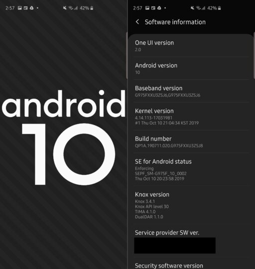
So Samsung has finally launched the One UI 2.0 beta based on Android 10 for the Galaxy S10. We’ve been waiting for it a long time, so let’s get right to it and talk about some of the new features and changes we have spotted in the beta after a day or so of using it on a Galaxy S10+.
Both Google and Samsung navigation gestures are included
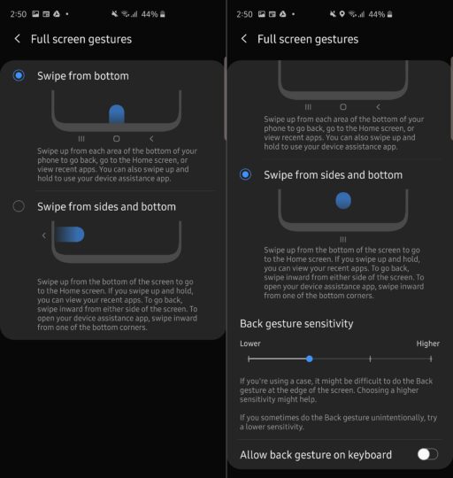
Let’s start with the gestures. One UI 2.0 adds Google navigation gestures to the mix. These are pretty similar to what you find on the iPhone. You have to swipe up from the bottom of the display to go to the home screen, and if you swipe up and hold, you get the multitasking menu. To go back, you can swipe in from the right or left edge of the display.

The good news is that Samsung has not removed its own navigation gestures, so what system you want to use is up to you. The standard navigation buttons are also available if you like doing things the old-fashioned way. Those are also what are enabled by default instead of the gestures when you first install Android 10.
Camera UI redesigned… again
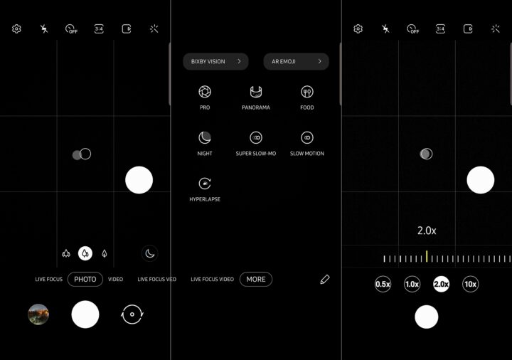
Now here’s something you might hate: Samsung has changed the camera interface for the millionth time. The biggest change? You no longer see all the camera modes available above the shutter button. Every mode except Photo, Video, Live Focus, and Live Focus video is now grouped together in the More section. You can go back to the old way by manually dragging each mode from the More section to the area above the shutter button, but it’s extra work.

When you zoom in and out in the camera using your fingers, you can now find four buttons that let you instantly switch between 0.5x, 1.0x, 2.0x, and 10x zoom levels. This is very helpful. Sadly, the dedicated Video mode still exists, and Samsung has not added a video recording button to the Pro mode. You will also not find any new options in the camera settings.
Screen recorder built-in, device maintenance made simpler
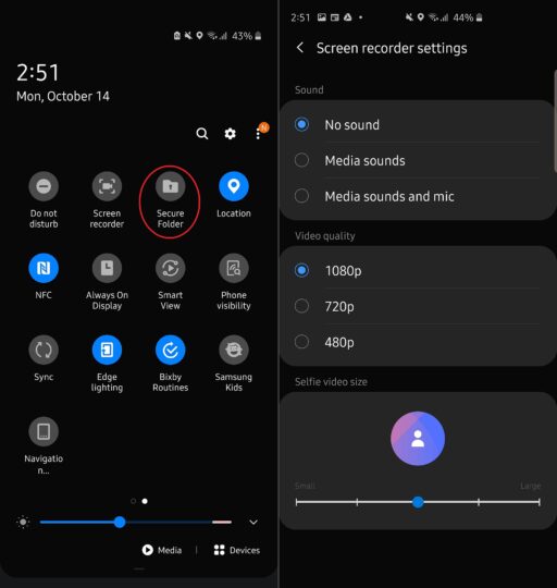
With One UI 2.0, the Galaxy S10 has the new screen recording feature from the Galaxy Note 10. You can record the screen, all the sounds played on the phone and everything that is picked up by the microphone. You can also add a selfie feed when recording the screen, which is very cool.

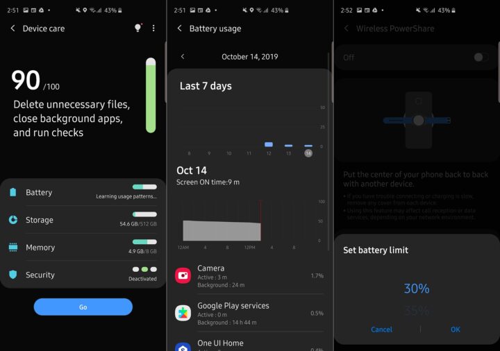
Oh, and One UI 2.0 has the option to disable that charging information you always see on the screen on a Galaxy Note 10. It also shows you more detailed battery stats in the Device care section, which has been redesigned to be simpler to use. You can now decide when Wireless PowerShare should stop charging other devices. It stopped only at 30% on Pie, now you can tell the phone to stop at 90% if you wish.

New shortcut and gesture for enabling One-handed mode
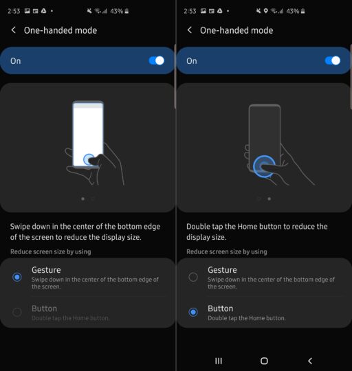
If you like using one-handed mode on your Galaxy S10, you will probably hate the new gesture you need to use to enable it. You can’t swipe in from the left or right edge of the screen to enable one handed mode anymore. You have to swipe from the bottom center of the screen to the bottom edge of the screen.

This is because Google’s navigation gestures require one to swipe in from the left or right edge of the screen to go back in/from apps. If you use standard navigation buttons, however, one-handed mode can be now be accessed with just a double tap of the home button instead of tapping it three times.
Digital Wellbeing gets focus mode, Night mode now Dark mode
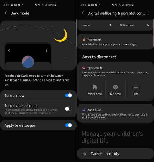
Google has improved the Digital Wellbeing feature with Android 10. You now have a focus mode that disables all notifications and apps so you can focus on work and other things. There are also new parental controls. You can remotely track how much your kid is using the phone and set limits to screen time. The apps they can use can be limited as well.

Night mode is called Dark mode now because that’s what Google calls it, and Dark mode even darkens your wallpaper so your home screen doesn’t hurt your eyes. As we have noted before, many of Google’s app follow Night mode on Galaxy devices even on Android Pie and switch to a dark UI when Night mode is enabled, but Android 10 will still be needed for some apps, such as YouTube, which only respect the system-wide Night/Dark mode setting on the new version of Android.
Other stuff included in One UI 2.0
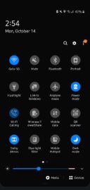
In the notification shade, the time and date at the top is smaller so you see more toggles on the screen. This is actually the opposite of what One UI is supposed to do, which is to make things easier to reach with one hand. However, inside settings menus and proprietary apps like Messages, you still have the top half of the screen occupied only by the name of the menu/app, with the first few interactable items starting from the bottom half of the screen.


One UI 2.0 is also filled with new animations that make things look smoother. The volume control buttons have been redesigned and there are beautiful new Edge lighting effects. Some basic Samsung apps have received new options. The Contacts app has a trash section so you can restore deleted contacts within 15 days. There is also a trash section in the My Files app, and My Files can now copy files to multiple destinations at the same time. Last but not least, the Calculator app can now convert time and speed units.
Not a big update, and lots could change in future releases
One UI 2.0 is not a big upgrade, and Samsung could end up changing plenty of things we see in the first beta. We like some of the new features but will reserve judgement on One UI 2.0 and Android 10 until the final release of the software. And, as you would expect, the first beta isn’t very stable. It doesn’t seem to have any bugs, but we ran into performance issues and stutters and wouldn’t recommend it for daily use.
Have you received the Android 10 beta on your Galaxy S10? What do you think about all the changes and new features? Let us know in the comments, and look forward to our detailed analysis of all the new features in One UI 2.0 in the coming days!

- Model: SM-G970F
- Dimensions: 69.9 x 142.2 x 7.9mm
- Display: 5.8” (146.5mm) Super AMOLED
- CPU: Exynos 9820 Octa
- Camera: 12 MP, CMOS F1.5/F2.4 (77°) & 16MP, CMOS F2.2 (123°)Ultra Wide
- Model: SM-G973F
- Dimensions: 70.4 x 149.9 x 7.8mm
- Display: 6.1"(157.5mm) Super AMOLED
- CPU: Exynos 9820 Octa
- Camera: 12 MP.CMOS F2.4 45° Telephoto & 12MP F1.5 77° & 16MP F2.2 123° Ultra-wide
- Model: SM-G975F
- Dimensions: 74.1 x 157.6 x 7.8mm
- Display: 6.4"(162.5mm) Super AMOLED
- CPU: Exynos 9820 Octa
- Camera: 12 MP.CMOS F2.4 45° Telephoto & 12MP F1.5/F2.4 77° & 16MP F2.2 123° Ultra-wide
The post All the new features in Galaxy S10 Android 10 One UI 2.0 beta appeared first on SamMobile.
from SamMobile https://ift.tt/2VFa3gf
via
IFTTT


