A brand new UI design with customizable color themes was one of the main talking points of Android 12. Google calls the new design Material You, and it can change the color scheme of UI elements based on the wallpaper chosen by the user. However, when Samsung released the first beta version of One UI 4.0, there was no sign of Material You. The feature was introduced later with the second beta release.
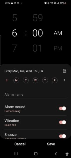
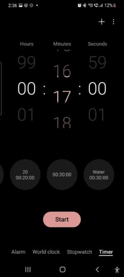
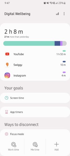
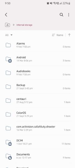
While the Material You theming engine appears to be a bit buggy right now, most of the stock Samsung apps have started following it. After choosing any wallpaper, a new menu appears and prompts you to select a color scheme from multiple options (all inspired by the colors from the selected wallpaper). We tried all the stock apps from Samsung, and here are the ones following the Material You theme in One UI 4.0.
- Calculator
- Calendar
- Clock
- Contacts
- Device Care
- Gallery
- Messages
- My Files
- Phone
- Reminders
- Samsung Cloud
- Samsung Pass
- Settings
- Tips
- Weather
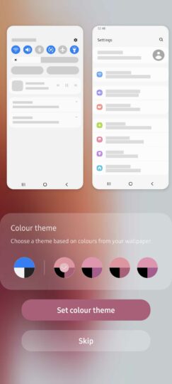
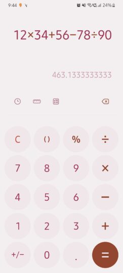
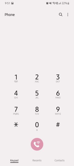
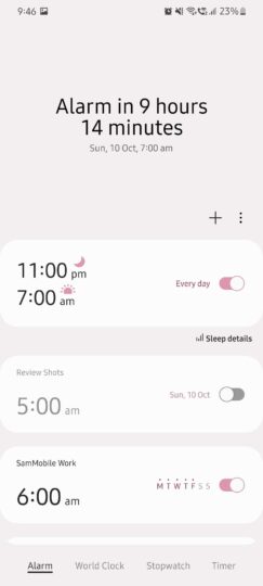
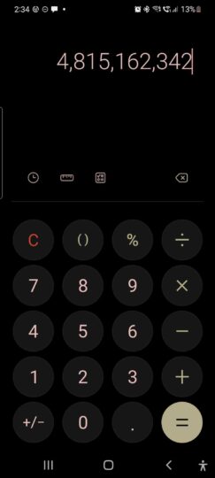
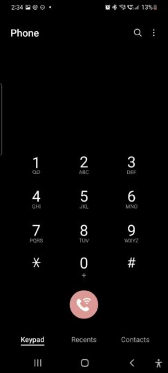
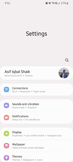
Not all these apps use Material You colors to the same effect, though. Some apps show minimal signs of color customizations, while others flaunt them. For example, Calculator and Device Care show a lot of Material You colors, while Gallery and Settings show minimal effects. Moreover, when the dark mode is active, the Material You effects get minimized even further.
We hope that more stock and third-party apps will start supporting Material You effects in the future. Do you like Google’s and Samsung’s Material You direction? Or do you prefer the older UI design? Let us know in the comments section below.

Join SamMobile’s Telegram group and subscribe to our YouTube channel to get instant news updates and in-depth reviews of Samsung devices. You can also subscribe to get updates from us on Google News.
The post All the stock Samsung apps with Material You theming on One UI 4.0 appeared first on SamMobile.
from SamMobile https://ift.tt/2YzxflC
via IFTTT


