For Samsung, the Galaxy S10+ is the culmination of all the fancy features and experiments the company has run over the last year or two. Samsung’s tenth anniversary Galaxy S flagship lineup comes with three models of different sizes, and as expected, the S10+ is the version with the most amount of features and power under the hood.
The S10+ comes with dual front cameras taking up the right hand corner of the 6.4-inch Infinity-O Super AMOLED display, a 4,100 mAh battery, a variant with a ceramic back, and up to 12GB of RAM and 1TB of internal storage, along with highlights such as an in-display fingerprint sensor, three rear cameras, and reverse wireless charging like the 6.1-inch Galaxy S10.
Samsung is banking on the S10+ to get all the attention, both from consumers and tech reviewers, which may be why the company chose to send only the S10+ to the latter after the Galaxy S10 series’ launch. And today we look at whether the Galaxy S10+ is everything we had hoped it would be or if it fails to live up to everyone’s expectations.
Design

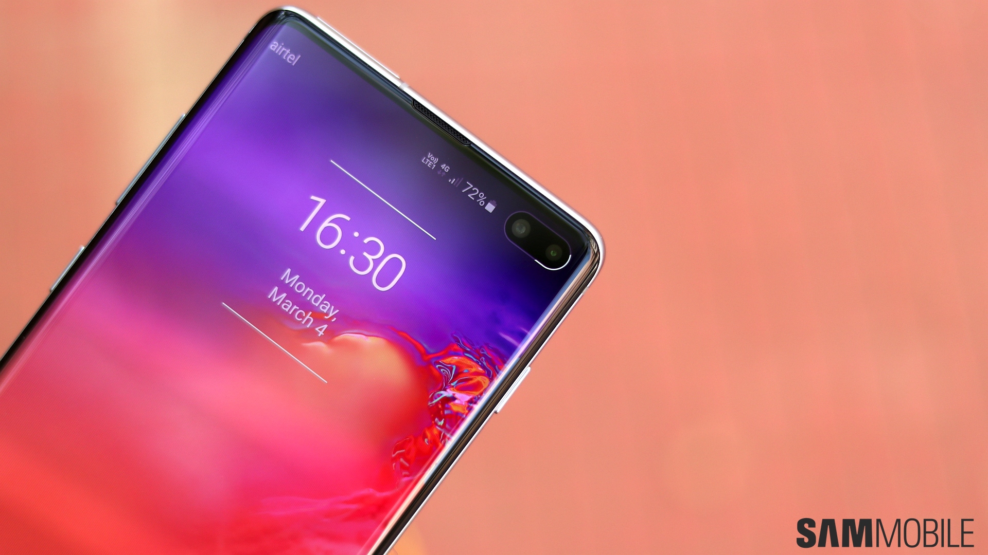
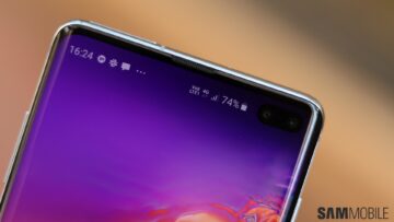
We’ll start off with the design as always, and there’s a lot to discuss with the Galaxy S10. The Galaxy S10 trio is pretty much the same glass and metal package as its predecessors, but we have two new additions to Samsung’s flagship lineup: An in-display fingerprint sensor and a cutout for the front cameras right inside the screen. Where the former is invisible, the latter is all too visible and ever present. And on the S10+, it’s a wider cutout than the S10e or S10’s, which can be an eyesore at times.
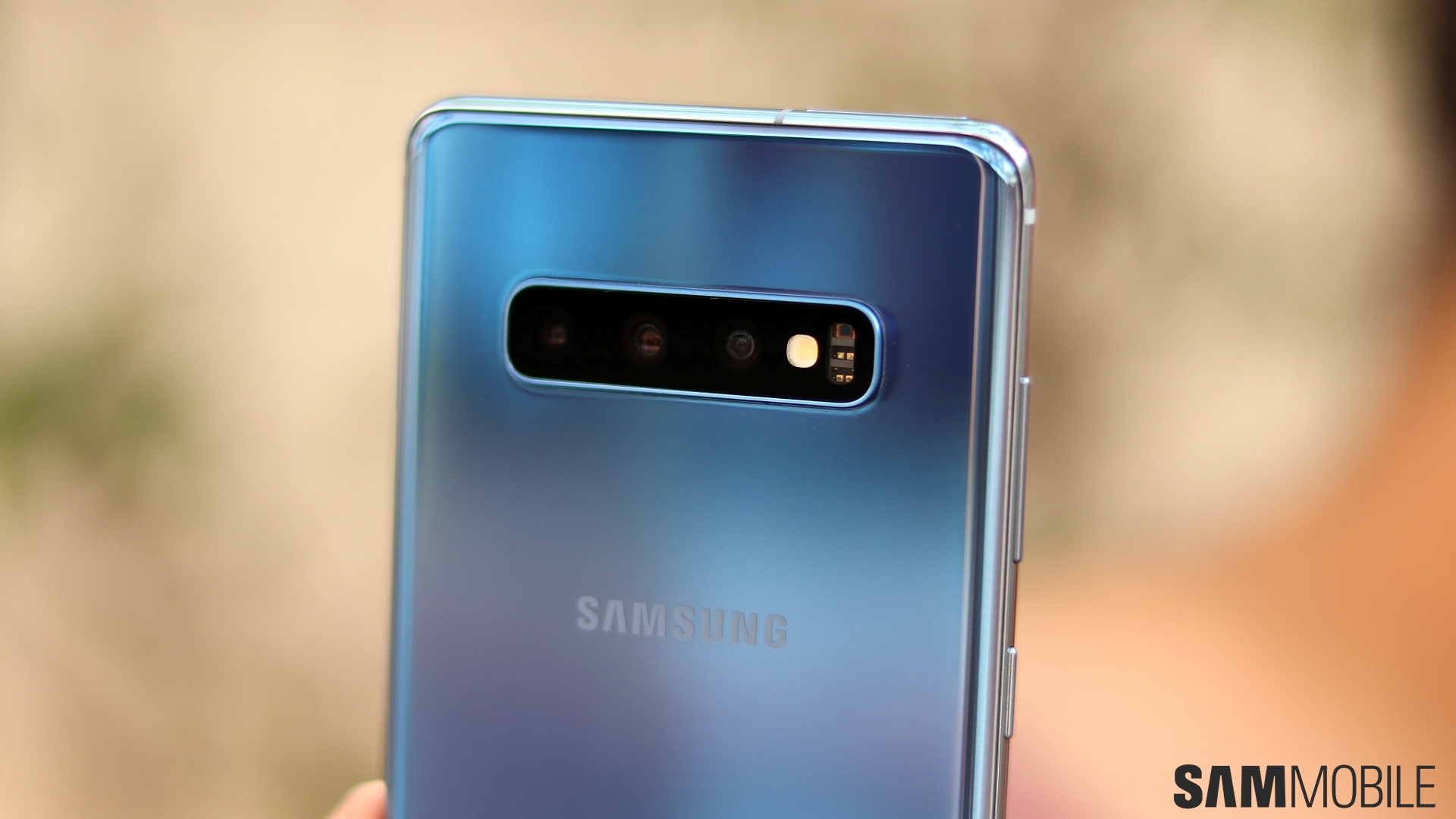
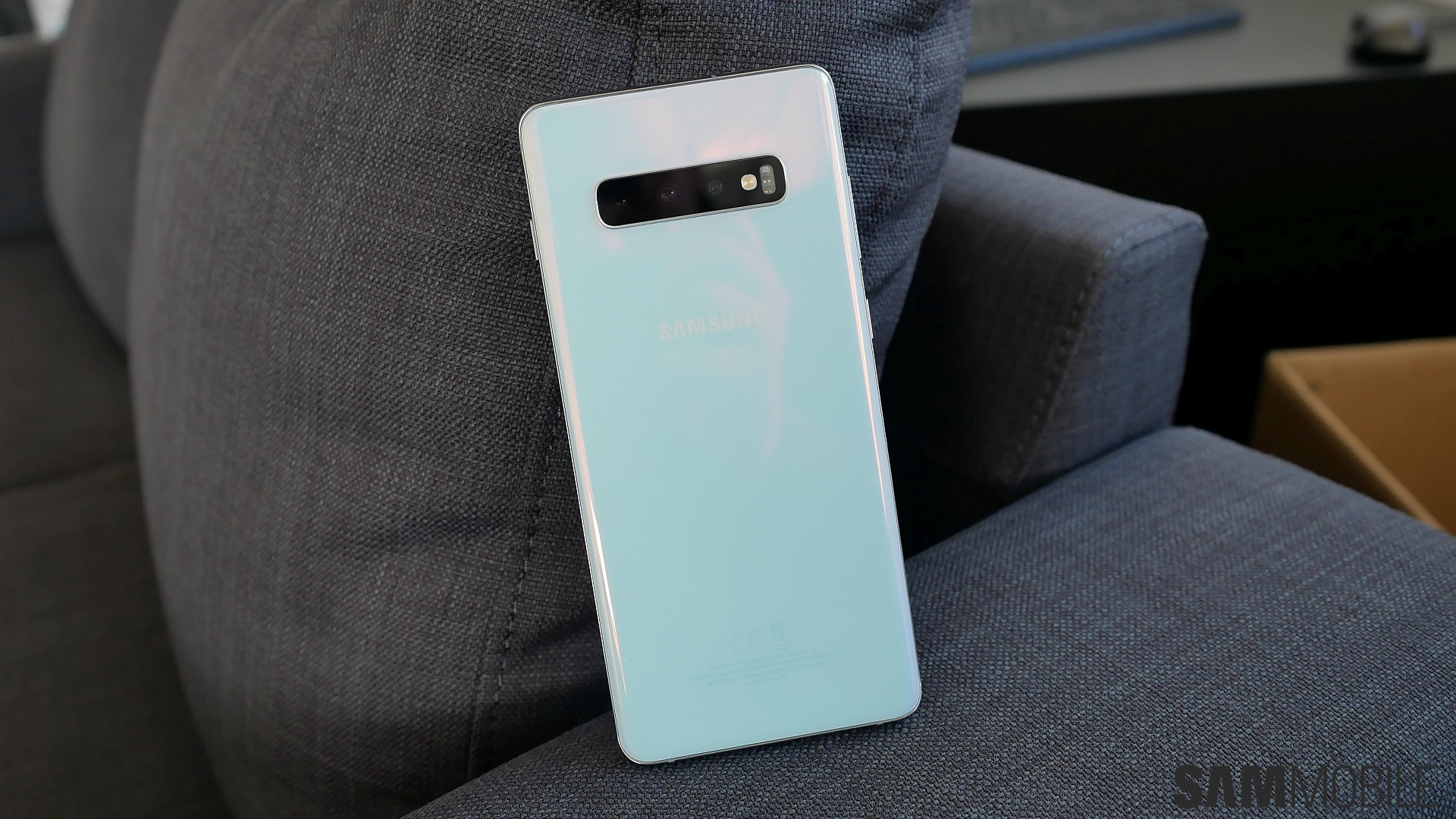
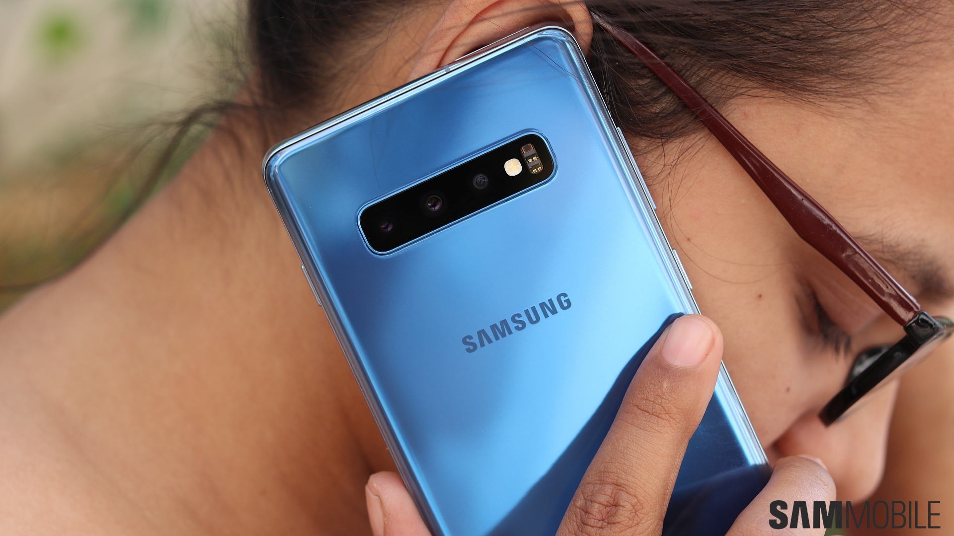
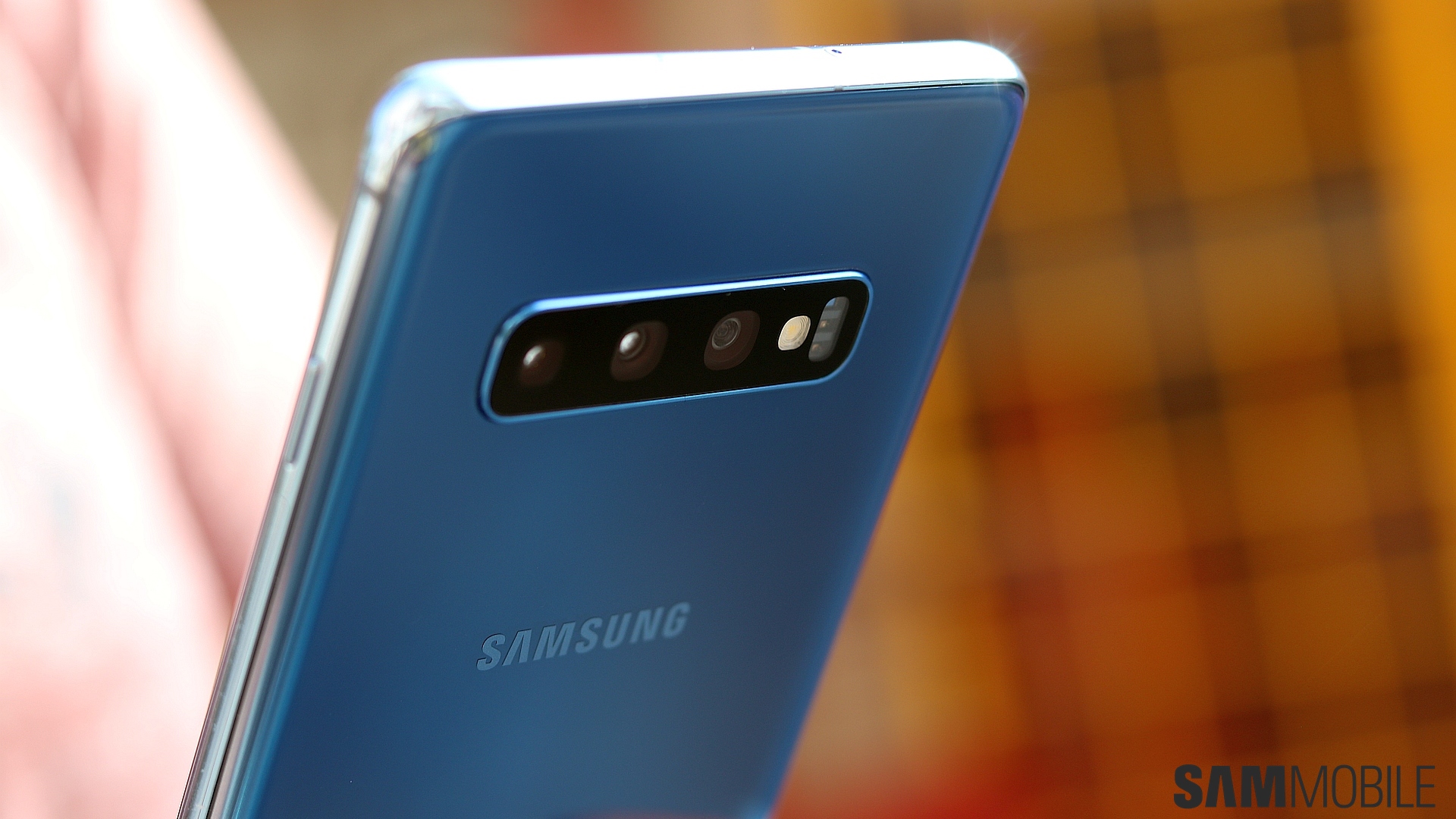
However, the gains in compactness are well worth it in our opinion. The bezels are considerably smaller as the camera resides in the display, and that allows the S10+ to offer a 6.4-inch screen despite the same overall size as the Galaxy S9+. At the back, Samsung has chosen to keep things classy by not going overboard with gradient colors, with a very subtle change of shade depending on how the light hits the glass. And the rear camera assembly sticks out of the body a bit more than it did on the S9+, and that’s because the S10+ is thinner than its predecessor.

And you will feel that thinness in everyday use. It combines with the smaller bezels to make the Galaxy S10+ feel extremely sleek and manageable for a device with a 6.4-inch screen and one with a 4,100 mAh battery inside. A headphone jack is here as well, along with that Bixby key (which can now be remapped), IP68 water resistance, and a USB Type-C slot that still supports the same old Quick Charge 2.0 fast charging speeds (15 watts).

The standard notification LED, sadly, has not made its way to the Galaxy S10. It’s a sacrifice made for the smaller bezels, with no space around the camera cutout or in the bezels for a dedicated notification LED. The screen lights up around the front cameras when facial recognition is actively detecting your face on the lock screen and when you switch to the front camera from the rear camera. It also acts as a countdown timer for selfies with both the timer option and the ‘show palm for taking selfie’ gesture, but it isn’t used for notifications.


Display

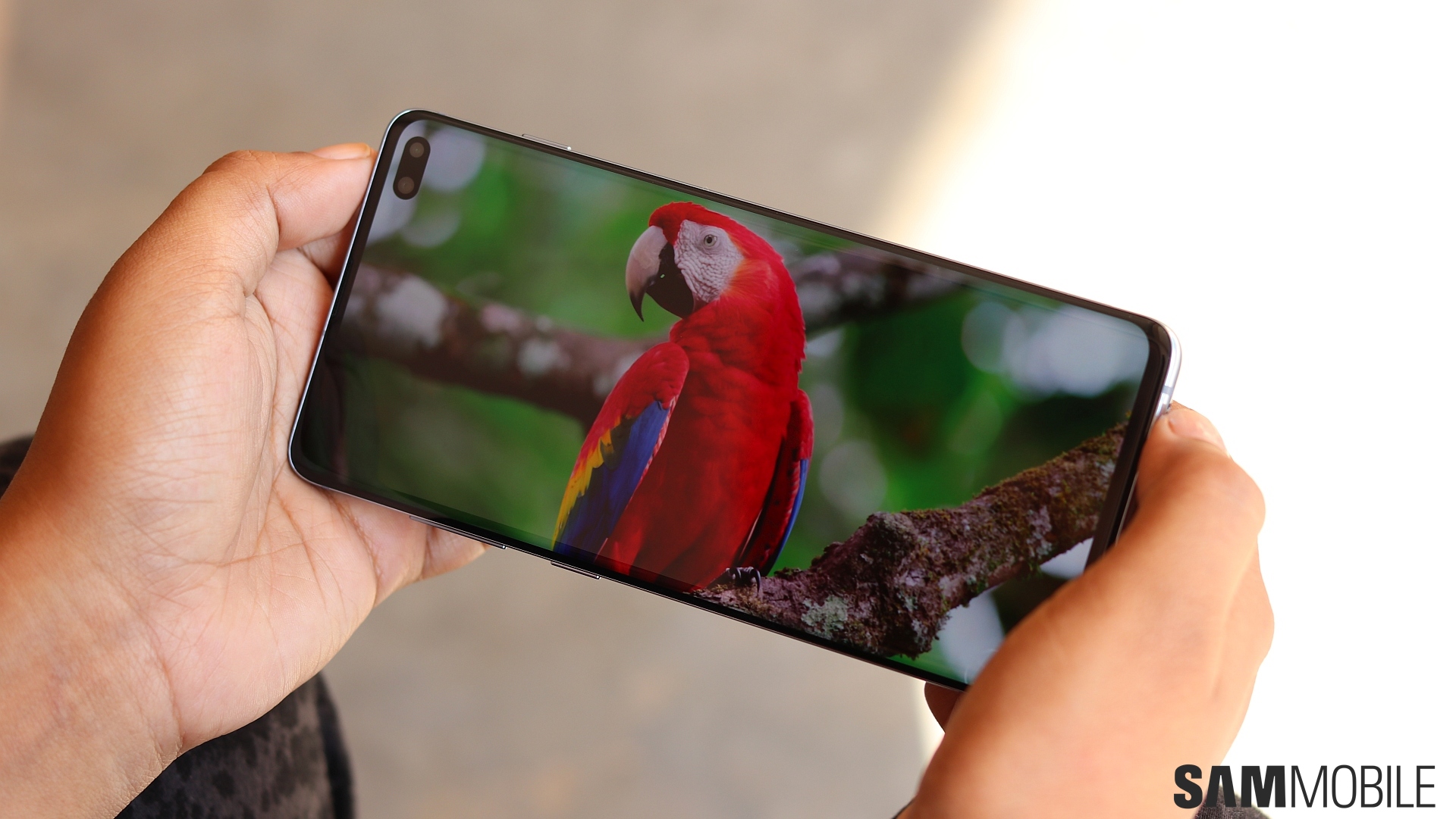
Alright, so let’s talk about that 6.4-inch Infinity-O Super AMOLED display. You have the usual suspects here, which are vivid colors, wide viewing angles, and excellent brightness levels. But Samsung has worked on color accuracy as well. The S10+ (along with the S10 and S10e) has the most accurate screen on a smartphone ever in that regard. If you’re a regular user of Samsung’s flagship phones, you’ll notice how the display has warmer whites (yellowish) out of the box than any previous flagship, possibly a result of the color accurate tuning.
You can make the whites look cooler (bluer) in the display settings, but you will also notice how there are only two screen modes to choose from. You have Vivid, which is the default and lets you change the white balance and manually adjust the red, green, and blue levels, and then there’s Natural. Natural screen mode cannot be modified in any way and it turns the whites even more yellow. For those who take color accuracy seriously, Natural is the screen mode to use.
And the warmer tone is something you get used to after a point. Once that happens, you’ll not complain about the display quality. The brightness levels in particular are noticeably higher, especially out in harsh sunlight. The touchscreen is also smoother to use and feels much more premium than the Galaxy S9. The display’s curves do make for accidental touches a bit too often, though. It’s something Samsung had fixed quite well with the Galaxy S9, but palm rejection is not that great on the S10+.

Okay, so about that camera cutout. Well, as we said earlier, it can be an eyesore, especially when you’re using an app with a light user interface. In such apps, the status bar is usually some bright color, which makes the cutout stand out more. Also, something that may or may not be a problem for you is that Samsung has darkened the glass on top of the camera well enough that the camera lenses aren’t easily visible, so you’re basically just looking at a black patch unless light’s hitting the cutout at an angle.
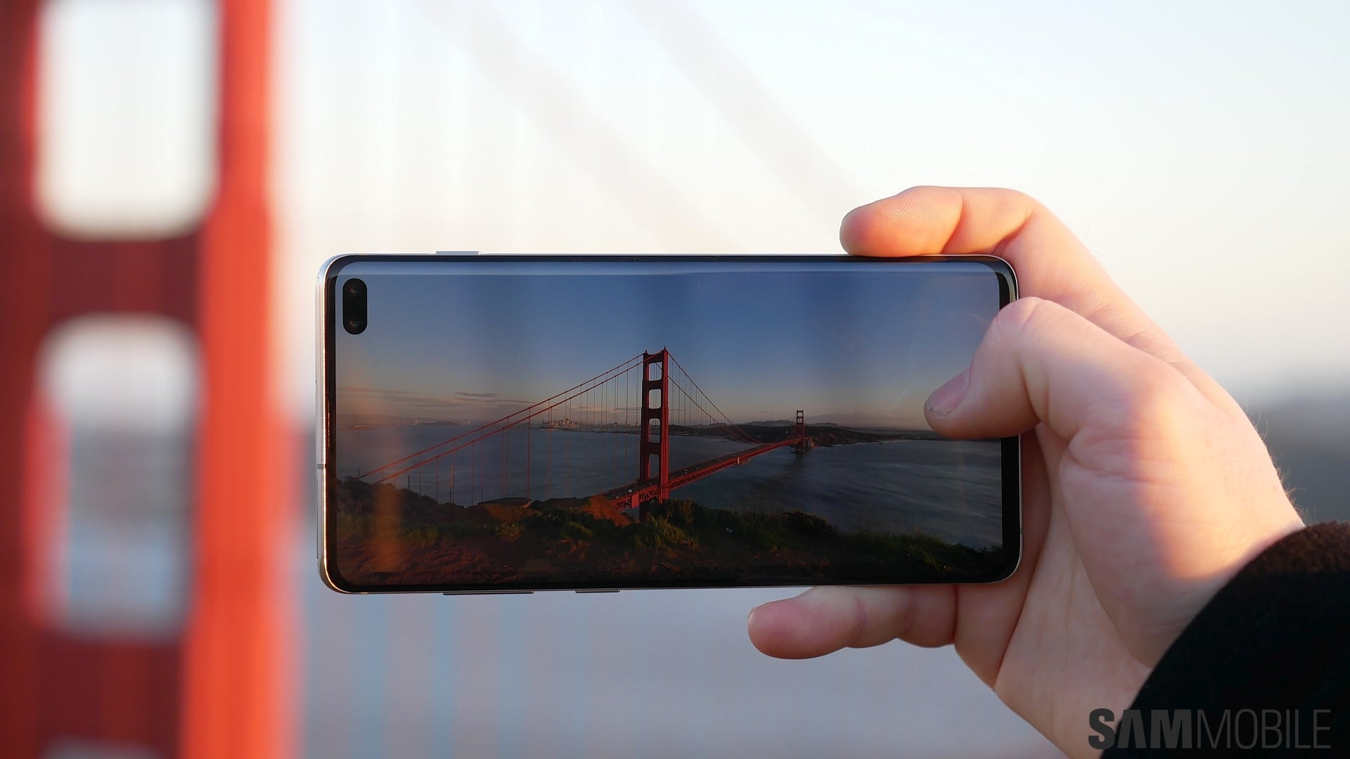
When it comes to watching videos, the cutout is, frankly, not really an issue. You have to manually zoom in on videos to make them wrap around the cutout, and while that part of the video does get cut out (no pun intended), you’ll probably get used to it. The same goes for gaming. One thing that will irritate some folks is how the network and battery indicators aren’t at the right edge of the screen. The cutout pushes them towards the left side, and that leaves less space for notification icons.
Thankfully, for those who can’t stand that cutout, Samsung offers an option to just blacken out the area next to the cutout and make the entire UI start below the cutout. However, that results in a bigger virtual top bezel than the S9 or Note 9 so it’s not something we would recommend.
In-display fingerprint sensor

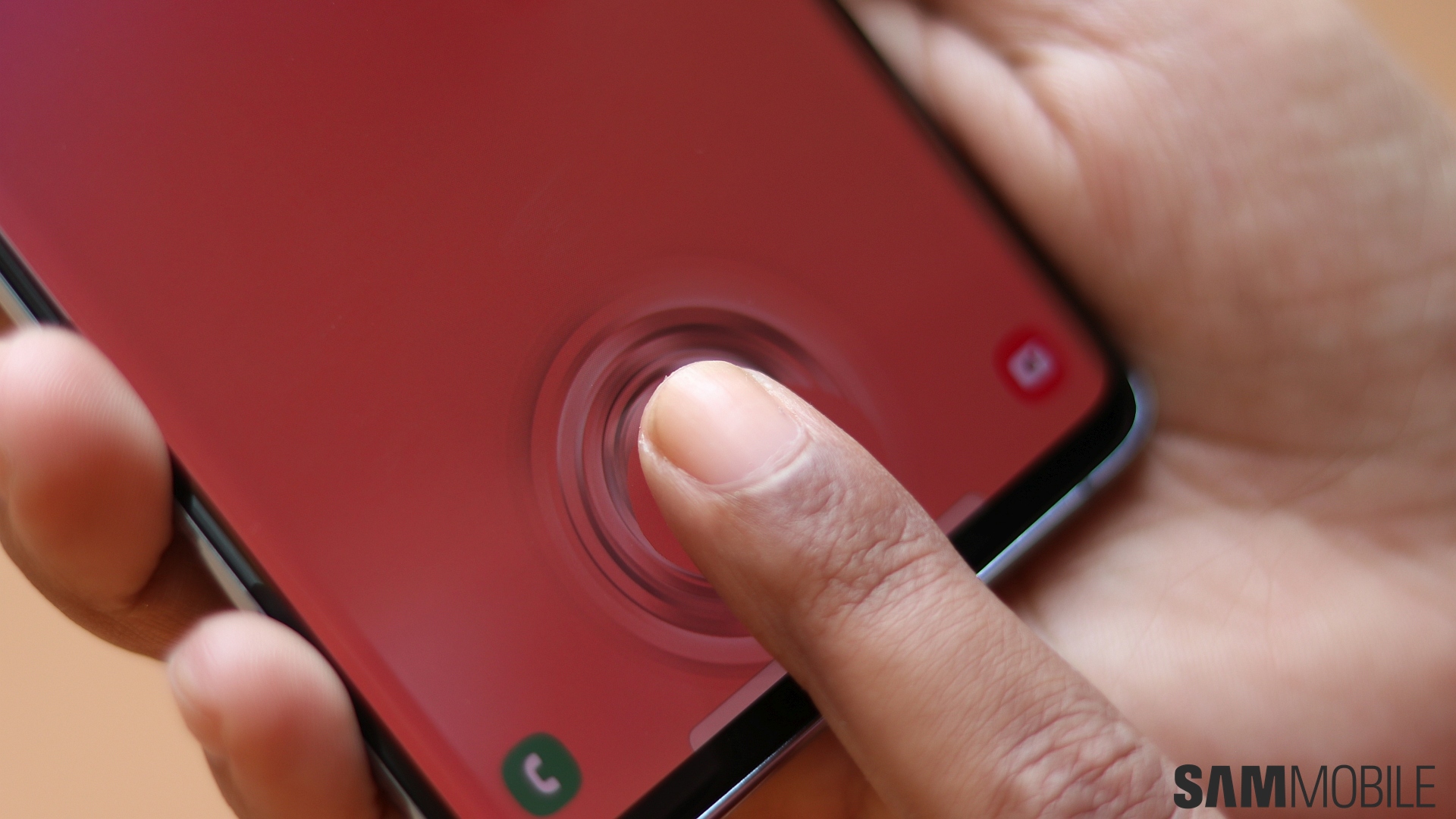
The fingerprint sensor on the Galaxy S10 and S10+ is a big deal because it resides under the display, bringing the fingerprint reader back to the front after two years of less-than-ideal placement at the rear. Samsung has gotten rid of the iris sensor, leaving just fingerprint and facial recognition as the biometric options. How does the in-display fingerprint sensor work? Well, it’s good, but it has a few annoyances that stop it from being a perfect alternative to a physical fingerprint sensor or an iris sensor.
First off, there are no physical boundaries to help you with accurately placing your finger at the right position without looking at the phone. You certainly start getting used to it and your finger will start tapping the right spot with time, but it’s probably never going to be as perfect as a physical button. And if you are used to pressing hard on the home button on a Galaxy S8 or S9 to wake it up and upgrade to an S10, you’ll also have to tell yourself to stop putting your finger where the home button is, as the area behind the home key is no longer pressure sensitive.
The in-display sensor can also take an extra second to detect your finger and unlock the phone at times, although this is something that became pretty much a non-issue after the first software update. Samsung also fixed the amount of pressure required for the sensor to work with that software update. Out of the box, with a basic screen protector installed, you might have to press considerably harder for the sensor to register your fingerprint during registration. Not all of us here at SamMobile faced this, however, so your mileage may vary.
Overall, the in-display fingerprint reader is neat, but it’s not truly awesome. It’s accurate and fast when it works, but there’s a fairly steep learning curve as far as getting used to putting your finger on the display the right way is concerned. Thankfully, Android Pie’s Lift to wake feature and the fairly quick facial recognition work well together and allow you to use the fingerprint sensor less often, but those who loved the iris sensor will be disappointed to lose that biometric alternative if they upgrade to the Galaxy S10+.
Rear Camera

The Galaxy S10+ (and the S10) has a triple rear camera setup made up of a primary 12MP Dual Aperture (F1.5-F2.4) lens, a 16MP F2.2 ultra-wide lens with a 123-degree field of view, and a 12MP F2.4 telephoto lens that enables 2x zoom. And honestly, the 12MP primary camera and 12MP telephoto lens perform pretty much the same way they did on the Galaxy S9 or Galaxy Note 9, which is to say you usually get great shots with very little noise in all lighting conditions in auto mode.
One of the most awaited camera features of the S10 trio was no doubt Bright Night, which takes and combines multiple long exposure pictures of a scene and combines them to give you better lit photos in the dark. And as we have already written about, Bright Night simply doesn’t offer much benefit and doesn’t even come close to such dedicated night modes on Google and Huawei smartphones. Bright Night is an extension of Scene Optimizer and can’t be forced to work – the phone will use it on its own if it’s really dark, but not otherwise.
Check out a few camera samples from all three rear cameras below. Each scene that we shot using each rear camera are placed next to each other in the gallery.


Samsung has also introduced a feature called Best Shot. It takes a few seconds to study a scene and then tells the user how to better frame the shot. Scene Optimizer, meanwhile, can detect up to 30 different types of subjects and comes with a setting that adds ‘starburst flares’ to light sources (see last photo in the gallery above). This can become a nuisance at times, but for the most part, the flares don’t make or break a picture. Oh, and Flaw Detection from the Note 9 is present as well and is very helpful in telling you if a photo may have come out blurred.
Alright, so let’s focus on the 16MP ultra-wide sensor now. Being able to take wide shots to fit in more of a scene without having to move back is great, and the Galaxy S10+ doesn’t disappoint. Image quality in ultra-wide shots is comparable to photos taken with the regular 12MP camera, with no noticeable tonal shift most of the times other than a slightly darker picture because of the difference in minimum apertures (F2.2 on ultra-wide, F1.5 on primary camera). Some noise can also creep in at times, but that’s a rare occurrence.
Below is a scene captured with the primary and ultra-wide cameras. More such samples can be seen in the gallery above.
Samsung has also opted to use the ultra-wide camera to take Live Focus (bokeh) pictures, so the camera no longer zooms into the subject when you switch to Live Focus mode. It gives you more leeway to frame shots without worrying about its distance from your camera, and we think Samsung has also improved edge detection. Samsung has also added new blur effects. Color Point is the best one, allowing you turn the background to grayscale, and the effect can be changed after a picture has been taken.
Below are a few Live Focus samples.


For video recording, the Galaxy S10+ has a trick up its sleeve that no other smartphone does: It can record HDR10+ videos to enhance color and contrast and apply individual brightness levels in each scene. This sounds better than it works, though. We compared a couple of quick video recordings of the same subject with and without HDR10+ enabled and didn’t really find anything different. Perhaps that’s why Samsung lists this as a Labs feature, meaning it’s still in beta.
Video recording with the rear camera also offers a new Super Steady stabilization toggle, which simply switches to the ultra-wide camera. The ultra-wide camera seems to just be slower at matching the physical movement speed of the device, and while videos do come out smoother, the movement looks rather unnatural. And if you were wondering if videos can be shot in Pro mode, well, they can’t. It seems Samsung isn’t interested in bringing that option back, and a dedicated video recording camera mode is to blame here.

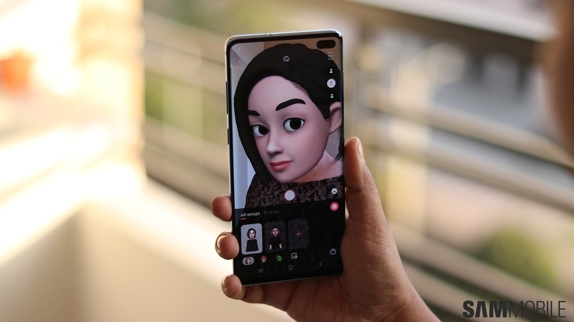
AR Emoji has received some upgrades as well. There are more genders to choose from, the camera can now match your entire body’s movements instead of just facial expressions, and it also tracks things like your tongue. A nice addition is the option to turn just your head into an AR Emoji, similar to those cat and dog filters from Snapchat. And you no longer need to smile awkwardly with your lips closed before taking a picture for conversion into an AR Emoji.
Instagram fans will also find the dedicated Instagram camera mode useful. Once you take a picture in Instagram mode with the rear or front camera, you can instantly upload it as a story. The gallery gets a dedicated Instagram button as well, and you can choose to either put up a picture on your feed or as a story by tapping that button.
Front camera

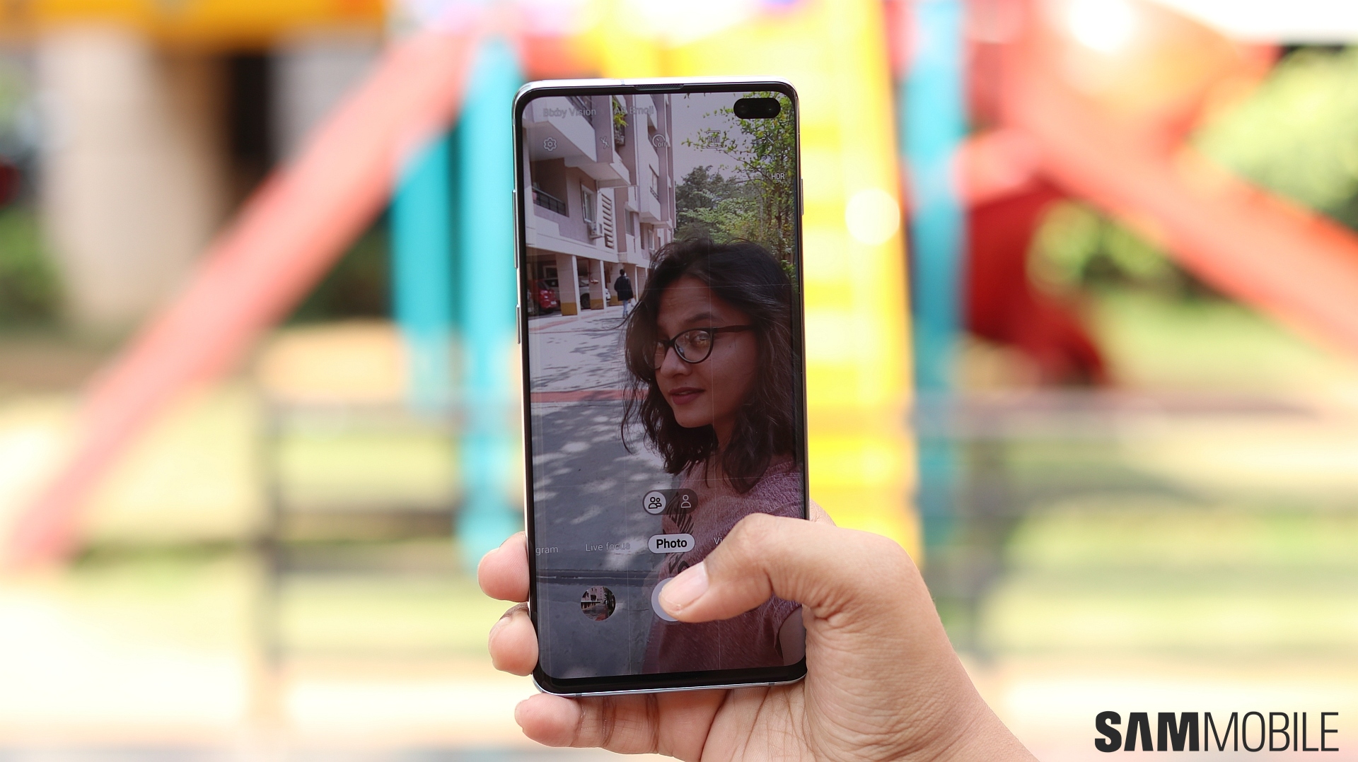
The 10MP+8MP dual front camera setup’s main purpose is to take portrait/bokeh pictures (Live Focus), but what Samsung hasn’t pointed out is that the second camera also lets you take slightly wider selfies than the primary selfie snapper. Thanks to Dual Pixel autofocus, the front cameras are pretty good at maintaining focus on your face and there’s a fair amount of detail in selfies taken outdoors. The S10+ tends to blur out selfies taken in low light, though. It’s worse than previous flagships, in fact, so you will have to hold the phone really steady.
Low-light selfies also suffer from a lack of detail. Samsung’s aggressive noise control algorithm is to blame here, although the dedicated second camera means portrait selfies even in poor lighting tend to have good background blur. Both the primary and secondary front cameras can be used for Live Focus shots, and like mentioned above, the second camera takes slightly wider selfies as well. Samsung’s camera specs tell us the second camera has a 10 degree wider field of view, and while that’s not very high, it’s useful nonetheless.
The Galaxy S10 trio also support 4K video recording on the front camera. Don’t be fooled by the marketing, though. Unless you take videos in good outdoor lighting, the 4K videos don’t really offer more detail compared to 1080p videos.
Check out a few selfie samples below.


Performance

We’ll say it straight away: The Galaxy S10+ is extremely quick and smooth. We have the Exynos 9820 variant with 8GB of RAM (which is the minimum on the S10 and S10+), and the S10+ doesn’t break a sweat in day-to-day navigation through the user interface or when switching between apps. It’s noticeably smoother than the Galaxy S9 or Note 9 out of the box and it sure looks like Samsung has thrown in additional optimization here.
Thanks to the 8GB of RAM, the phone also tends to close down background apps less often. In fact, we loaded up one high-end game (Life is Strange), started playing it, minimized it, opened 4-5 regular apps, opened a second high-end game (Modern Combat 5), and then tried to switch back to the first game, and the phone hadn’t killed it. This may not always be the case depending on how many constantly active apps (such as social networking apps like WhatsApp) are in memory, but it gives you an idea of where the 8 gigs of RAM makes a difference.
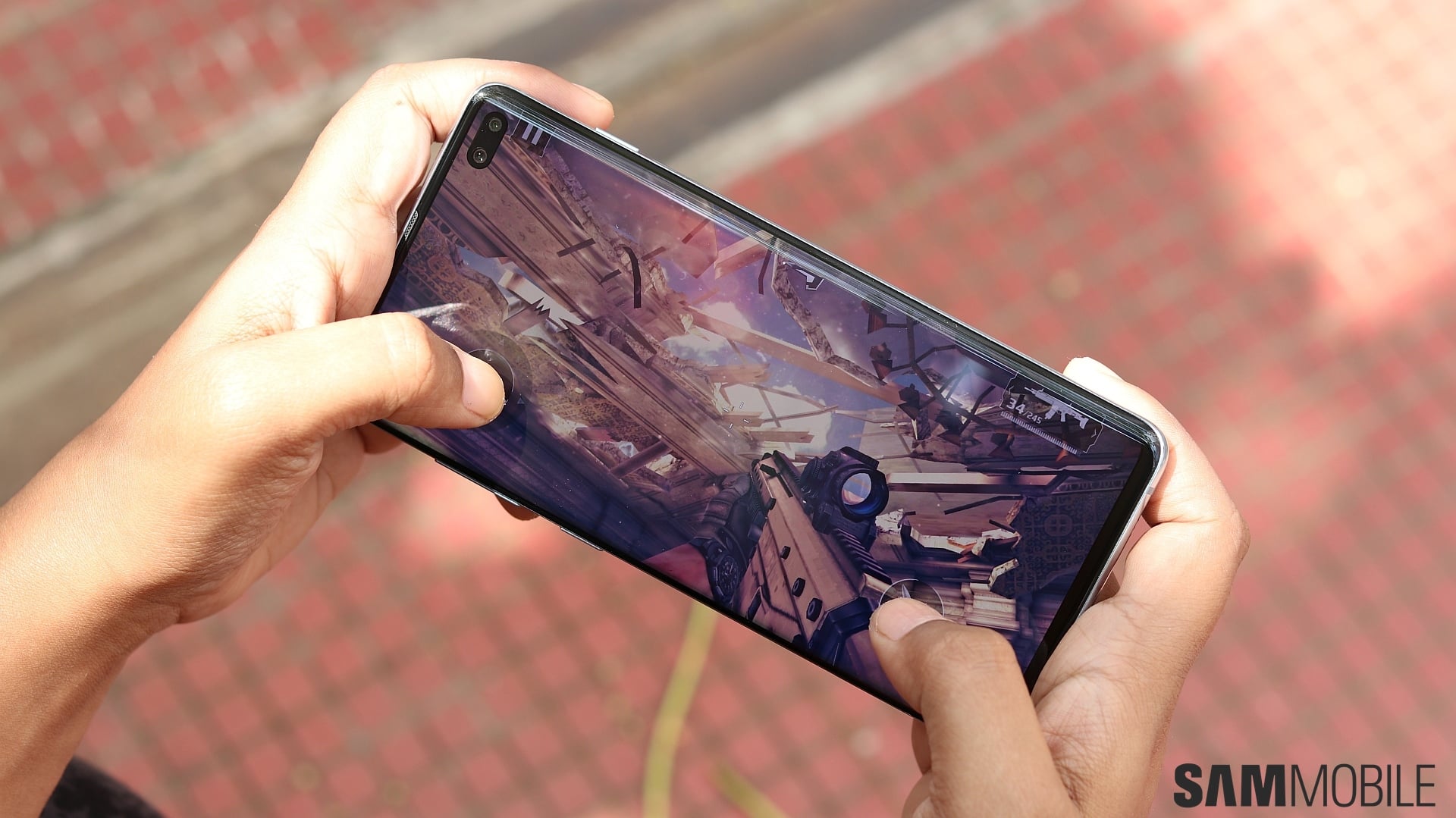
Gaming is also effortless on the S10+. It tends to get warm after extended periods of use, but it never gets uncomfortably hot unless you’re using it outdoors in hot weather. However, some games don’t seem to be supported on the S10+ yet, such as Asphalt 9, but we’re guessing developers will update their games quickly to fix this. We have also seen online that the Snapdragon version is a bit quicker with things like saving photos in the camera app, but without a Snapdragon unit to compare, we didn’t think the Exynos variant was lacking in any way.
Software

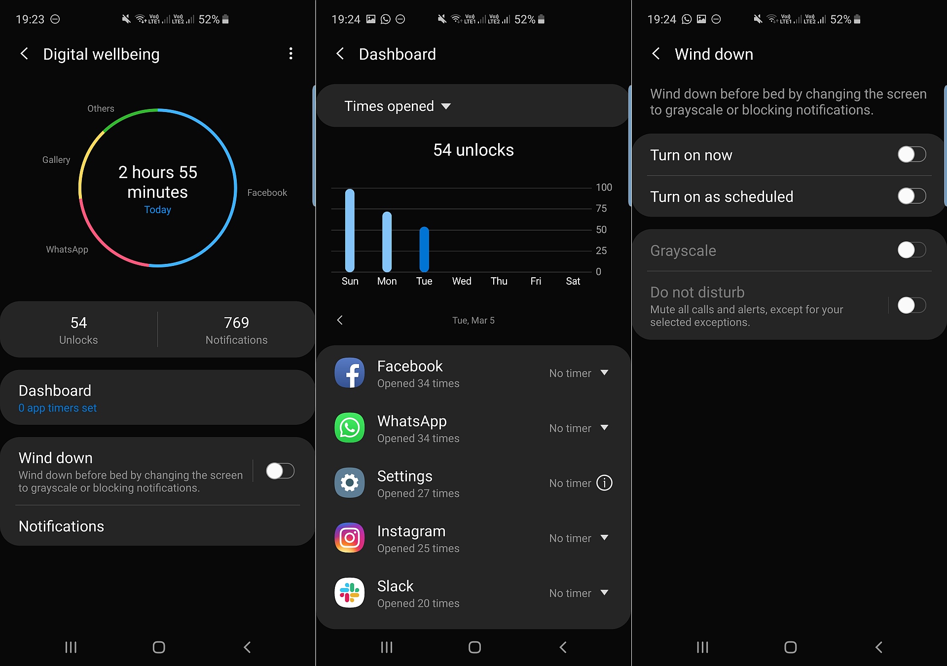
As expected, the Galaxy S10 lineup is the first to come with Android Pie and One UI out of the box. It’s One UI 1.1 here instead of 1.0 that we find on the Galaxy S9, Galaxy Note 9, Galaxy S8, and Galaxy Note 8, and two big additions in One UI 1.1 are Digital Wellbeing and Bixby Routines.
Digital Wellbeing is designed to help you reduce your smartphone addiction. It keeps track of the number of times you unlock the phone, open different apps, and receive notifications over the course of the day, and you can have it raise an alarm if you use a particular app too much. It also has a Wind Down option that can enable do not disturb and change the screen to grayscale to demotivate you from using the phone further. It’s basic stuff that works well, and the ability to check how many times you unlock the device is especially useful, at least if you are actually willing to tackle your addiction to your phone.

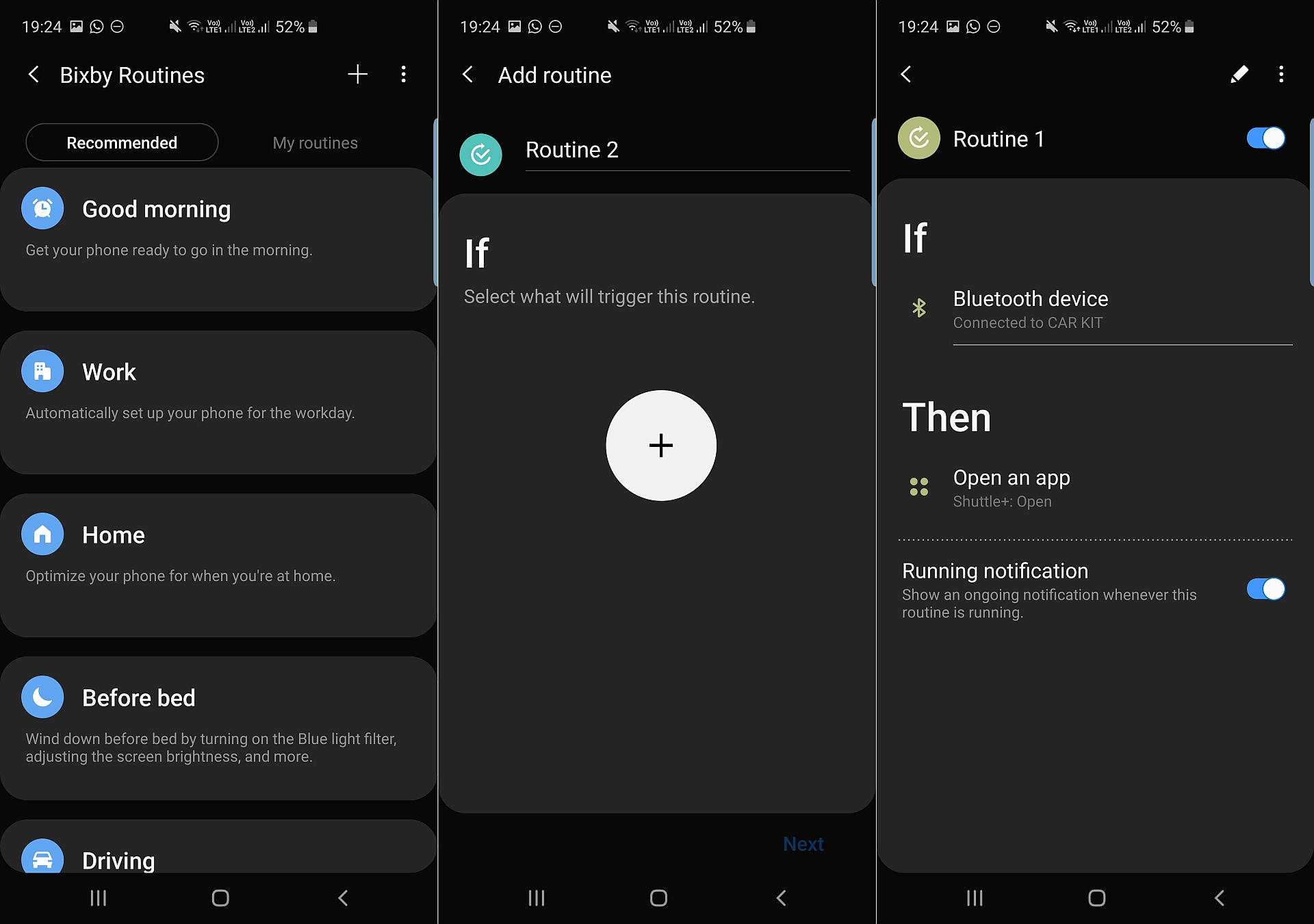
Bixby Routines, meanwhile, lets you automate various aspects of the device. You can set a routine to open a music app when the phone connects to your car’s audio system, disable things like Always On Display and Bluetooth during a customizable time interval to save battery life, or increase the ringtone volume when you reach home. You also get automatic recommendations for routines based on your usage. For example, if you tend to mute your phone when you reach home and turn on the blue light filter, you will get a custom routine suggestion with those settings, and you can then enable that routine with one touch.

The rest is pretty standard fare. The S10 trio is loaded with your usual Galaxy features. Edge Screen shortcuts, Edge Lighting, Always On Display, Secure Folder, themes support, home screen customization (locking icons into place, accessing notification shade by swiping down on the home screen, etc.), Samsung Pay, One-handed mode, Dual Messenger, Game Launcher, and more are available, along with minor old features like Download Booster, Smart Stay, or the option to swipe your palm across the screen to take a screenshot.
You also get many One UI and Pie-specific features, such as a Night mode, although some existing Galaxy features have been slightly crippled on Pie. Multi Window, in particular, now works exactly like it does on stock Android. You can’t swipe in from the edge in an app to make it open in a pop-up window, nor can you long press the recent apps key to quickly jump into Multi Window mode. Basically, some of the nifty shortcuts have been removed, although Multi Window itself works just as well as it always has.
Audio, call quality

The Galaxy S10+ gets stereo speakers with Dolby Atmos support, with the earpiece used as one of the channels for stereo output. The speakers can get really loud but don’t distort even at highest volume, although they’re not as bass-heavy as some might like. For them, there are the AKG-tuned earphones in the box. These remain unchanged from before and offer excellent audio quality, although Samsung is keeping the focus on higher frequencies (treble) with the earphones as well.
Call quality was also not an issue on the S10+; the same goes for network reception on both SIM slots. The S10+ does have issues with detecting 5GHz Wi-Fi networks when you’re a bit too far from the router. This is something Android Pie introduced on the Galaxy S9 and Note 9 as well, and Samsung seems unwilling to do anything about it. The S10 trio also support Wi-Fi 6 networks, but it’s not something you’ll be able to use anytime soon as routers that support the Wi-Fi 6 (Wi-Fi ax) standard are still in their infancy.
Battery life

The Galaxy S10+ simply does not offer the kind of endurance you expect from a 4,100 mAh battery, at least not on the Exynos model. It’s not as good as the Galaxy Note 9 with its 4,000 mAh battery, despite a newer, more efficient processor. Battery life did improve over a week or so, but where the Note 9 would give you 4-5 hours of screen on time and a total usage time of 20-21 hours on a single charge, the Galaxy S10+ loses steam at around the 14-15 hour mark with the same amount of screen time.
Battery life may get better with time, especially with Samsung’s so-called ’24hr Intelligent Battery’ feature that learns your usage pattern and tries to improve battery life where possible, but we were quite disappointed with the battery performance out of the box. Battery endurance may also vary by market, especially with extensive use on mobile data. Our S10+ in the Netherlands did better than our S10+ in India. The former still didn’t match what we expect from such a big battery, but it sure looks like the S10+ is affected harder than previous flagships when you compare its endurance in different countries.


Furthermore, the Snapdragon version has better battery life if we go by reviews from US-based blogs. Performance on the Snapdragon model is also better, at least in benchmarks, making one wonder why Samsung is forcing its less capable/efficient chip on most of the world. Unless the phone’s battery life improves further over time, the Galaxy S10+ is going to end up disappointing consumers. It’s more than sufficient to get you through the day without worrying too much, but the battery life sits somewhere between the Galaxy S9+’ and the Note 9’s.
Fast wired charging speeds haven’t increased, either, but fast wireless charging has improved. Samsung says the faster wireless charging speeds can be obtained from its Wireless Charger Duo and other wireless chargers with 10 watt+ power output, and we found the S10+ charges faster than other flagships with even the convertible wireless charger Samsung released with the Galaxy S8.

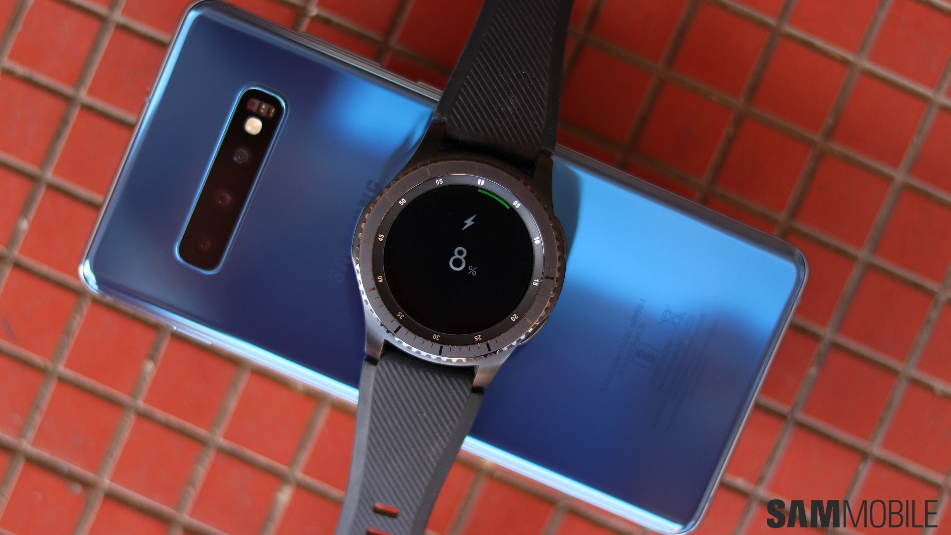
The Galaxy S10 lineup can also charge other devices wirelessly via the Wireless PowerShare feature. It works fine, and in a short test, we found the Galaxy S10+ charged the Gear S3 Frontier from 13 percent to 27 percent in 17 minutes. The phone itself lost only 6 percent battery during that time, so Wireless PowerShare is certainly handy for charging wearable devices.
The only problem with Wireless PowerShare is that you can’t really use the phone when you charge a wearable device with it, as the phone has to be kept upside down. That shouldn’t be a factor when you try to charge other phones with the S10+, although we don’t think it’s a great idea to charge phones using Wireless PowerShare other than for emergency scenarios. Even Samsung knows that and requires the S10 to have at least 30 percent battery charge for using PowerShare.
Conclusion
The Galaxy S10+ is an amazing phone. For a tenth anniversary flagship, it comes with just the right amount of new features. The smaller bezels make for a compact design, the Super AMOLED display is beautiful, the ultra-wide rear camera is great to have, the in-display fingerprint sensor is nifty, and battery life is better than any previous Galaxy S flagship.
There are a few things that will irk you, like that display cutout or the fact that the battery life falls short of what you expect it to be. The in-display fingerprint sensor is good, but fans of the iris sensor will not take to it immediately nor will those who still think a fingerprint sensor inside a physical front-facing home key is the best way to go. None of these are deal-breakers, though, nor do they make a big enough dent in the overall experience of using a Galaxy S10+.
And while we have only had the Galaxy S10+ for review, we are guessing the Galaxy S10 is as good. You will get lower battery life and a single front camera will mean your portrait selfies may not be as good as the S10+’, but if you want a slightly more compact S10 with all the meaningful features, the 6.1-inch Galaxy S10 should be a great option. That said, the Galaxy S10+ is clearly the flagship to beat, and while it falls just a tad short of being a true masterpiece, it comes pretty close.
| Pros |
Cons |
| Stunning display |
Front camera cutout can be an eyesore in the first couple of weeks |
| Compact design thanks to smaller bezels |
Bright Night camera feature is mostly useless |
| Ultra-wide camera is very handy, great all-round camera performance |
Battery life falls short of expectations on Exynos model, same old wired fast charging speeds |
| In-display fingerprint sensor is a neat feature |
In-display fingerprint sensor has a learning curve |
| Long battery life, reverse wireless charging useful for charging wearables |
No iris scanner |
| Noticeably faster and smoother than previous flagships |
No notification LED |
| Loud stereo speakers with Dolby Atmos |
|
| A headphone jack! |
|
| New software features, like Digital Wellbeing and Bixby Routines |
|
| 8GB RAM, 128GB storage on base model |
|
Note: We will also be doing a review of the Galaxy S10e, but it will take a few days to go live as Samsung hasn’t sent one to us for review. We have bought one on our own money, so it will arrive for us at the same time as it will for pre-order customers.
- Model: SM-G975F
- Dimensions: 74.1 x 157.6 x 7.8mm
- Display: 6.4"(162.5mm) Super AMOLED
- CPU: Exynos 9820 Octa
- Camera: 12 MP.CMOS F2.4 45° Telephoto & 12MP F1.5/F2.4 77° & 16MP F2.2 123° Ultra-wide
The post Samsung Galaxy S10+ review: Almost a masterpiece! appeared first on SamMobile.
from SamMobile https://ift.tt/2TlxSM8
via
IFTTT


