Not only is the Galaxy Z Fold 2 Samsung’s second foldable smartphone of the year, but it’s also a testament to the company’s commitment to this form factor. It took a leap of faith with the Galaxy Fold and while that device stumbled out the gate, Samsung has advanced this cause so significantly that it already feels like ancient history.
The Galaxy Fold was unlike any other device on the market last year. It was groundbreaking and unique but it just didn’t feel “normal.” It felt a bit rough around the edges, too fragile and perhaps a bit too high maintenance. Samsung couldn’t possibly allow that to sustain if it wanted to give its foldables any chance of thriving in the market.
So it rewrote the script with the Galaxy Z Flip. As we mentioned in our review of the device, the biggest compliment you could give the Galaxy Z Flip was that it felt normal. It didn’t feel like an unfinished device and was actually put together very well. It had an Ultra Thin Glass display, a noticeably rigid and more durable hinge as well as a host of other improvements to allay any concerns that users may have had about extreme fragility.
The Galaxy Z Flip made us very excited for the Galaxy Fold’s successor. We knew that Samsung would consolidate these gains and push the envelope further for its top-of-the-line foldable. And boy has it done that for the Galaxy Z Fold 2. The naysayers who wondered why a device like the Galaxy Fold was needed in the first place have met their match.
There’s no question of debating now why the Galaxy Z Fold 2 needs to exist. It’s here to stay and the only thing we need to figure out now is whether it’s worth the $1,999 price tag, which is exactly what we’re going to do in this Galaxy Z Fold 2 review.
Galaxy Z Fold 2 design

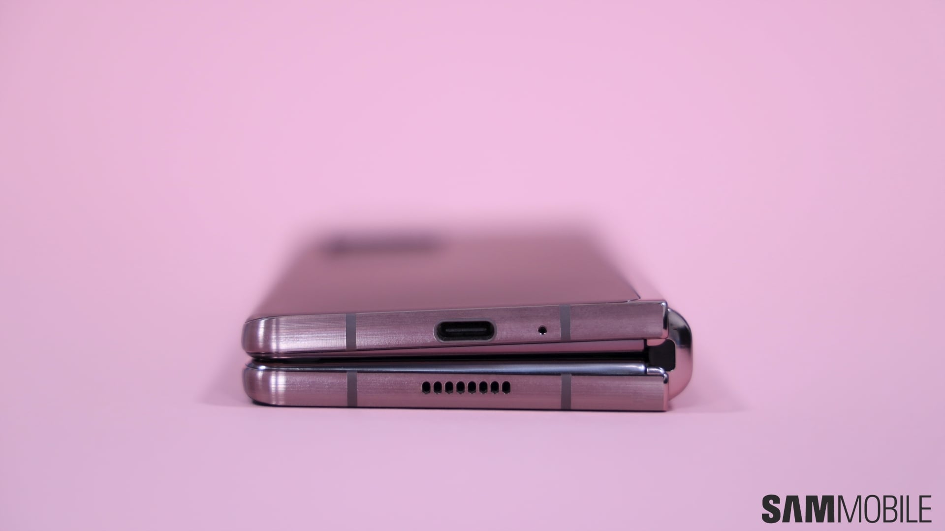
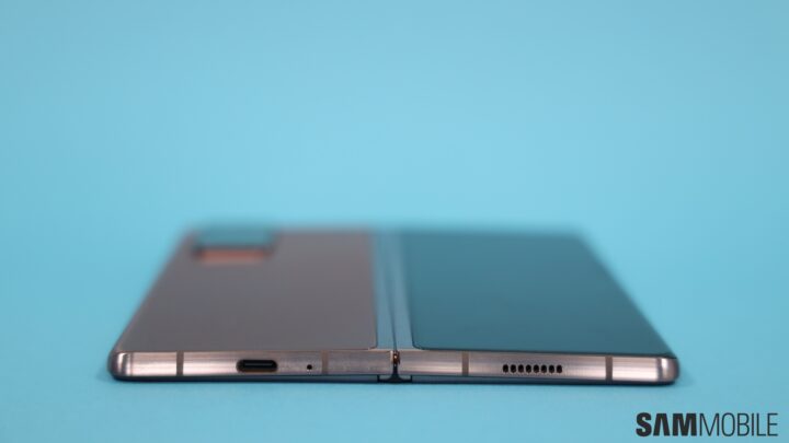
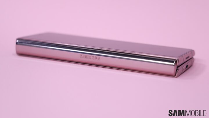
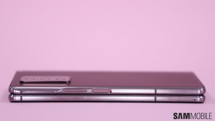
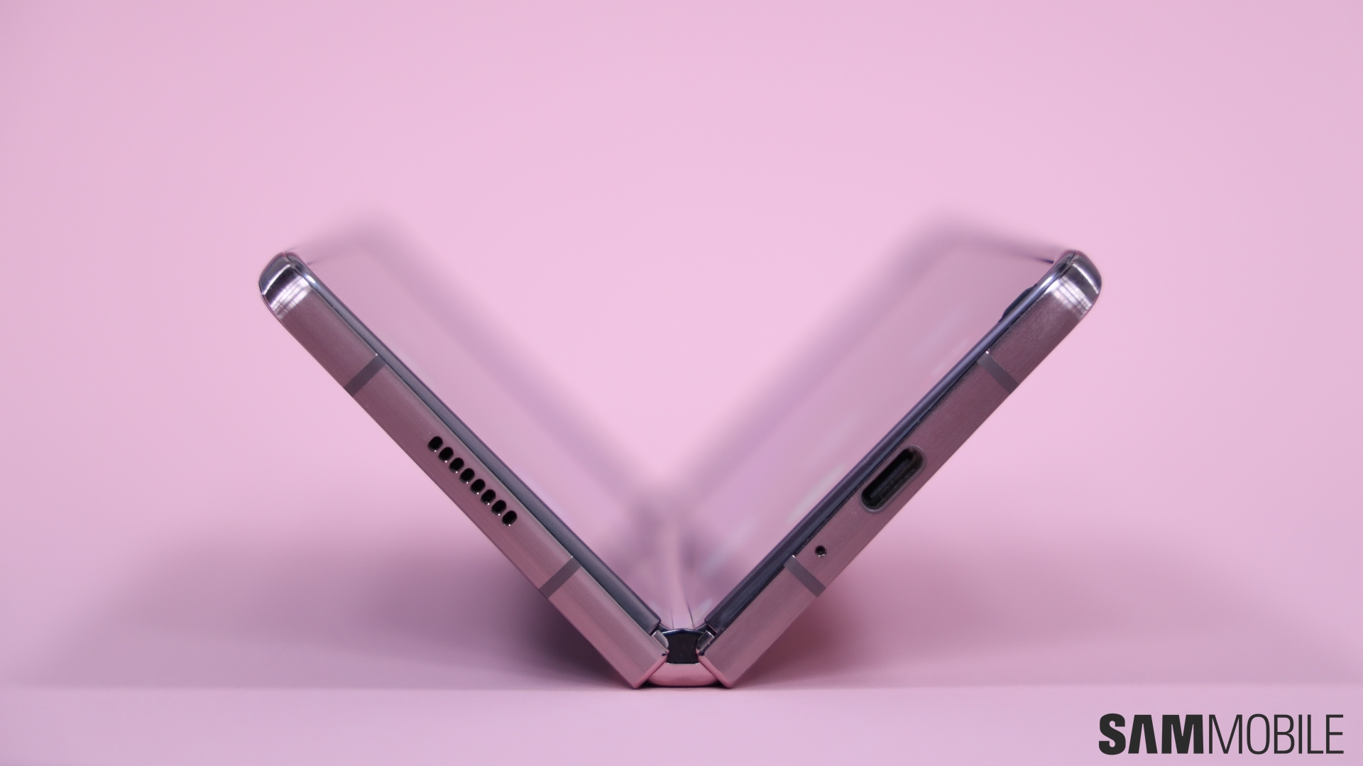
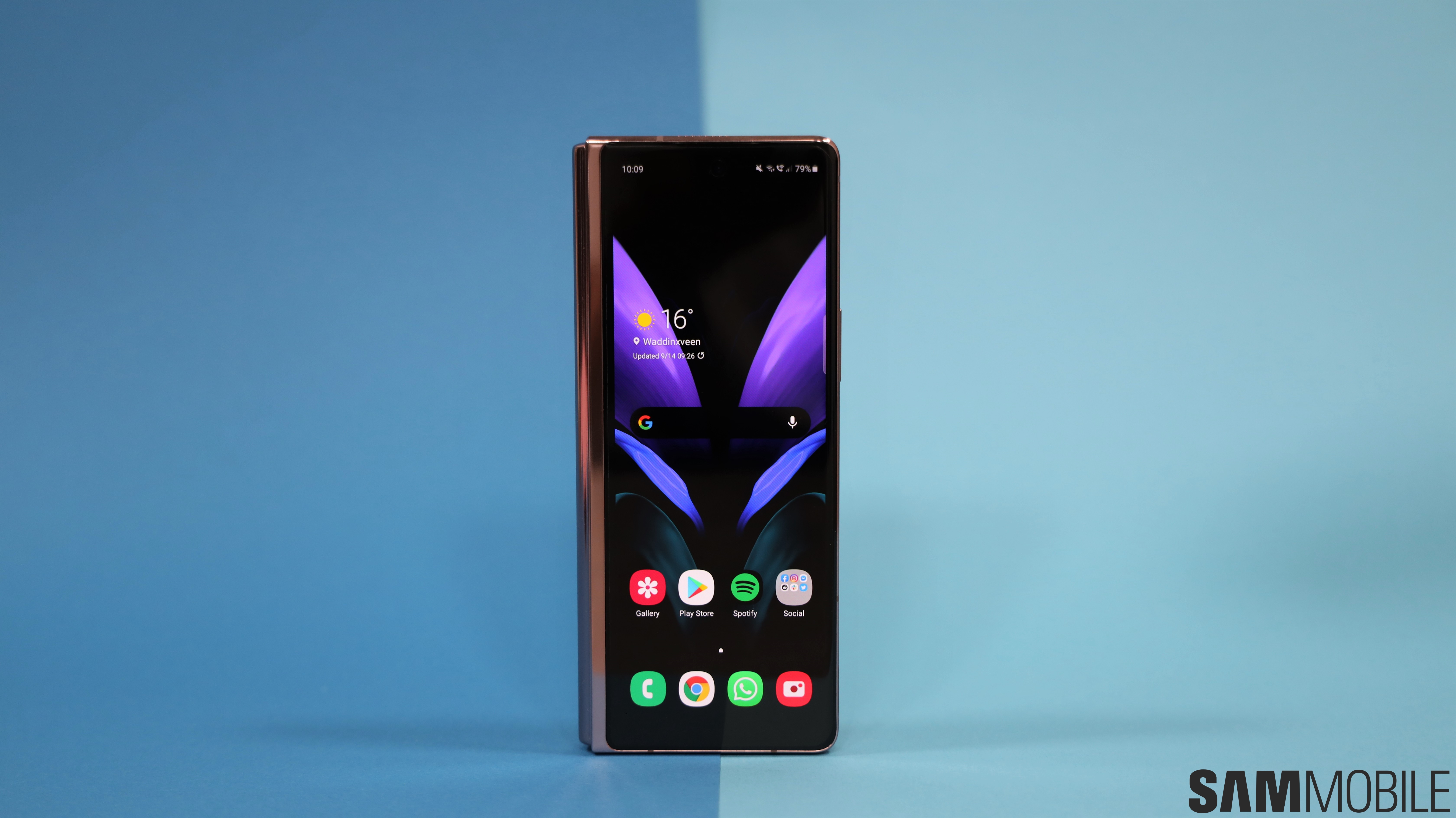
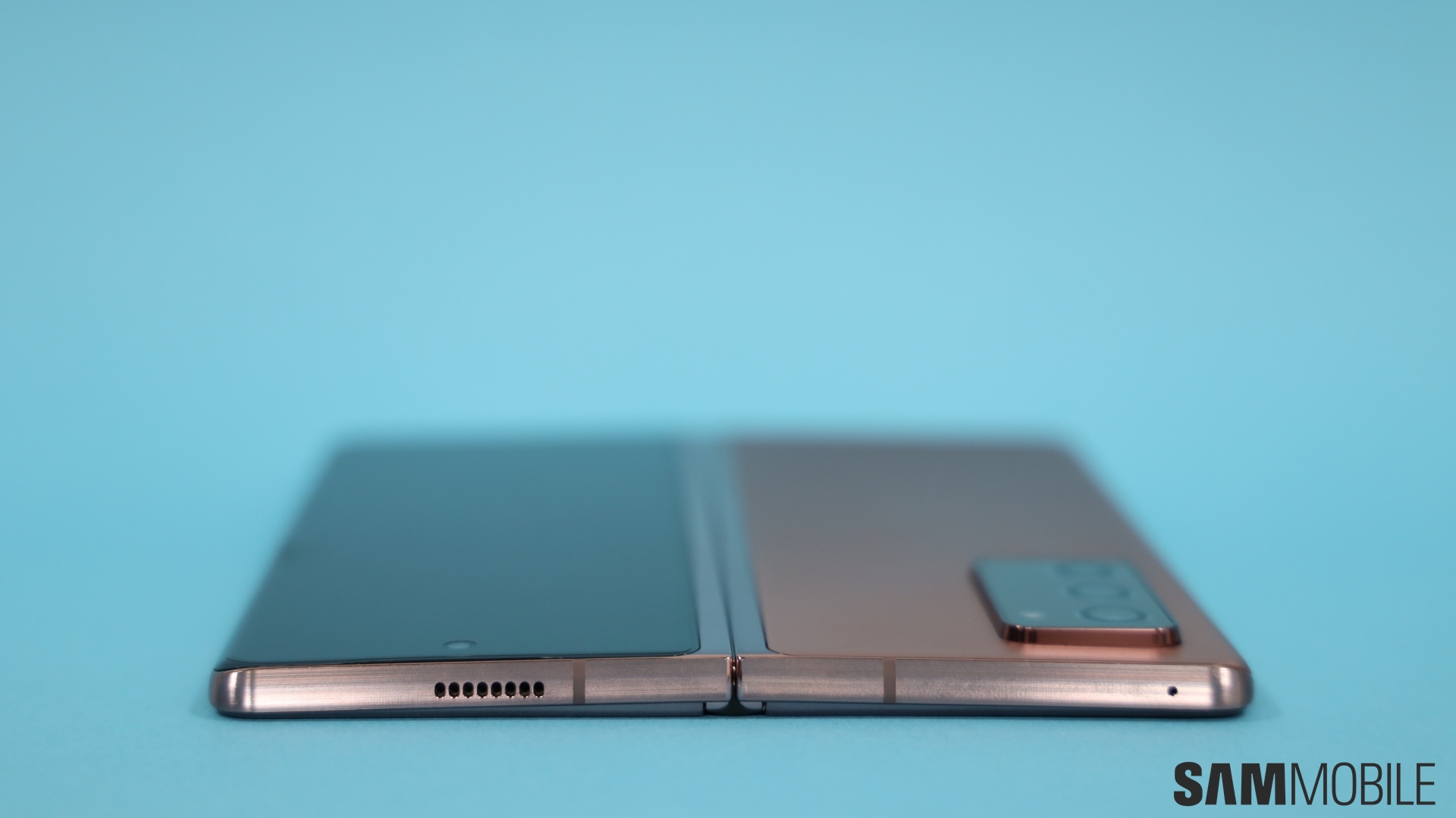
We quite like the boxier design of the Galaxy Z Fold 2. Its clean, sharp lines elevate the premium look and also result in a more secure grip. You certainly don’t want this phone slipping out from your hand. When folded shut, the device is tall, narrow and quite similar in heft to two regular phones stacked on top of each other. Like its predecessor, it doesn’t fold completely flat. There’s still a gap between the two halves but it’s narrower than before.
This is not a device that just disappears in your pocket. At 282g, it’s slightly heavier than the foldable it replaces. You will feel that you’re carrying something substantial in your pocket. One of our female colleagues pointed out that if it were to ever fit inside their jeans pocket, they’d still want to carry it in a bag as that would feel like a much safer option. This is an inconvenience for women who don’t necessarily like to carry a bag when they’re out and about. They’re left with no other option than to carry the phone in their hand all the time. For them, Samsung offers the Galaxy Z Flip, which fits in a tiny jeans pocket just fine.

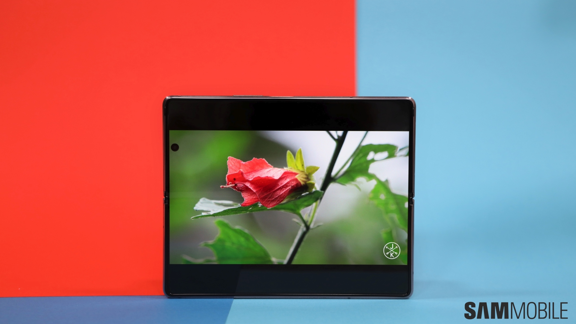
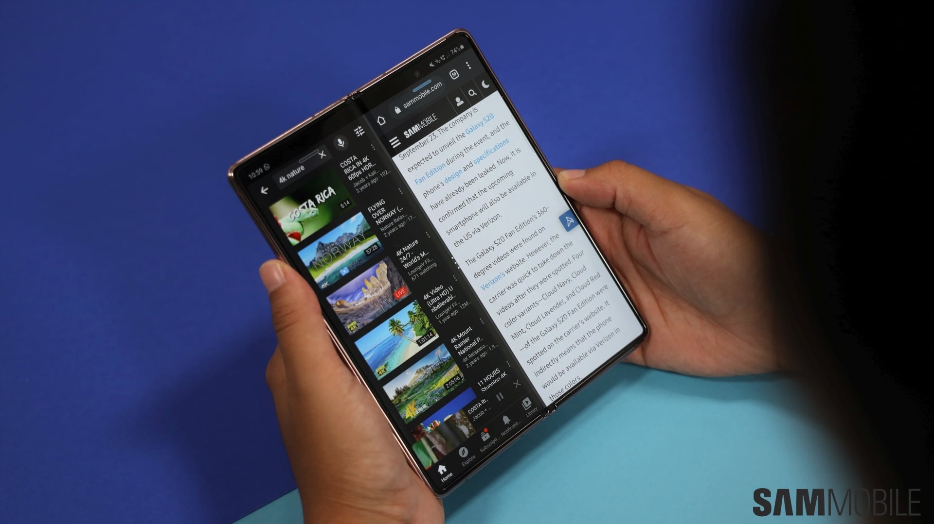
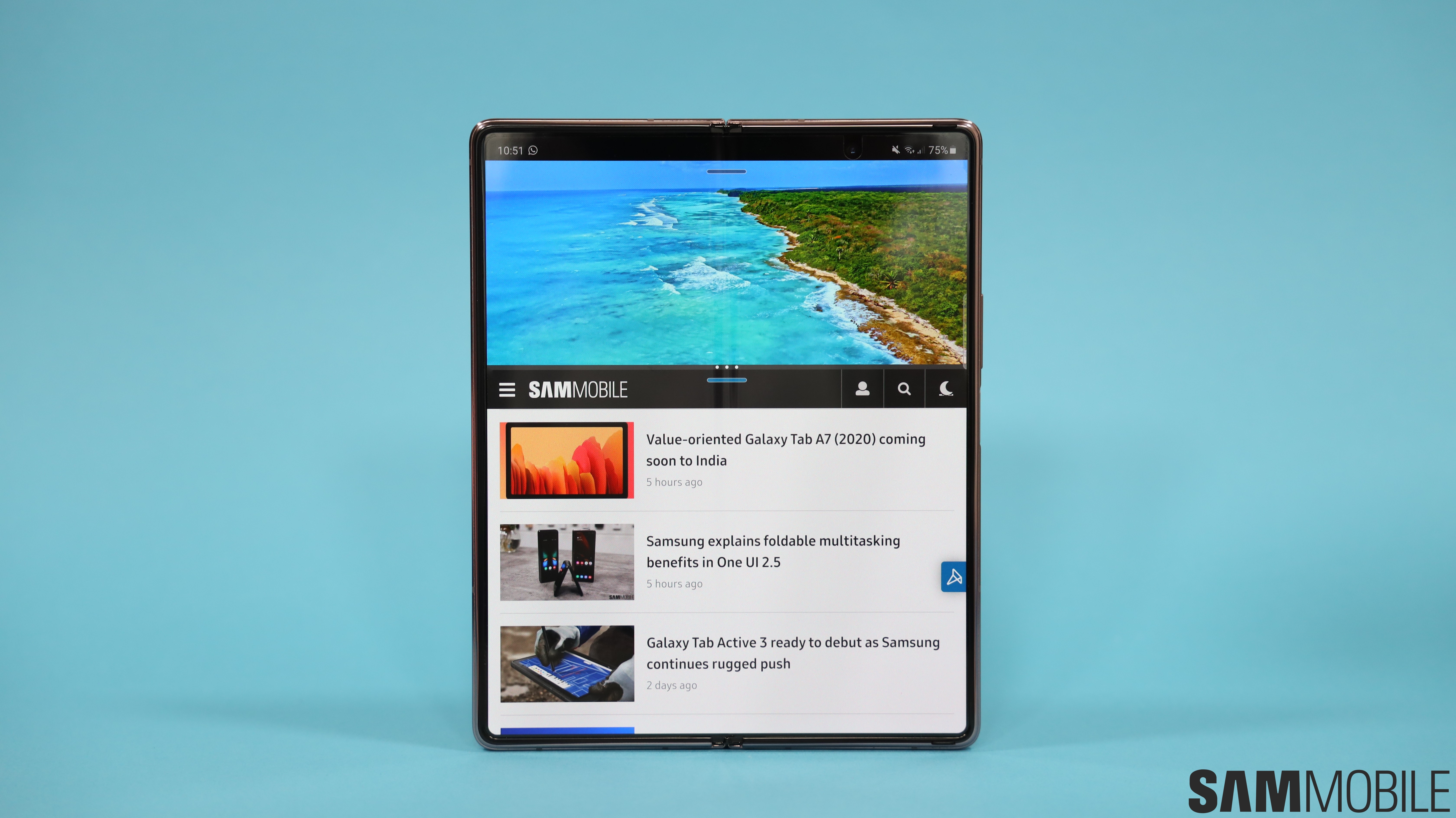
The genius of this device reveals itself when you unfold it. It transforms from a chunky brick into a 7.6-inch tablet with tiny bezels and no notches. The refinements that Samsung has made here really do make it feel like a premium tablet. It feels completely natural to use even one-handed and you won’t get tired of it even after using it for a few hours.
What’s incredible is just how well put together the Galaxy Z Fold 2 feels. The fit and finish is excellent, there’s no flimsiness, no wiggle or play in its panels and Samsung has even thrown in magnets to get you that satisfying snap when you fold it shut. As far as foldables go, the Galaxy Z Fold 2’s design is as great as it can get.


Galaxy Z Fold 2 hinge

The hinge is the most essential part of a foldable smartphone – if it fails, the device is basically just a paperweight. There is a long list of improvements that Samsung has made to its Hideaway Hinge to ensure that it can withstand the rigors of daily use. Since the hinge has moving parts, dust ingress remains a significant concern as that has destructive potential.
Samsung has added small brushes on the inside that reduce the size of the gap and sweep it when the device is folded and unfolded. This is done to move dust away from the moving parts. A similar setup was used for the Galaxy Z Flip as well. Samsung is using eight CAM mechanisms on the inside to provide rigidity to the hinge. This is what allows the hinge to freely stop at different angles between 80 to 160 degrees.

The company has done a great job of putting all of this together. The folding and unfolding motions are incredibly smooth, much more than you’d expect if you’ve not handled a foldable before. The mechanism feels very durable and with Samsung claiming it’s good for at least 200,000 folds, you’re going to be set for a few years.
Since there are gaps and moving parts, the Galaxy Z Fold 2 does not have an IP rating for dust and water resistance. That limits your freedom somewhat as you wouldn’t really want to chill out in the pool while watching Netflix on the large display.
Galaxy Z Fold 2 display

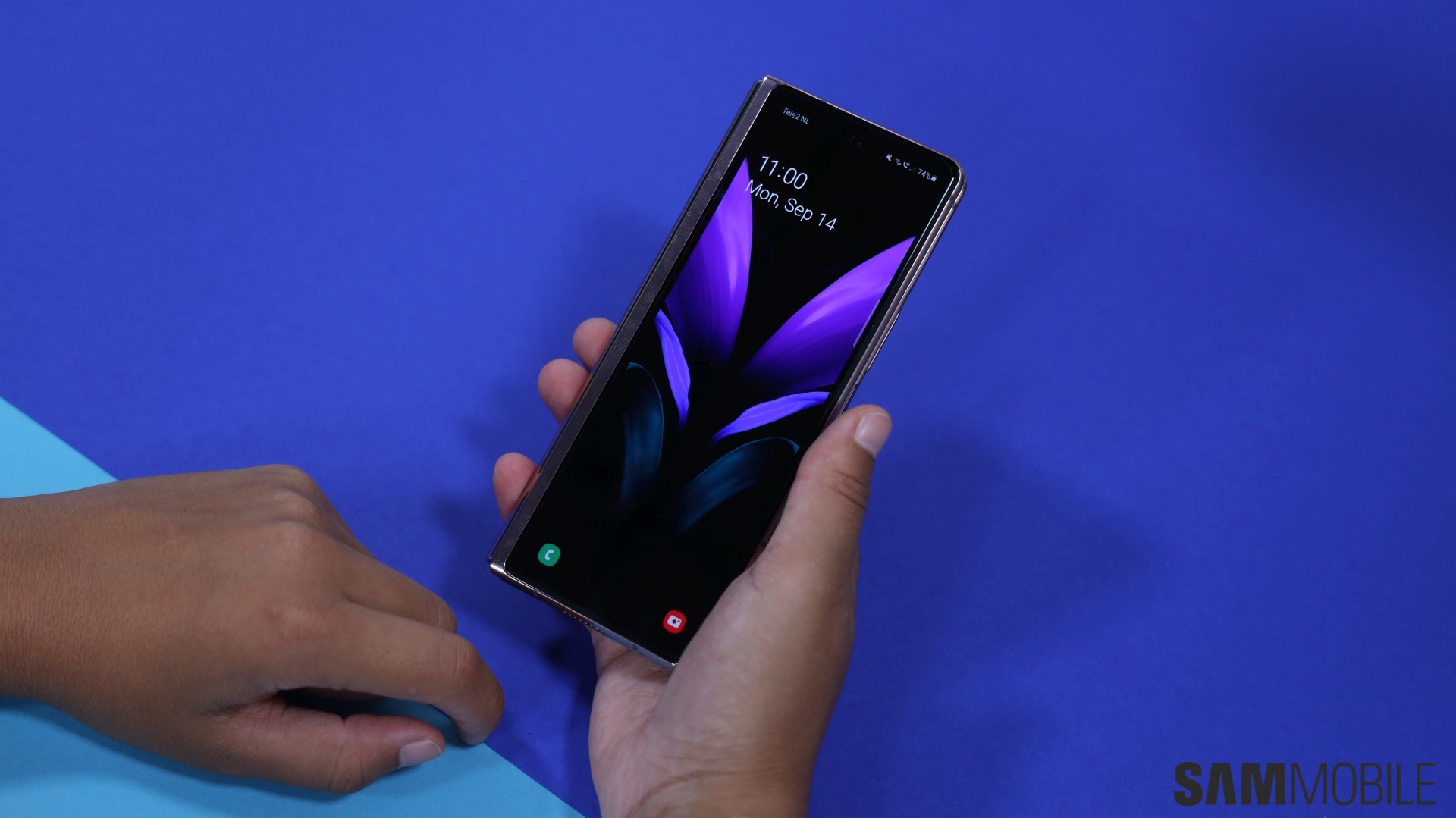
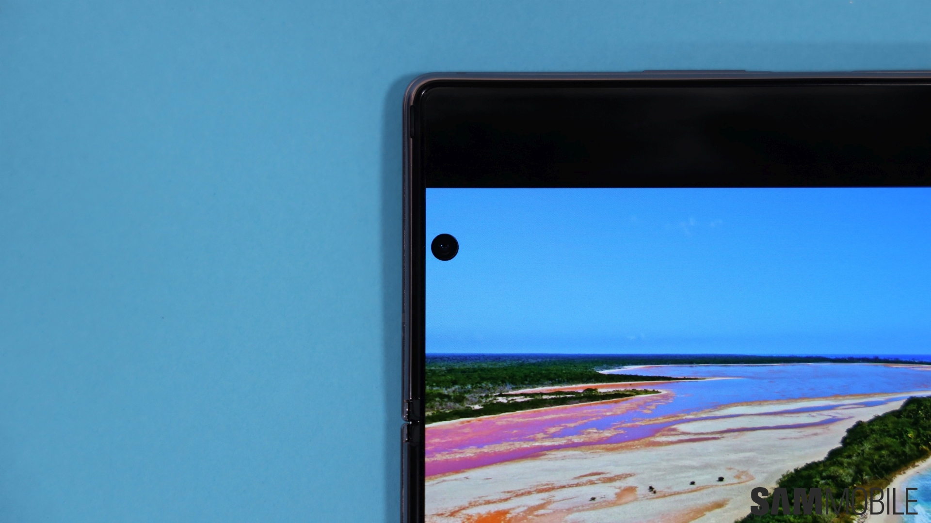
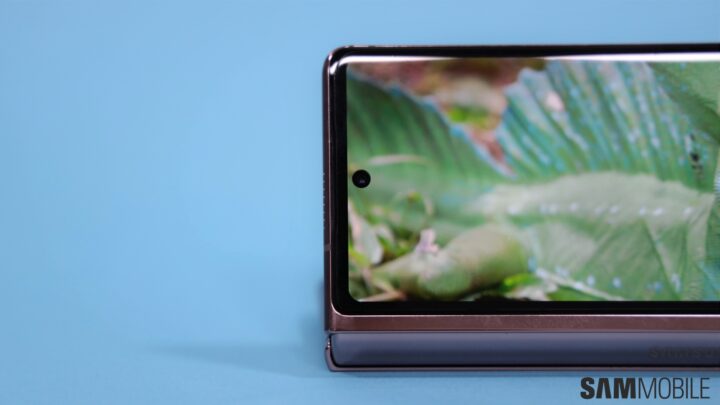
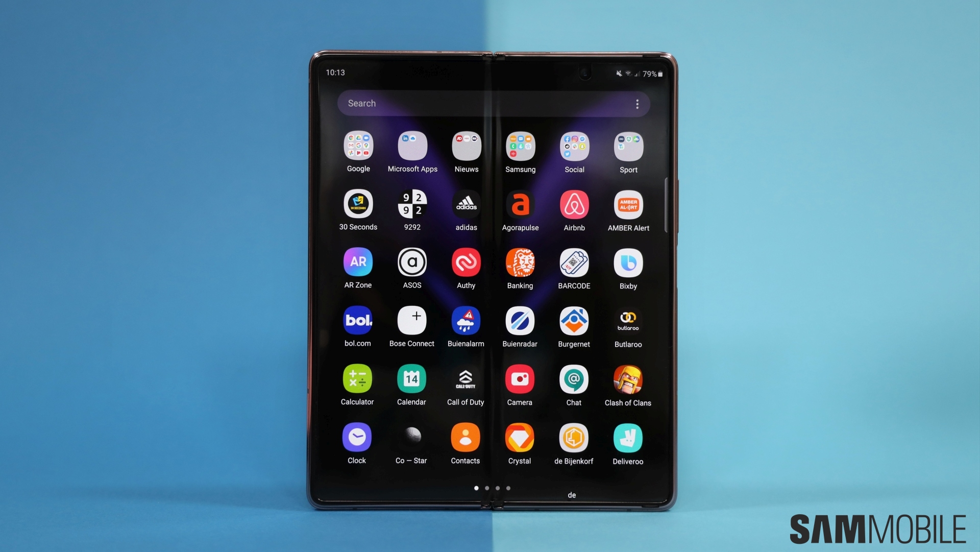
The cover display on the Galaxy Fold left a lot to be desired. It was way too small and many of us would simply unfold the device every single time. So it was great to see that Samsung opted for a 6.2-inch Super AMOLED cover display for the Galaxy Z Fold 2, even though it only has a 60Hz refresh rate. That’s a diagonal measurement, by the way, so keep in mind the tall 25:9 aspect ratio. It still feels awkward to use since it’s not wide enough but at least it’s bearable. It’s great that the selfie camera is in the punch hole as that allows the panel to have minimal bezels.
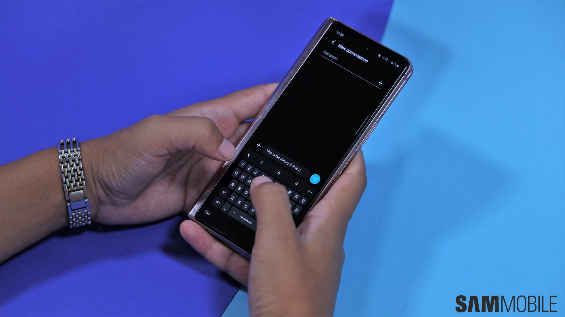
I find the cover display to be fine for shooting off a quick text or a mindless Instagram scroll as I wait for my coffee, but I don’t like using the cover display for an extended period of time. Typing long emails can get frustrating, particularly if you don’t want any typos or mistakes in there, though that can be mitigated somewhat with swipe typing. Texting with one hand while walking can present a challenge as the finger gymnastics I have to do while juggling a cup of coffee or my subway ticket makes me think I might drop the phone.

That’s also partly because the device is so chunky when it’s folded. It can start feeling uncomfortable after a while, particularly if you have small hands. As someone who likes to scroll through Reddit, Twitter and Instagram before going to bed and again first thing in the morning, the compromise needed with the cover display just seems like a tax I have to pay to enjoy the main display.

You can’t miss the wow factor of the 7.6-inch foldable display. Yes, it’s made from Ultra Thin Glass, but don’t expect it to feel like glass. The composition of this panel is such that the glass layer is sandwiched between layers of plastic. Samsung is also shipping all units with a plastic screen protector applied out of the box. I’m annoyed by the thought of the screen protector picking up dings and scratches, which it will inevitably do after a few months of use, and there’s no question of slapping an aftermarket protector on it. If you want to remove it, the company recommends that you head over to one of its stores or approved retailers to have a trained professional do it. The cover display also comes with a protector but you’re free to rip it off on your own.
How glad am I that Samsung removed the notch and placed the internal selfie camera in a punch hole. The result is a larger display in a device that has about the same footprint as its predecessor, thanks largely to the slimmer bezels. There is a crease but it’s not something to be concerned about. You don’t really notice it when looking at the device head-on unless you’re straining your eyes to look for it. You’ll definitely feel it when you touch it but it doesn’t take away from the experience of using this brilliant display at all.

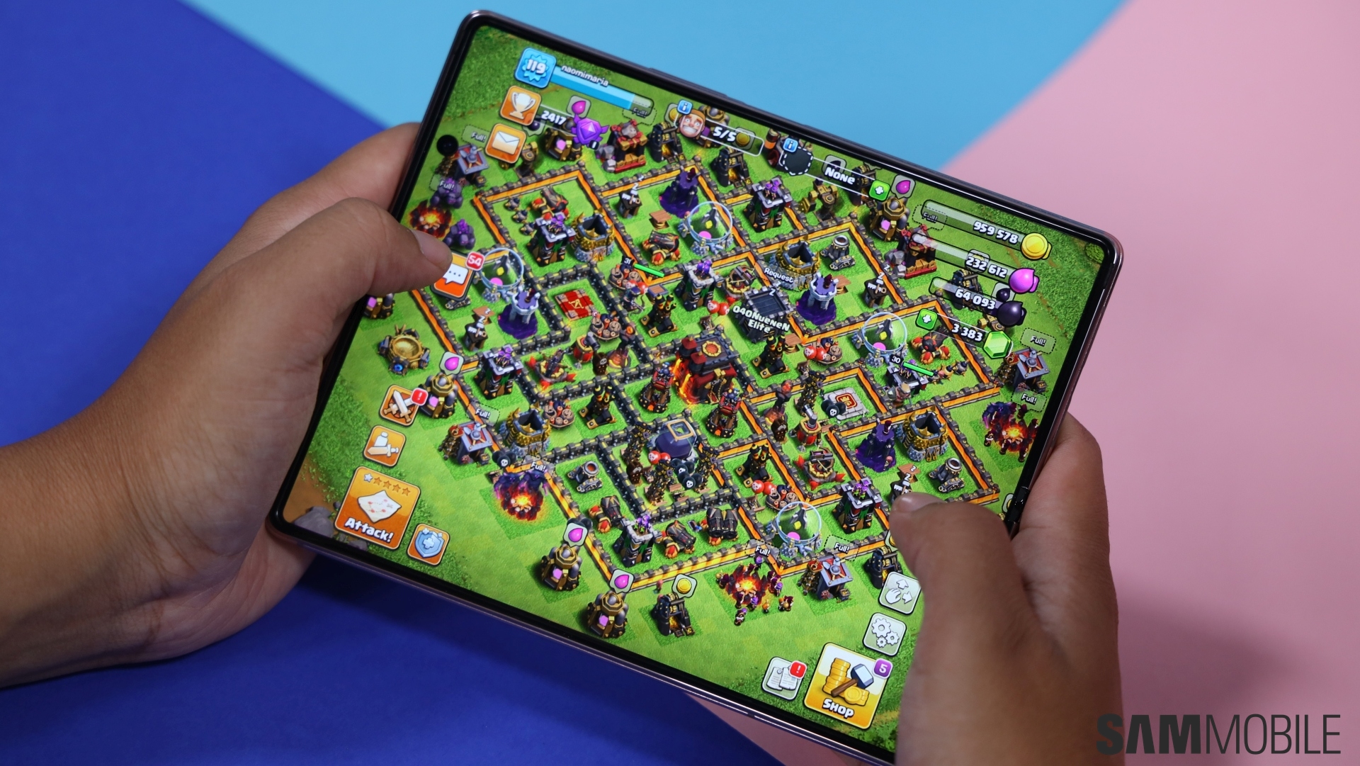
Having a tablet-sized display in your pocket is not a novelty that will wear off, it’s a level of convenience that was possible on a smartphone before. I find myself reaching for the laptop a lot less when I just want to kill time on the IKEA website, see what’s new at Saks or browse through Pinterest. That’s not something I’d normally do on my phone because I felt the screen wasn’t big enough for my escapism to feel immersive. As you’d expect, the Galaxy Z Fold 2’s display is also perfect for watching YouTube or Netflix, and has thus made my daily commute via train much more bearable.
The Galaxy Z Fold’s main display also has support for 120Hz adaptive refresh rate. It can intelligently adjust the refresh rate based on what’s being displayed in order to conserve battery life. For example, it goes as low as 10Hz when you’re looking at an image in the gallery but when you scroll to the next image, the transition happens at 120Hz. You’re going to love just how fluid the higher refresh rate makes everything feel, particularly on a display of this size. The added benefit is that it also eliminates the jelly scrolling effect, where one side of the screen changes pixels faster than the other, that we saw on the Galaxy Fold.


Samsung goes on and on about how easily you can jump between the two screens to do whatever you need to do but that transition between 120Hz on the main display and 60Hz on the cover display can be jarring. It would be so much better if there was consistency here. You see, dropping down to 60Hz after using 120Hz feels like a massive downgrade and there’s no way you can escape this feeling when transitioning between the displays on the Galaxy Z Fold 2, unless you set the main display to 60Hz as well which I won’t recommend at all.
Granted, this decision was likely made by Samsung due to battery life concerns. Even an adaptive refresh rate will have a higher power draw. We hope that this will be addressed in future iterations. As far as the quality of these panels is concerned, Samsung’s AMOLED displays rarely give us anything to complain about. Both get nice and bright, the color reproduction is excellent and the viewing angles are great.
Galaxy Z Fold 2 cameras

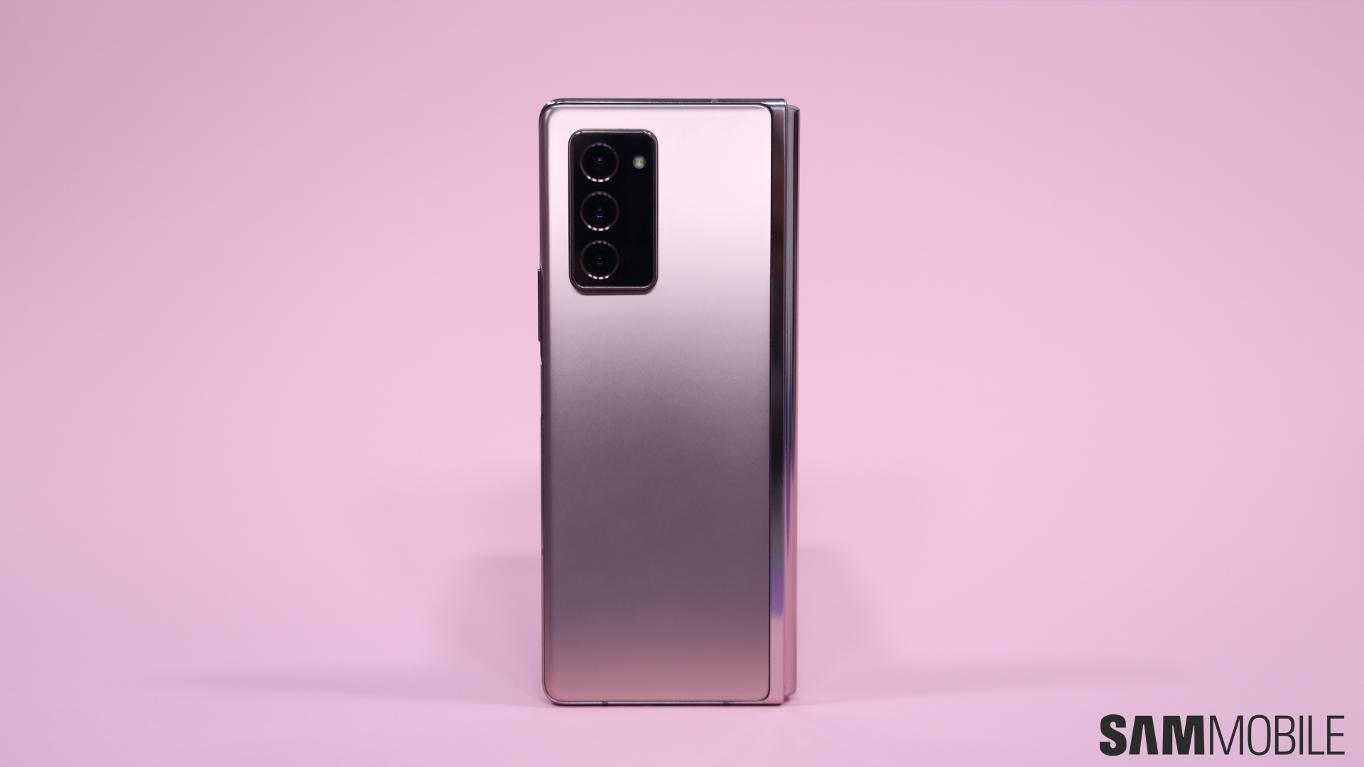
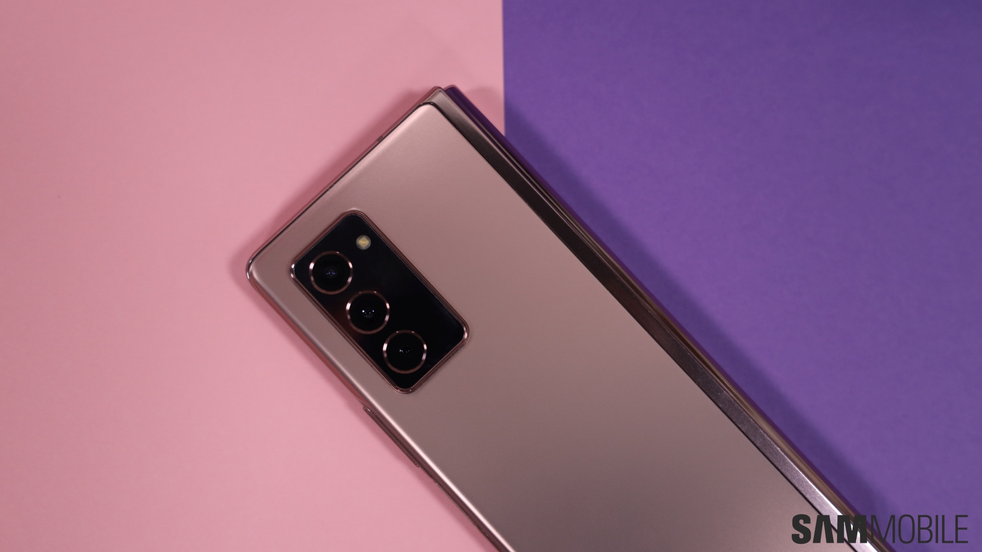
There are five cameras on this handset. The rear camera setup consists of a 12-megapixel primary sensor paired with a 12-megapixel ultra-wide and 12-megapixel telephoto sensor. Interestingly, the zoom camera that Samsung has picked for this device was first introduced three years ago with the Galaxy Note 8. Both the cover and main display have one 10-megapixel selfie camera each.
None of the fancy camera stuff that we’ve seen from Samsung’s flagship phones this year is present here. So you won’t find any 100x Space Zoom or 8K video recording but since both are basically just novelties, there’s no reason to dock any points from the Galaxy Z Fold 2. There’s only one thing you need to know about these cameras and it’s that the camera setup is good enough for most users. Unless you’re not trying to channel your inner Annie Leibovitz every time you open the camera app, you won’t be disappointed.
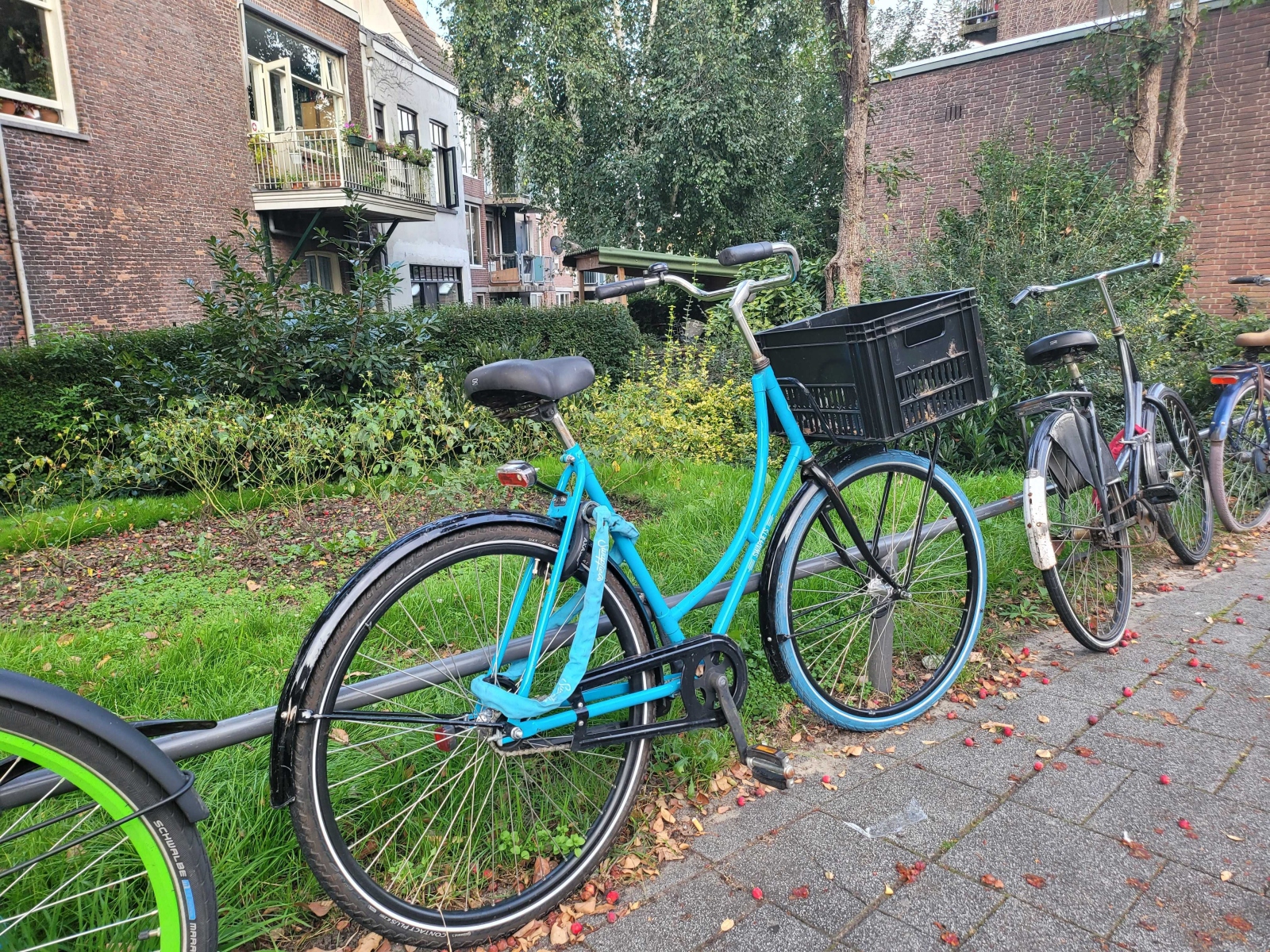
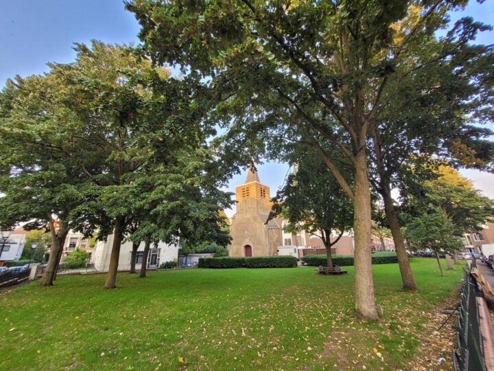
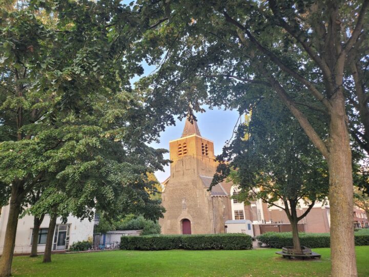
The pictures come out looking very Samsung-y, you’ll notice that it tends to brighten everything up and gets a tad too aggressive when smoothing faces. That’s not to say they look bad, not at all, you can actually take some pretty good photos with this setup. When there’s ample natural light, the camera will churn out sharp images with great detail without breaking a sweat. Even low-light performance is not that bad. The telephoto camera with its 2x optical zoom is good enough as well, at least if high zooming capabilities aren’t on your list of must-haves.


There are quite a few software features for the camera such as the Pro Video mode, Night Mode, Single Take and more. Auto framing is a new feature in which the camera can pan and zoom on you when the device is in Flex Mode. This is something that vloggers might get some use out of. Selfies come out just fine even with the aggressive processing that we tend to see from Samsung’s front cameras.


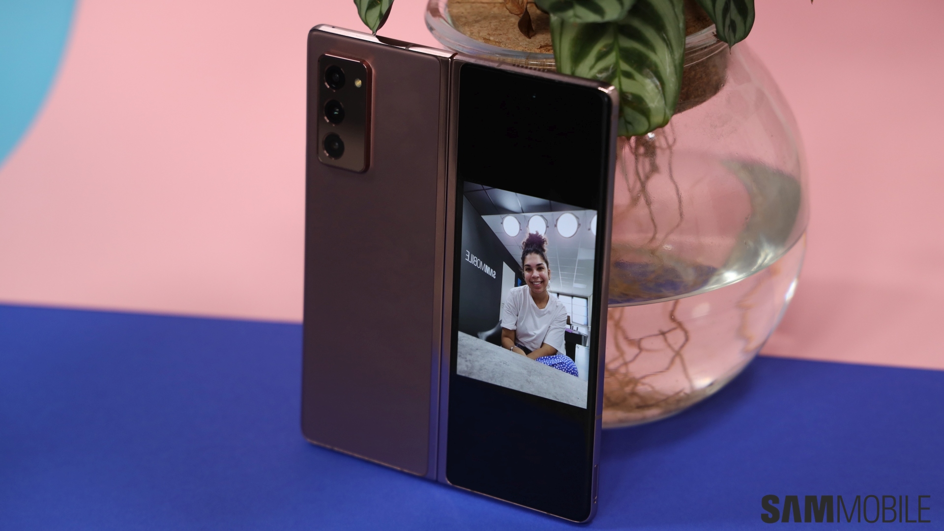
It’s also finally possible to get a camera preview on the cover display when the device is unfolded so you can use the rear cameras to take a selfie. Even when you’re taking a picture of someone, they can look at themselves in the cover display and make any adjustments if necessary. This is actually very useful and I’m glad that Samsung has added this capability. Hopefully, Samsung will also bring this functionality to the original Fold with a software update.

Unless you expect the world out of these cameras, you won’t be disappointed. If you just want something that takes good pictures for your social media, the Galaxy Z Fold 2 is more than capable of meeting your requirements. Since that’s what most customers want out of their phones anyway, the lack of a bonkers camera setup on this device might not bother a lot of people. If you’re not in that camp, you’ll have to look towards the Galaxy S20 Ultra or Galaxy Note 20 Ultra or wait for the Z Fold 2’s successor.
Galaxy Z Fold 2 performance and battery life

Samsung hasn’t made any compromises in the performance department for the Galaxy Z Fold 2. It’s equipped with a Snapdragon 865+ chipset paired with 12GB of RAM and 256GB of non-expandable storage. If you’re in China or Hong Kong, you can get the device with 512GB storage. As you’d expect, it’s blazing fast, handles multi-tasking like a champ and is more than capable of running your favorite games. There’s 5G support as well so you’re all set on that front.
Am I disappointed that there’s only 256GB of storage? A little bit. $1,999 is a lot of money for a smartphone and 256GB isn’t a lot of storage in this day and age. You can’t use a microSD card to expand it so the only other option is to rely on cloud storage, but then you’re unable to access your files if you don’t have an internet connection.

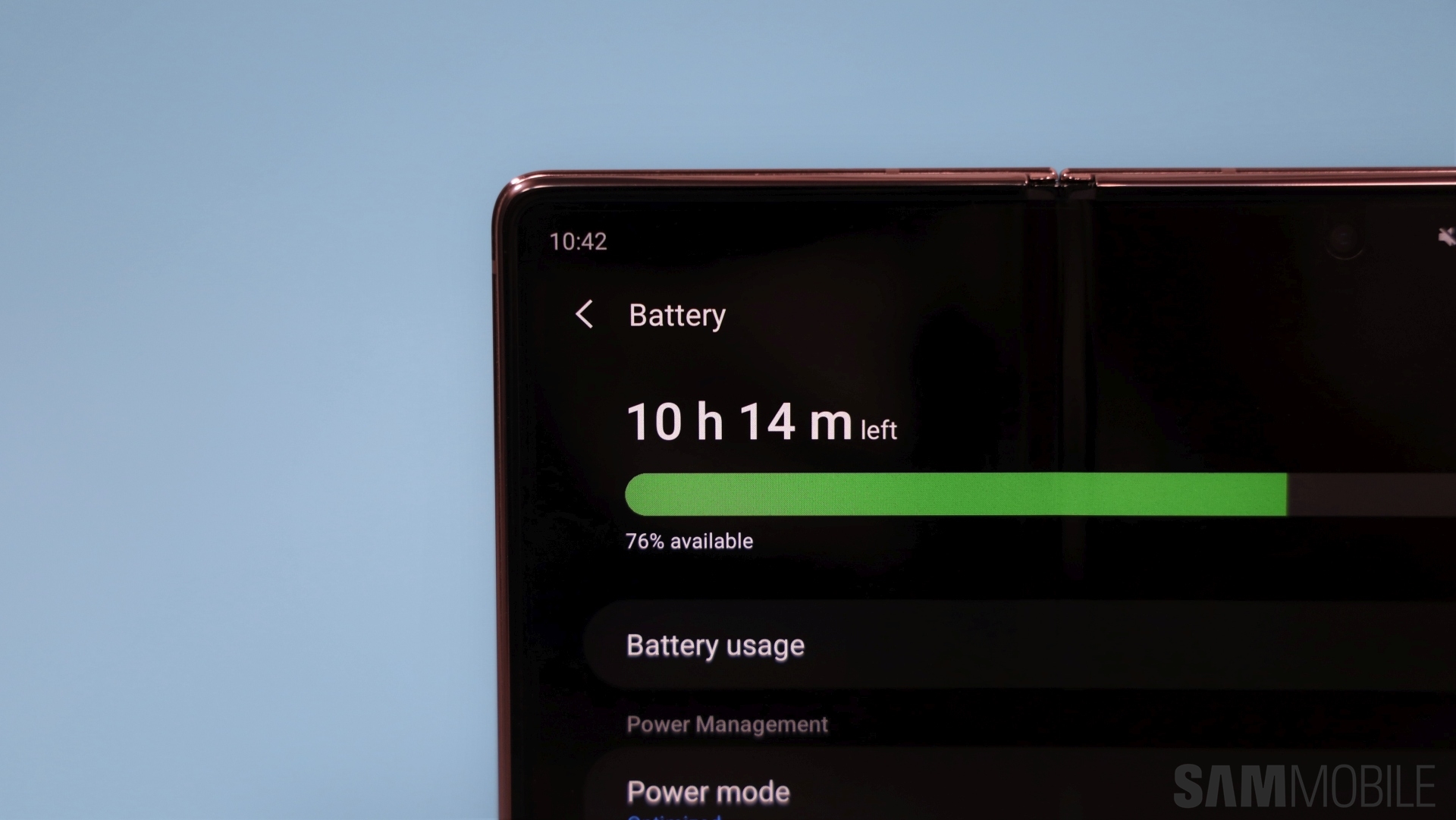
The two batteries inside the Galaxy Z Fold 2 provide it with a combined capacity of 4,500mAh. Battery life is decent but not exceptional. You can just about get a day’s use out of it when fully charged and using 5G. That’s satisfactory. It can keep me entertained on my commute to and from work, keep up with all of my daily tasks and even some moderate camera use. If you want to get more out of the battery you can drop the main display down to 60Hz. I tried that and while it did extend the battery life by a few hours, I much prefer using the adaptive refresh rate so that’s a trade-off I’m willing to make. The Galaxy Z Fold 2 does support faster wired charging at 25W and has Wireless PowerShare to let you share your phone’s juice with another device.
Galaxy Z Fold 2 software

Samsung has made a lot of improvements to the software so that users can get the most out of the larger display. As you’d expect, the Galaxy Z Fold 2 runs on Android 10 and comes with One UI 2.5. It’s included on the list of Samsung devices that will receive three major Android OS upgrades. This means that the Galaxy Z Fold 2 is covered until Android 13.
The main display on the Galaxy Fold basically acted like a massive smartphone screen so it didn’t quite fit the tablet description. With the Galaxy Z Fold 2, users can choose between two display layout settings. One is in keeping with the original in that it makes the content larger while the other packs in more content like a tablet. This lets you get a tablet-like UI for apps, however, only some apps support it when the phone is held vertically.

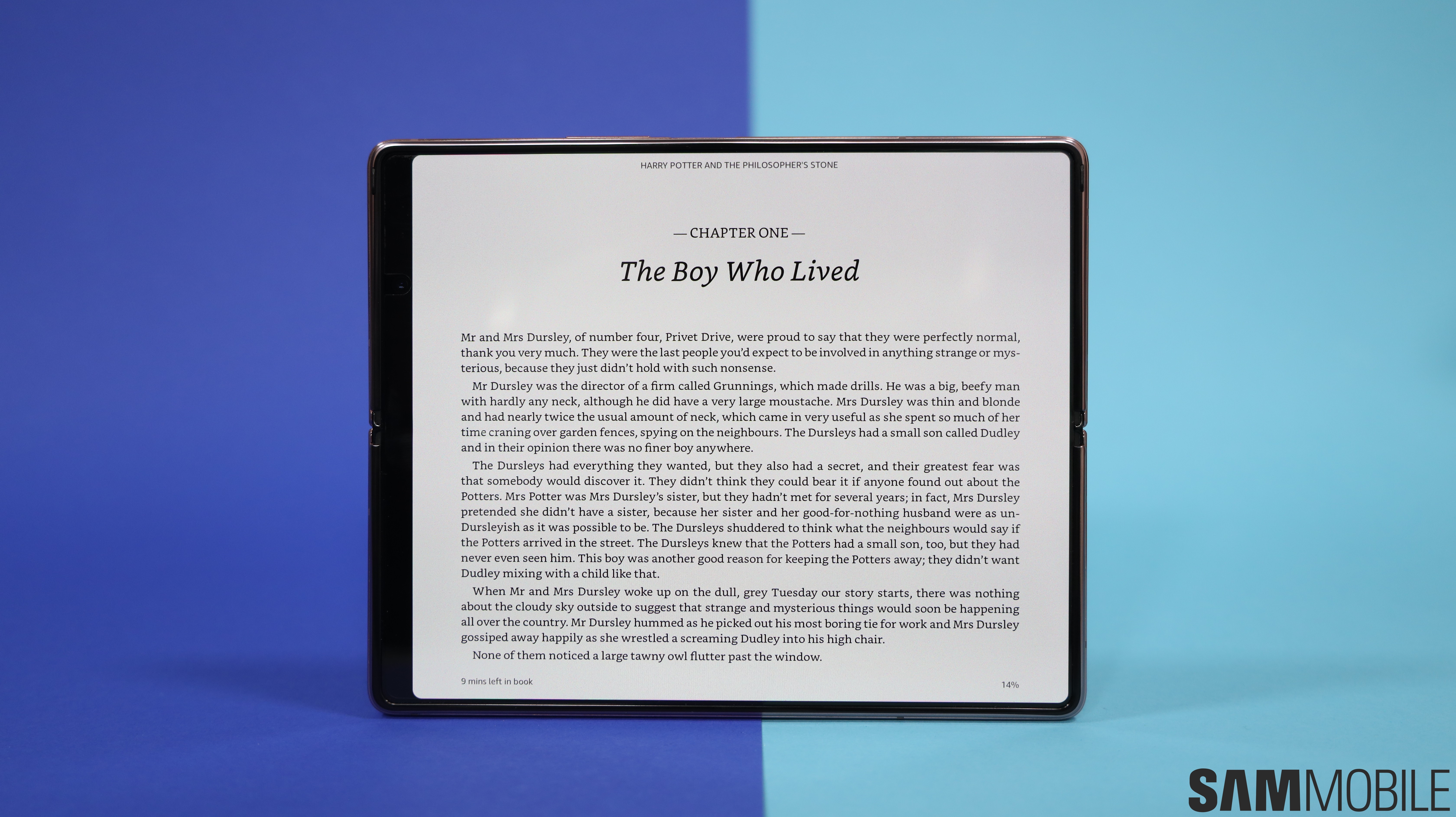
If you want the full tablet experience with separate panels and tabs, you need to turn the phone 90 degrees. The device tells the apps to treat the main display as a tablet and they adjust accordingly. So you get a full message thread and inbox in Gmail, the complete description beneath a video on YouTube, and multi-column view in apps like The New York Times. I also love the fact that I can get the two-page layout in the Kindle app, which makes the experience of reading books on the device so much better.

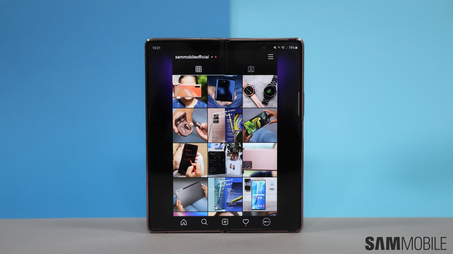
It does suffer from one big limitation which is not Samsung’s fault. Android apps are notoriously bad when it comes to adapting the UI for tablets. Instagram doesn’t even have a tablet mode so it looks all stretchy on the display. Facebook and Twitter aren’t that visually appealing, either, while some apps like Adobe Lightroom don’t treat the main display as a tablet even though it shows a perfectly fine UI on an Android tablet like the Galaxy Tab S7+.
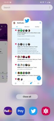
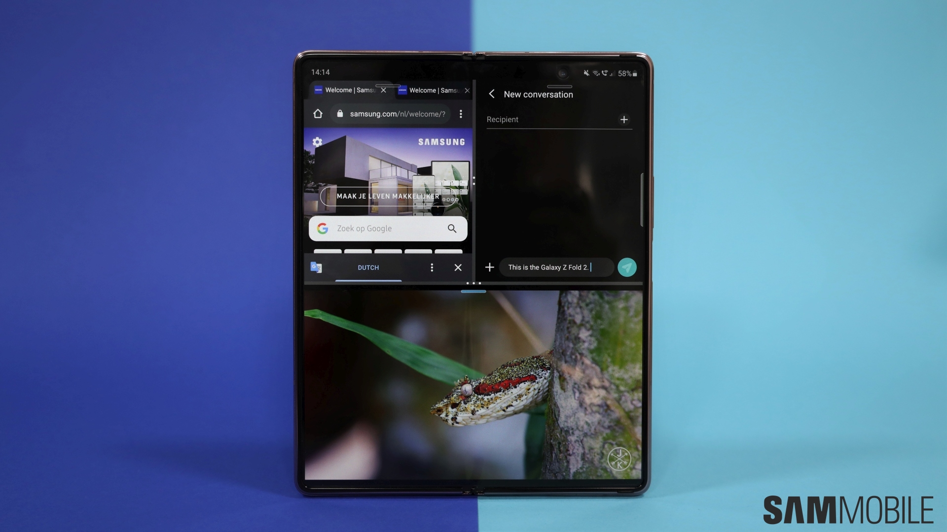
A display as big as this one is perfect for multitasking and the Multi-Active Window feature makes it possible on the Galaxy Z Fold 2. Open the Edge Panel and drop an app on the screen, and you can have up to three apps up and running at the same time. The grid view can be resized easily so that you can find a setup that works best for you. I just love being able to watch a video on YouTube while chatting on WhatsApp and browsing my Twitter feed all at the same time. Multi-Active Window lets me blaze through my morning ritual of scanning emails, RSS feeds and team communications at the same time. It’s this level of convenience that makes it difficult to go back to using a normal phone again.

You can even open up to five apps in separate pop up windows: Just drag an app icon from the Edge Panel to the center of the screen to open it. You can interact with the app in that window even if another app’s open in the background and the transparency of the window can also be adjusted. I haven’t got much use out of this feature, to be honest, but it’s there for anyone who might need that many apps open simultaneously.
I like how it’s possible to save my frequently used app pairs to the Edge Panel. I use the YouTube, WhatsApp and Twitter combination quite frequently and have it saved. So whenever I need to launch it, all it needs is one swipe to open the Edge Panel and one tap on the icon to launch it in exactly the same layout as they were saved in.

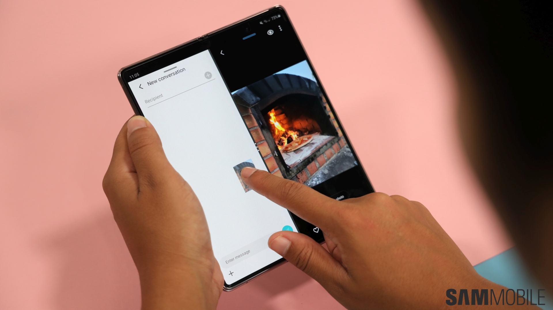
Samsung has also made it possible to copy and paste images and text from one window to another app, though support for this is quite limited. For example, you can copy text from Chrome and paste it into Samsung Messages but you can’t drag an image from Pinterest and drop it into WhatsApp. Samsung has worked with Microsoft to add support for this feature to Office apps so if you tend to use them quite frequently for work, you’re going to love this. Otherwise, it’s just going to be a lot of trial and error to figure out which apps you can use this with.
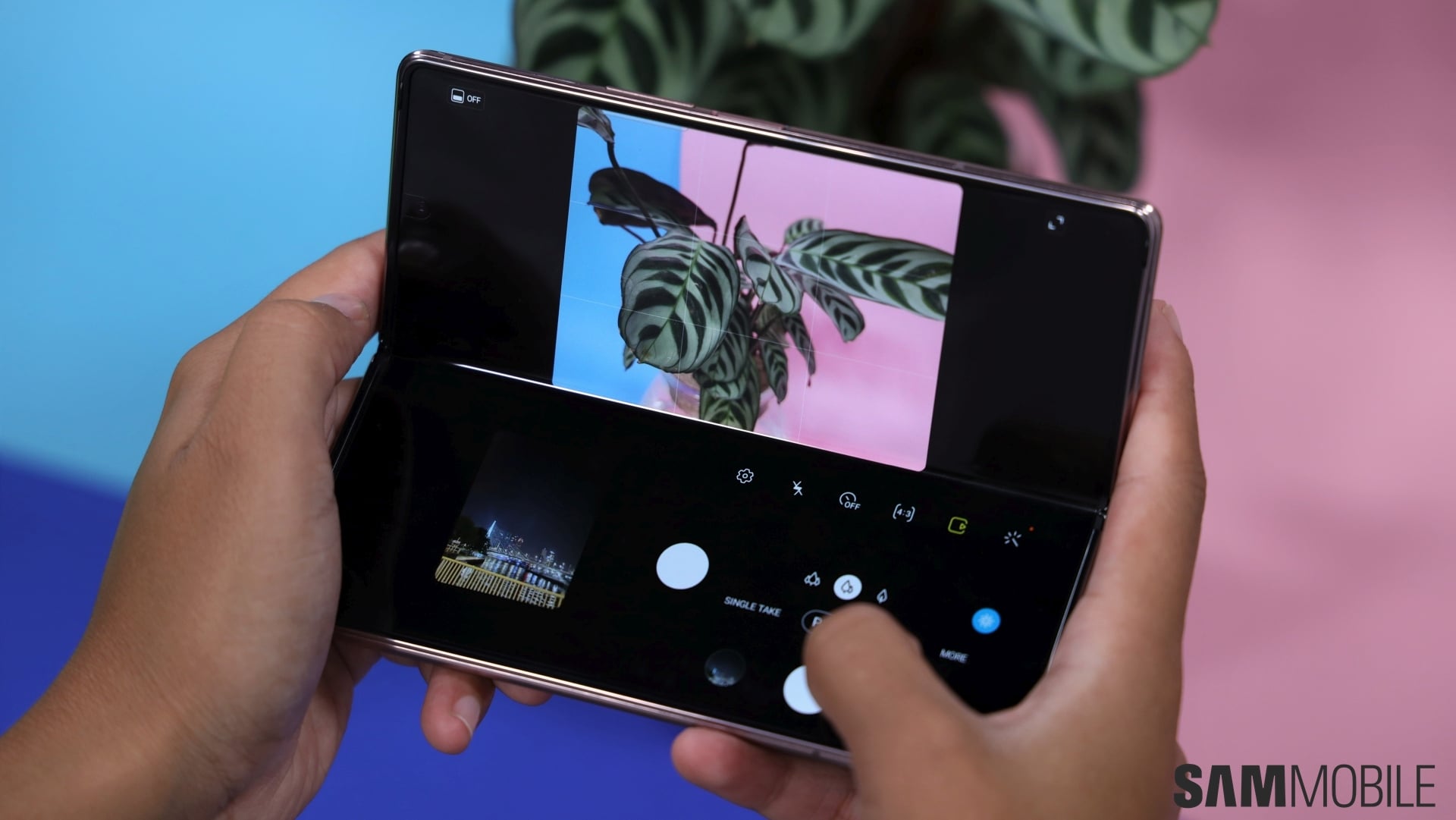
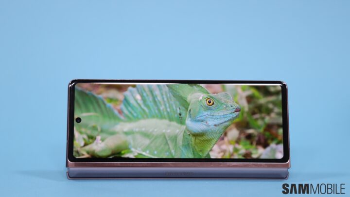
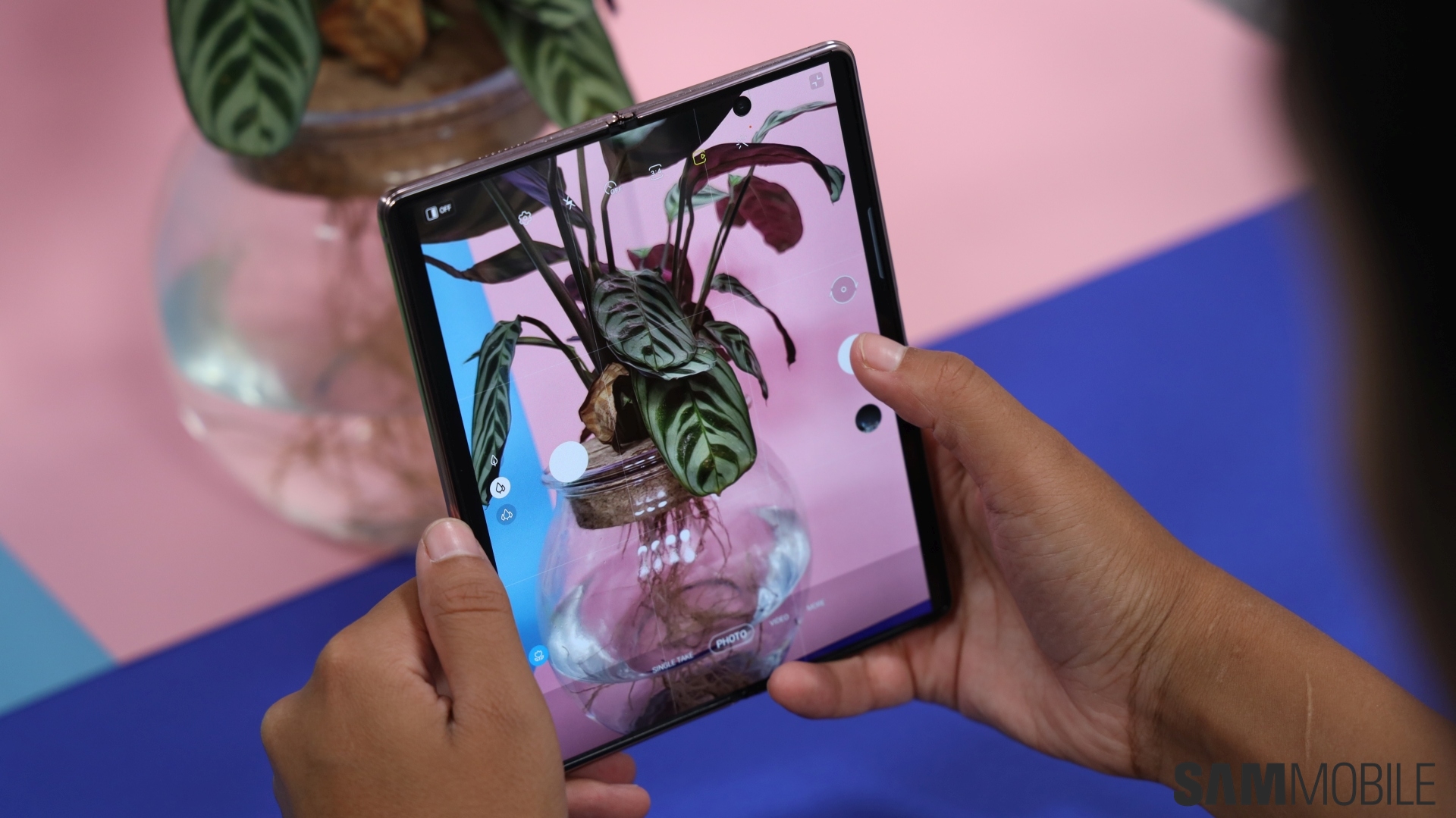
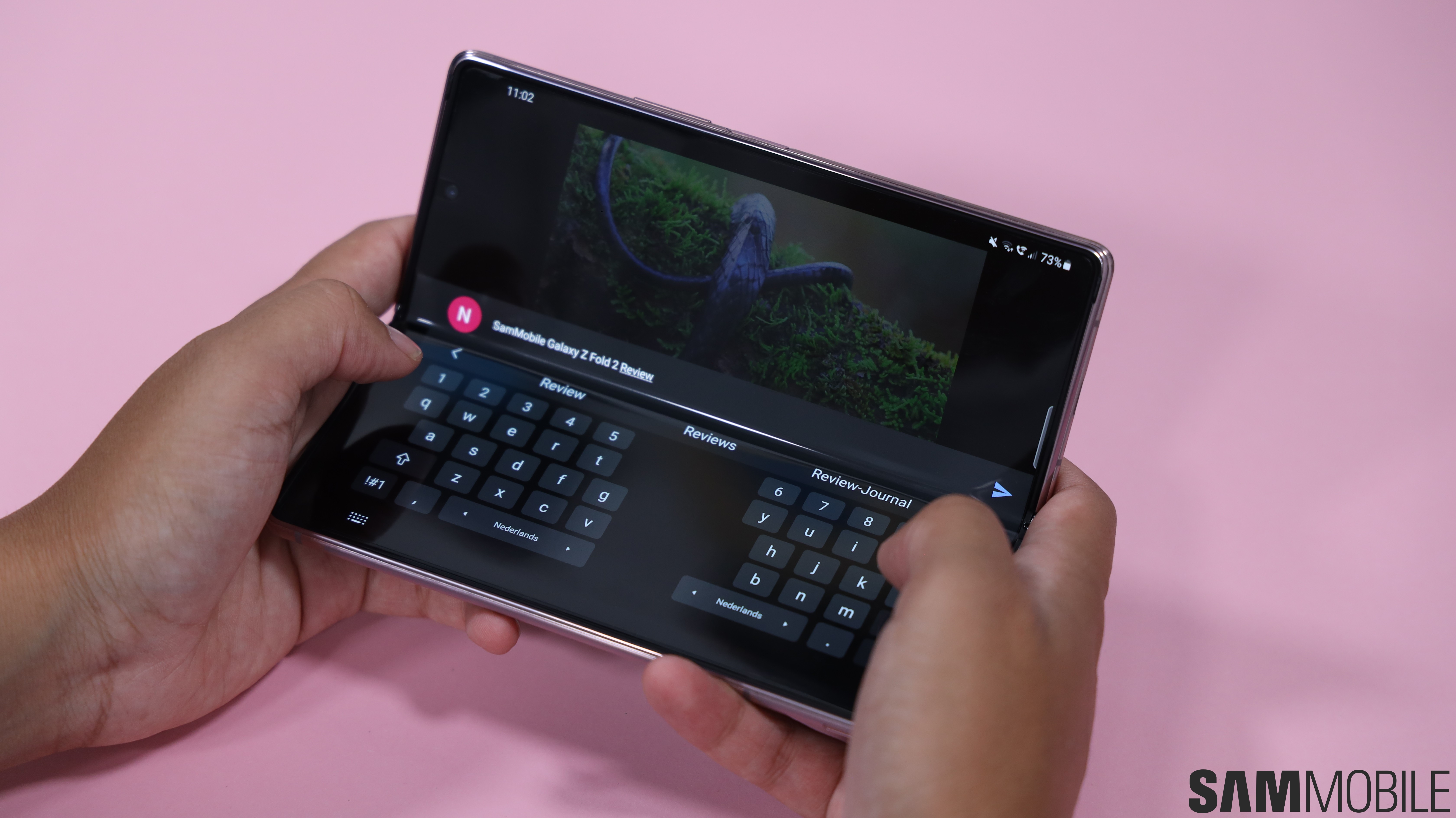
There are only a handful of apps that dynamically adjust their user interface when the handset is in Flex Mode. You will get the best Flex Mode experience with Samsung’s native apps. The Camera app can split its UI into two and displays the viewfinder at the top and the controls at the bottom. The bottom half also shows a small preview of the photos taken so you can swipe through them without having to open the Gallery. Some Google apps like YouTube and Duo also adapt their UI to suit Flex Mode. We can only hope that more developers update their apps to take full advantage of this feature, but that may take time as there still aren’t as many units out there for them to divert their time and resources towards making this happen.

App Continuity was introduced with the original Galaxy Fold. Certain apps could transition from the cover display to the main display when it was unfolded seamlessly. The Galaxy Z Fold 2 can do it the other way around as well. If you have an app open on the main display and you close it, the app will seamlessly transition to the cover display. I like this feature, it saves me from the hassle of having to launch apps again and navigate to where I was after folding the device. Do keep in mind that this feature isn’t enabled for all apps out of the box. You need to individually select apps that will be allowed to make the transition. This is good because I can keep apps with sensitive information, like my bank’s app, from moving to the external display.
Galaxy Z Fold 2 audio

Samsung has equipped the Galaxy Z Fold 2 with true stereo speakers, there’s none of that using-earpiece-as-a-second speaker business. These are quite impressive, they get nice and loud with a decent amount of bass. It’s not ground-shaking bass, mind you, but more than what you would have expected to get from the device. My only issue with them relates to their placement.
It’s quite easy to accidentally cover them with your hands so you do have to be a bit conscious about how you’re holding the phone, not something I particularly enjoy when trying to just get a bit of Netflix in before bed. As for the earpiece, I’m completely satisfied with it. The phone call quality is exceptional – everything sounds nice and crisp, just as you’d want it to.
Galaxy Z Fold 2 verdict

It’s hard not to like the Galaxy Z Fold 2. Forget that it costs $1,999 for a minute and that it’s not as durable as your Galaxy S20. See it for what it represents: A major leap forward for the industry and an incredible feat of engineering. This is everything we thought a smartphone of the future could be, and more.
Does it have shortcomings? Absolutely. I wouldn’t want to be caught out in the rain with it, for starters. I’d just be too worried about the water wrecking it. The day that we get completely sealed IP-rated foldable phones is far. I also wish that Google made Android more suitable for this form factor so the additional layer that Samsung is slapping on top of it for features like Multi-Active Window felt more like a core feature than an add-on. Some Android apps are just terrible for tablets so we’re entirely at the mercy of their developers for the user experience.
There’s no doubt left in anybody’s mind that Samsung has nailed the engineering side of things. The Galaxy Z Fold 2 is big, bold and beautiful. The hinge is solid and the overall build quality leaves nothing to be desired. Future foldable phones are only going to be better. It’s important now for Samsung to work with Google and other partners to further improve the ecosystem so that the true potential of this form factor can be realized.

Now for the $1,999 question: Should you buy it? There’s no denying the fact that Samsung is asking a lot of money for this device. Most people would never spend this much on a phone and there’s already growing consensus that even these $1,400 flagship price tags have gone too far.
There isn’t a pair of wireless earbuds in the box this time around to make the price more palatable. The target market for the device still remains the most loyal of Samsung fans, professional content creators, and those who like to experience the bleeding edge of technology. For the very fashionable crowd, Samsung offers the $3,299 Galaxy Z Fold 2 Thom Browne Edition.
The Galaxy Z Fold 2 is such an impressive upgrade that I’d even recommend Galaxy Fold owners to buy it. You can do so much more on it that wasn’t even possible on its predecessor. Even if you didn’t buy Samsung’s previous $1,999 smartphone, the Galaxy Z Fold 2 is as close to a productivity powerhouse as you can get right now.
In my view, you should buy it if you can get the most out of all the incredible features that it offers. Don’t buy it if the bulk of your usage comprises of social media apps, because half of them look terrible on the main display anyway (not Samsung’s fault), and if you’re just looking for great cameras. That’s like buying a Ferrari and only driving it in the city center. You’d be much better off with one of many great high-end phones Samsung has released this year.
| Pros |
Cons |
| Beautiful design, solid build quality |
Camera setup should have been better |
| Larger displays with slimmer bezels |
Lacks water and dust resistance |
| Bigger battery, 25W super fast charging |
Flex Mode app support is limited |
| Exceptional performance and stereo speakers |
No 45W fast charging |
| Flex Mode and Multi-Active Window are great features |
Software ecosystem can be improved |
| Satisfactory battery life |
|
| Capacitive fingerprint sensor |
|
| 5G support |
|
The post Galaxy Z Fold 2 review: Big, bold, beautiful and everything in between appeared first on SamMobile.
from SamMobile https://ift.tt/3hvcTht
via
IFTTT
