

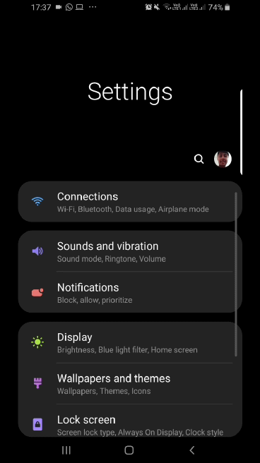
One UI, Samsung’s latest custom user interface for Galaxy devices, has been favorably received by many, but it also has its fair share of criticism. That’s to be expected from any major UI upgrade, but there’s one specific aspect of One UI that we feel gets criticized despite not actually being a problem, and that’s the “wasted space” in stock apps such as Messages, Samsung Notes, or Settings. To be precise, many take issue with how the upper half of the screen in these apps has nothing but the name of the app, and we thought we’d clear the air around it.
One UI is designed to put interactive elements in apps within easy reach of the user on big-screen phones, which is why it’s only the bottom half of the Messages, Samsung Notes, or Settings app that shows your messages, notes, or various settings menus when you first open the app. However, once you start scrolling up, the app interface becomes just like the interface on Oreo, as you can see in the GIF image below (if the GIF doesn’t play, click/tap on it).
We hope that clears the confusion. If not, you’ll just have to wait for the Android Pie update on your Galaxy device to try it for yourself and form an opinion. We are also working on an official One UI review that we will publish in the coming days. In the meantime, don’t forget to check out all the new features in Android Pie and also see how it compares visually to Android Oreo. If you own a Galaxy S9 or S9+, you can see if Android Pie has been released for your country in this constantly updated list.
The post PSA: One UI does not waste screen space in Messages and other apps appeared first on SamMobile.
from SamMobile http://bit.ly/2Ffpvtl
via IFTTT


ليست هناك تعليقات:
إرسال تعليق