Many have been averse to Samsung’s insistence on making curved screens the only option on its flagship phones since the Galaxy S8 came out in 2017. And this year, Samsung finally relented and brought us the Galaxy S10e. It’s probably not because the company realized there are consumers who want a flat screen, but because the Galaxy S10 comes in three variants, giving Samsung an opportunity to save costs on the smallest model while keeping the curved displays on the Galaxy S10 and S10+.
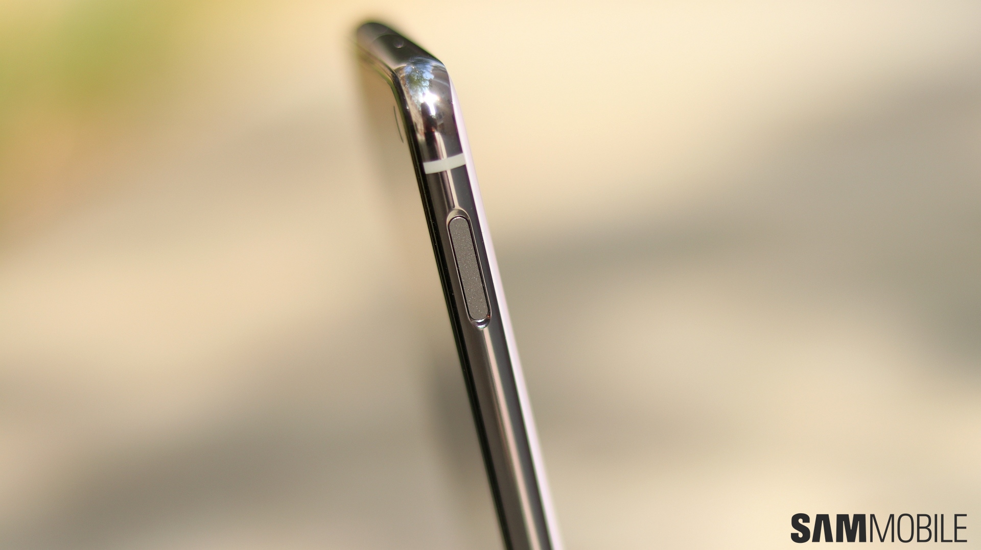
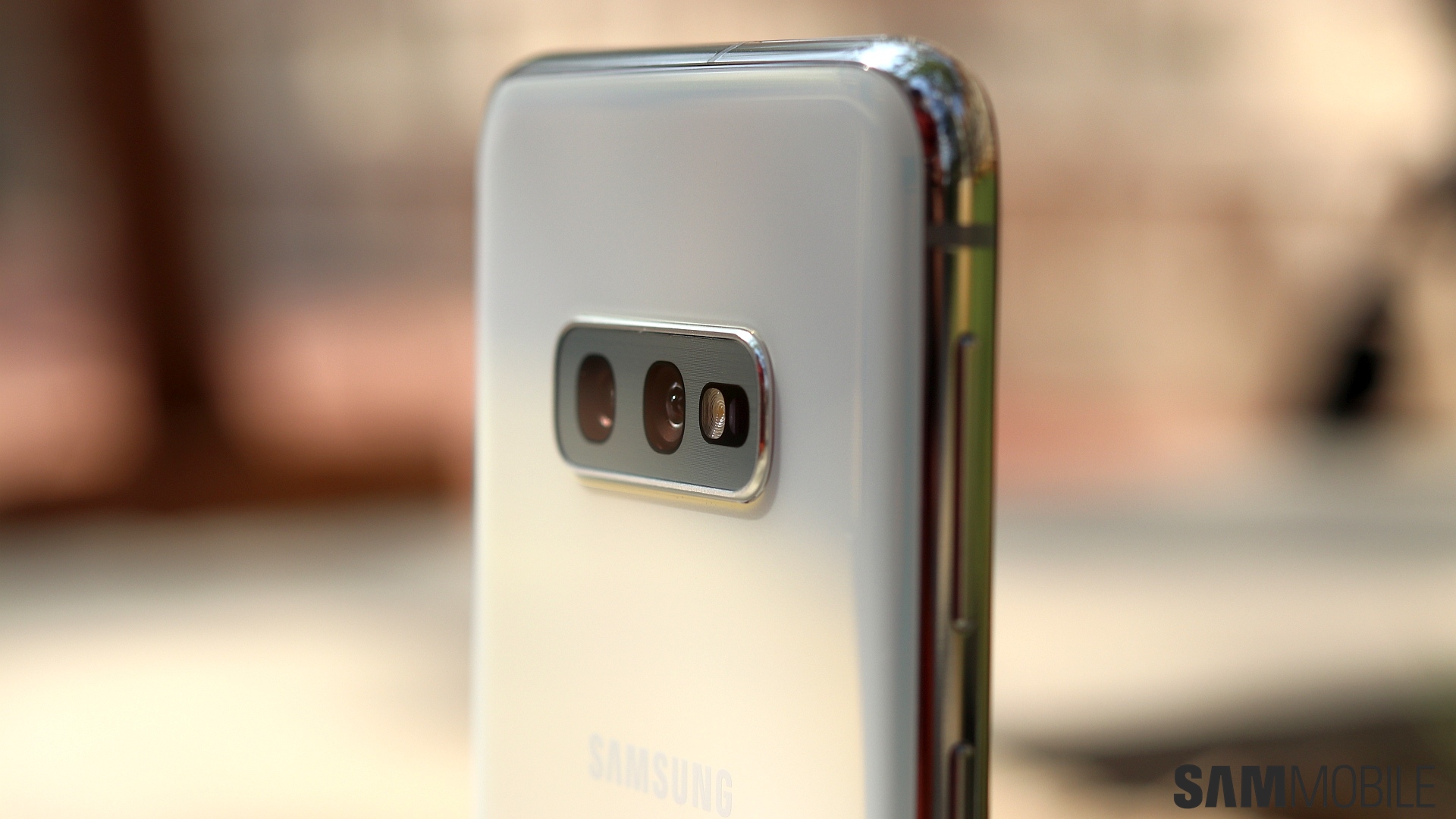
And it’s not just a lack of curves that differentiates the Galaxy S10e from its brethren. The S10e doesn’t get the fancy new in-display fingerprint sensor, either, with Samsung opting to put the fingerprint sensor on the side, embedded into the power button. The S10e also gets one less rear camera and makes do with 6GB of RAM on the base model, and all of that combines to make the device a more affordable proposition (it costs a whopping $150 less than the S10 and $250 less than an S10+).
But does the Galaxy S10e offer a user experience that justifies the flagship tag and go beyond just a compact phone with a flat display? Let’s find out in this Galaxy S10e review.
Galaxy S10e review: Design
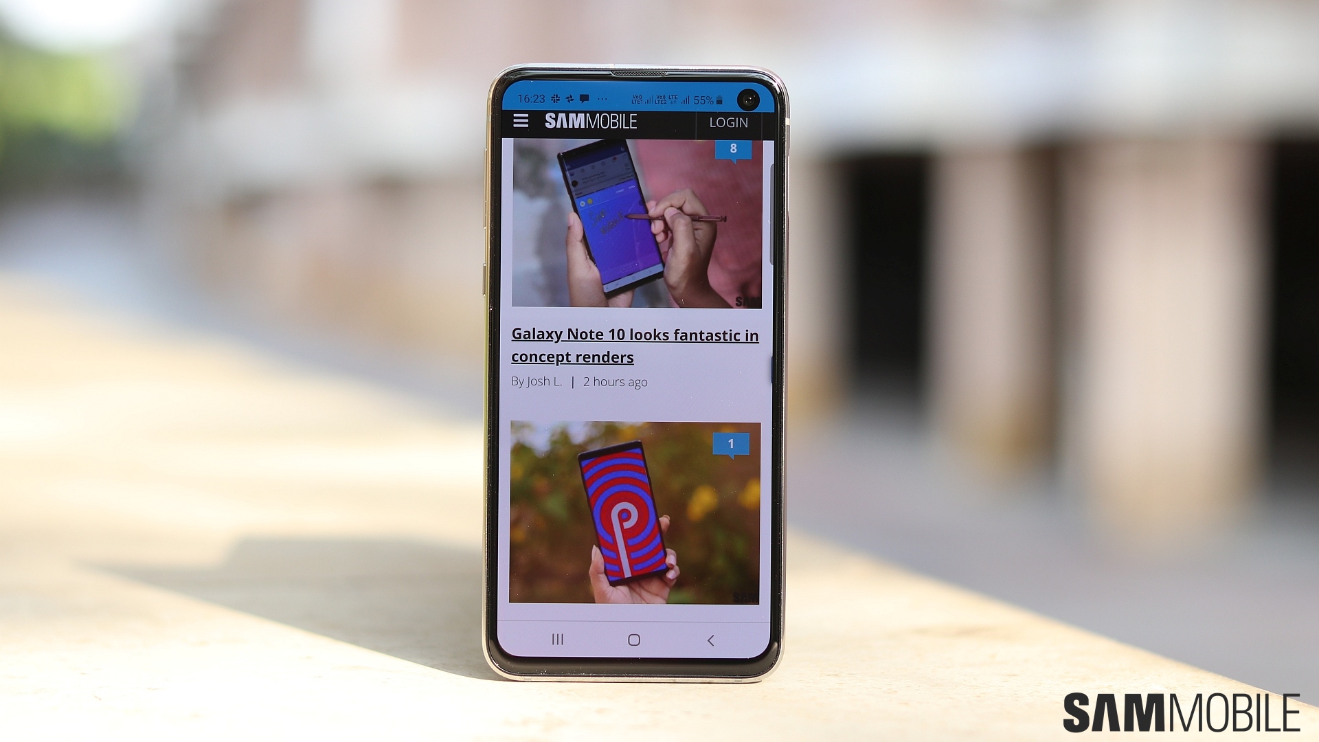
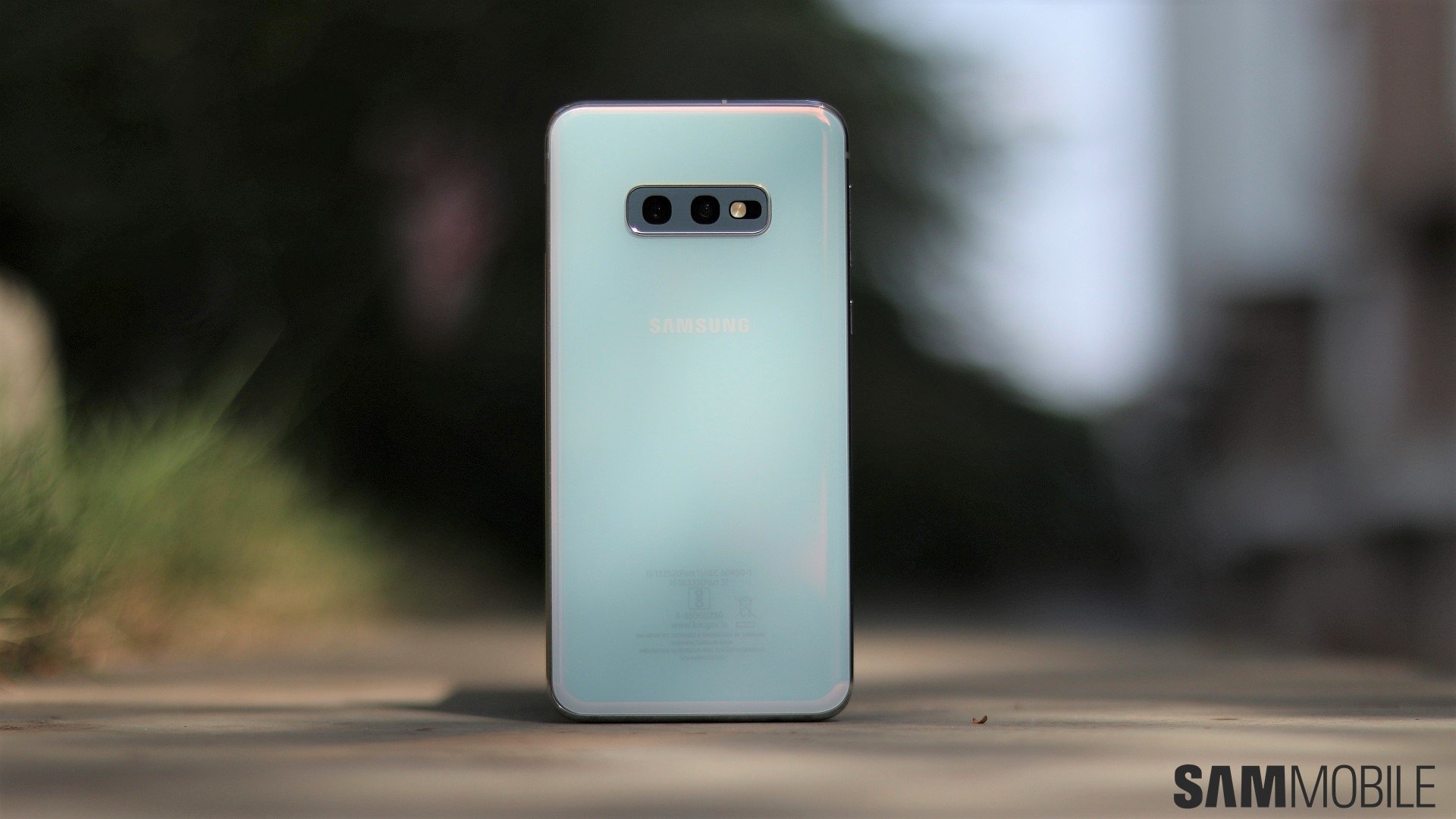
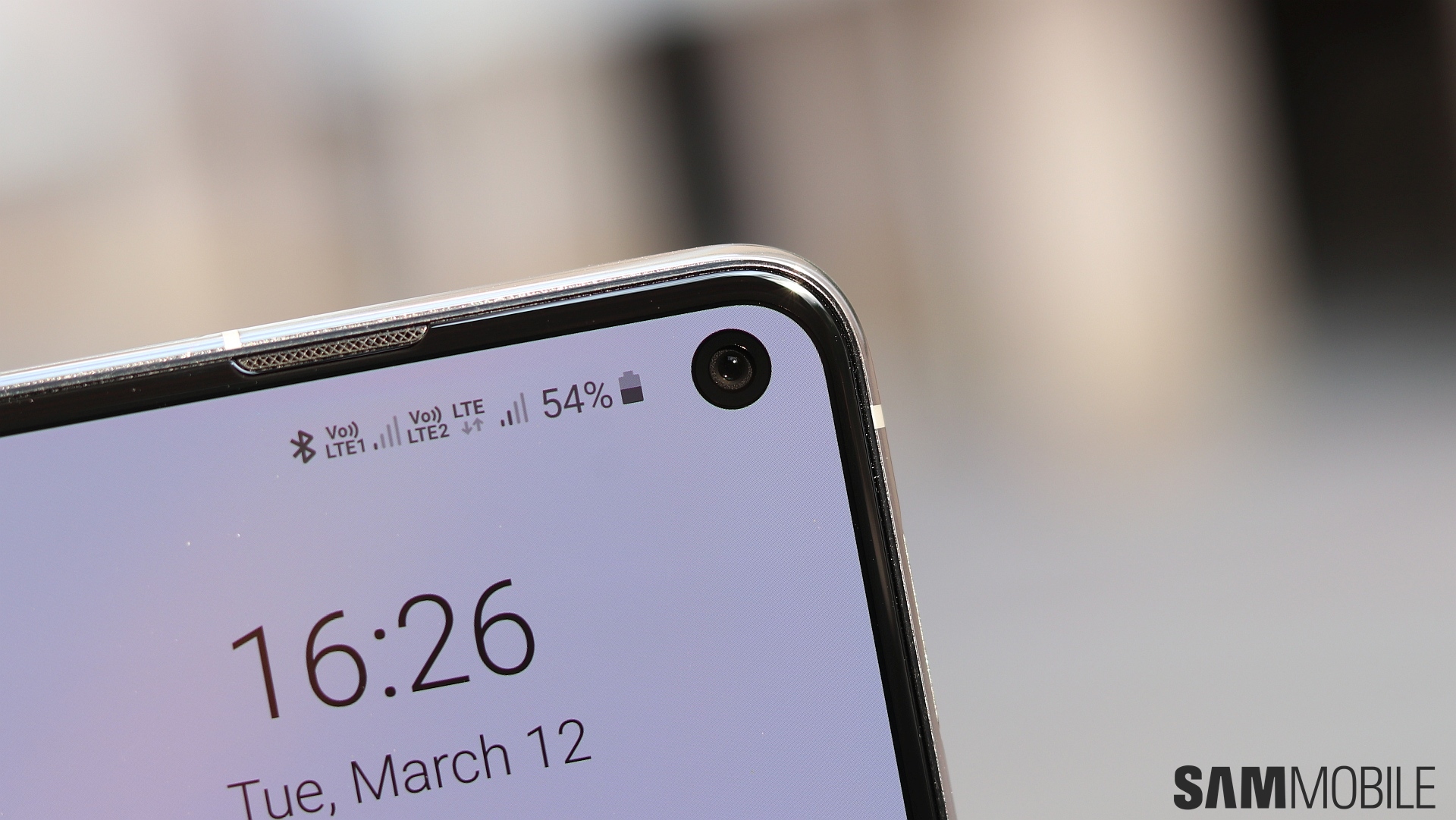
The Galaxy S10e is a compact phone, as expected, but the new Infinity-O display with its punch-hole camera and smaller bezels make it a bit shorter than the Galaxy S8 or S9 despite the same screen size. The lack of any curves on the display gives you more confidence with one-handed usage as well. Not that the S10e isn’t a slippery eel. That’s something you can’t avoid with phones that are made of glass on the front and back. The S10e feels as premium as its larger siblings as a result of all that glass, but it’s also prone to damage should it ever slip out of your hand and on to the floor below, so at least a basic case is still recommended.
The S10e has the same old physical key setup that we have seen on Samsung flagships in the last couple of years. You have the volume and Bixby keys on the left and a power button on the right. On the S10e, the power button also holds the fingerprint sensor. The power button is a bit too high on the body so you have to stretch every so slightly to tap that fingerprint sensor. Not everyone will face that problem, though. And thankfully, the fingerprint reader does a swell job despite its new-found location on the side of the phone. It detects your fingerprint at the slightest touch, and I found it better than the in-display fingerprint sensor on the S10+ as far as consistency was concerned.
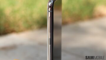
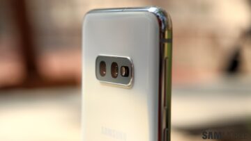


If you’re someone who upgrades to a new flagship phone almost every year, you’ll be surprised by how fresh the Galaxy S10e feels. That flat display is probably the main reason, along with the fact that you feel the edges of the phone more than you would with a curved screen. There’s still no space for a notification LED, sadly, although there’s hope that Samsung will enable the use of the light ring around the camera hole for notifications with a software update.
Display
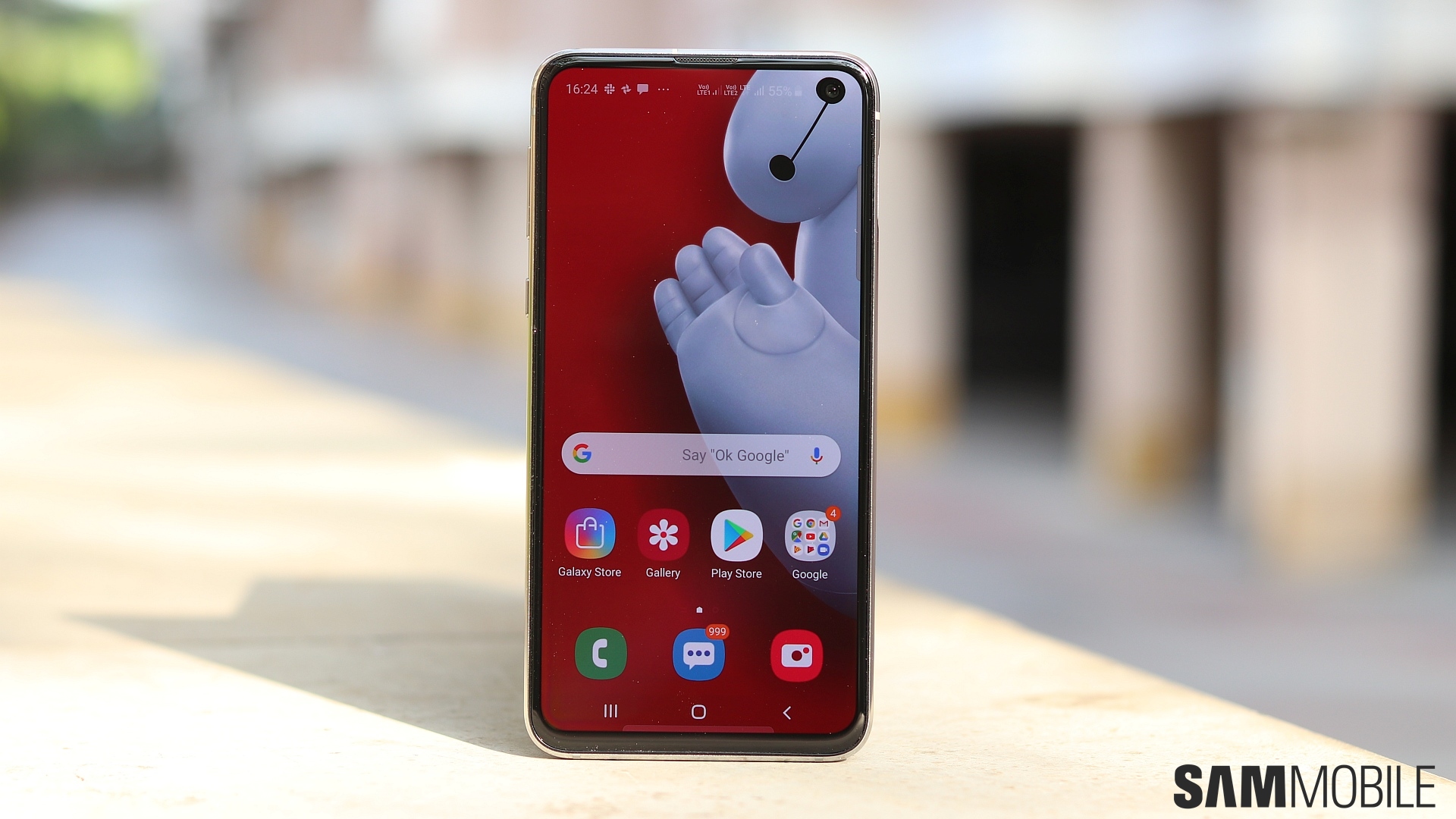
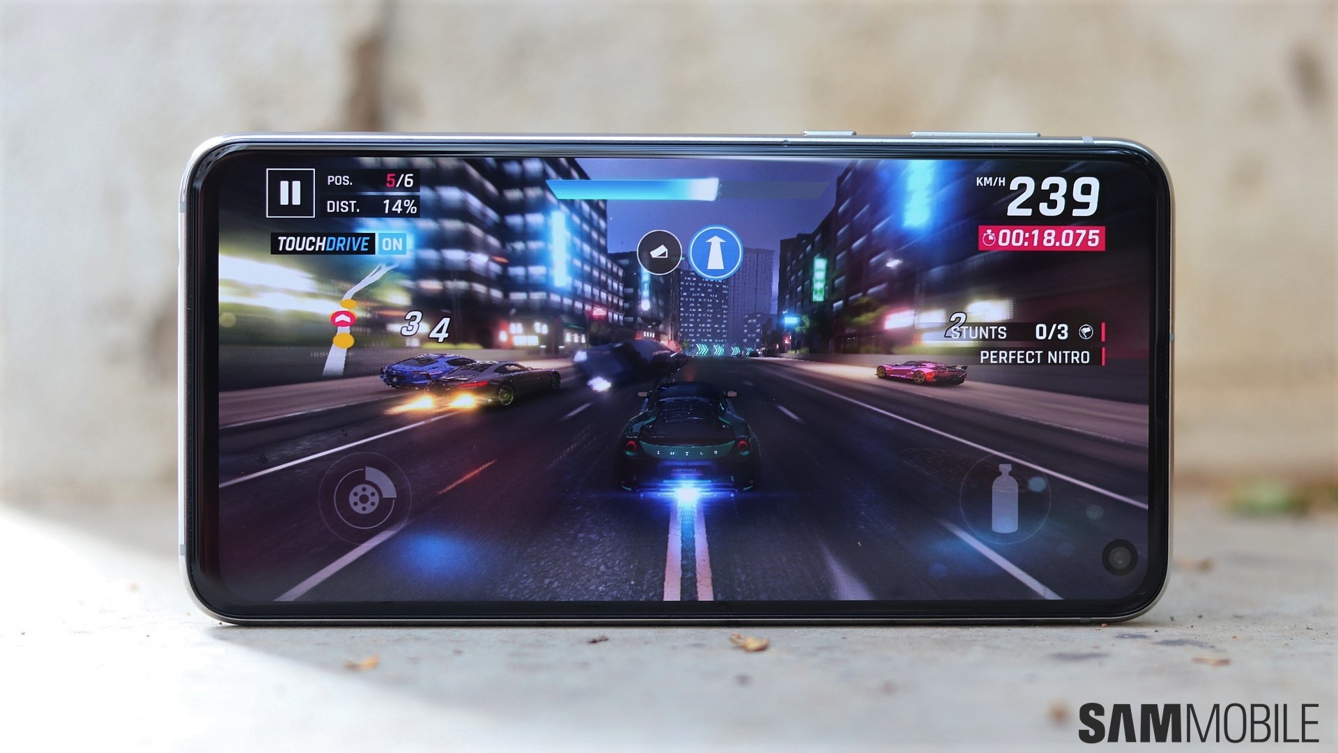
The 5.8-inch Infinity-O Dynamic AMOLED panel on the Galaxy S10e may not be curvy like the S10 or S10+’ display, but it’s exactly the same in terms of display quality. Samsung is aiming at color accuracy with its tenth-anniversary flagship so the S10e has a warm white balance (yellowish whites) by default. You can switch to cooler (bluer) whites from the display settings, or if color accuracy is important for you, you can choose the Natural screen mode.
And no, the fact that the S10e has a Full HD+ display and not a Quad HD+ panel doesn’t make any perceivable difference to sharpness in day-to-day usage. Samsung hasn’t stripped away the Edge screen functionality, either. But the 5.8-inch display does feel a bit cramped at times. Of course, that could just be something that bothered me, as I always opt for the larger of Samsung’s flagship models, but those who always buy compact phones may not have any issues.
As for that camera hole, I’d say it’s easy to start ignoring it after a couple of days, especially with Android Pie’s Night mode enabled. Not everyone may feel that way, and unfortunately, no one can really give you a proper verdict. The gains in compactness thanks to that display cutout (and hence the smaller bezels) cannot be understated, but the best thing to do is to go out to a store and play with the Galaxy S10e a bit before making a decision.
Cameras, Software
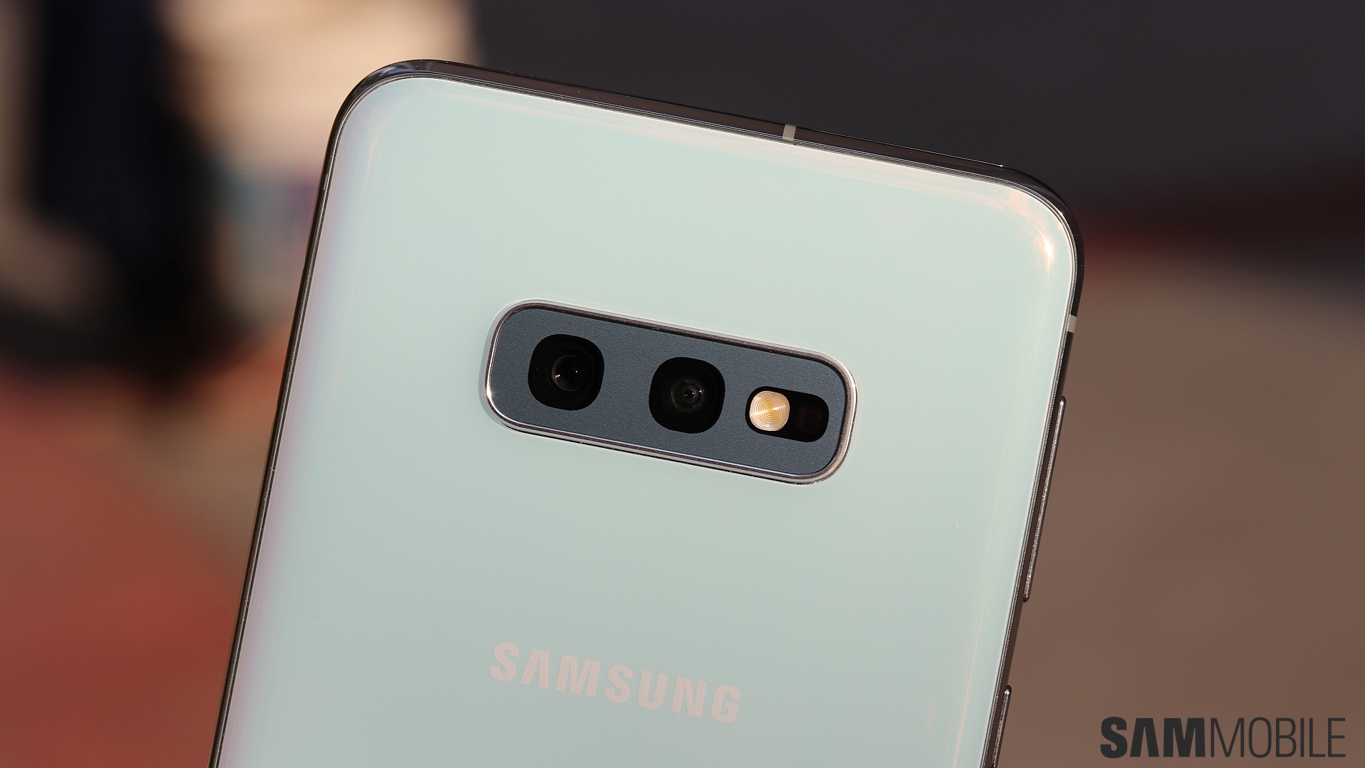
We’re not going to waste time talking about the Galaxy S10e’s cameras and the software. The S10e gets the same software features as the S10 and S10+, so you can check out our Galaxy S10+ review for details on the software. That goes for the cameras as well, with the S10e sporting the same primary and ultra-wide rear cameras and the same primary 10MP front camera as the S10+. The only difference in the camera experience is with Live Focus portrait shots with the front camera. The S10e uses software-based Live Focus, so the quality of portrait selfies is a bit lower, and we’ve put up some samples of Live Focus selfies below for you to check out. You can also see how Live Focus selfies differ between the S10e and S10+ here.


Performance
The Galaxy S10e comes with the Exynos 9820 chipset under the hood like the S10 and S10+, with the Snapdragon 855 fulfilling the processing duties in markets like the US and China. We tested the Exynos model with 6GB of RAM and can say the S10e’s performance matches that of the S10+. The S10+ gets 8GB of RAM by default, but the only place you’ll notice that making a difference is in multitasking, with the S10e more prone to killing background apps (although you won’t notice this in day-to-day usage).
The lower screen resolution no doubt helps the Galaxy S10e chug along without breaking a sweat. As we had mentioned in our S10+ review, Samsung seems to have thrown in extra optimization on its 2019 Galaxy S flagships, and that results in smooth animations and quick app launch times. There’s barely any stutter, no matter what you try to do on the phone. The S10e did heat up quite a bit during the first day of use when I was busy installing apps and transferring my data to the phone, but I didn’t face the heating issue from the second day.
As mentioned in the design section, that fingerprint scanner in the power button does a great job at quickly and accurately detecting your fingerprints. Facial recognition works fast as well, and when you combine it with Android Pie’s Lift to wake feature, you can quickly unlock the S10e by simply bringing it up in front of your face. Of course, facial recognition isn’t as secure as iris recognition, but that’s something we will probably have to live with on all Samsung flagships from now on.
Audio quality, call quality
Okay, so you’d expect the Galaxy S10e to have the same audio chops as the Galaxy S10 or S10+, but there’s one key difference that I noticed between the S10+ and S10e. The S10e’s stereo speakers don’t seem to be as loud as the S10+. The audio quality is the same, in that there is no distortion even at full volume, but the S10e sounds a bit quieter. It’s not something you’ll notice without having the two side by side, but I noticed something was off the first time I played something on the S10e’s speakers after shifting to it from the S10+.
When you enable Dolby Atmos, the S10+ also sounds fuller. Now, it’s unclear if this disparity was present on the Galaxy S8 or S9 as well. When Samsung wasn’t doing this all-screen, punch-hole display thing, we didn’t think the speakers on the smaller Galaxy S8 or S9 would be affected because of the smaller size of the phones, so we never tested things when those devices were released. Again, without an S10+ to compare to, the S10e sounds just fine, and you get the same AKG-tuned earphones in the box for high-quality in-ear sound.
Calls and network reception didn’t pose a problem on the S10e nor do they differ from the S10+. Calls come in loud and clear and the person at the other end never complained, and network reception on both SIM slots is impeccable, even in low-network areas like underground parkings. The one thing I miss is the option to add extra volume during calls, though. That was a useful feature for a long time on Samsung phones, but it’s missing on the S10 lineup.
Battery life
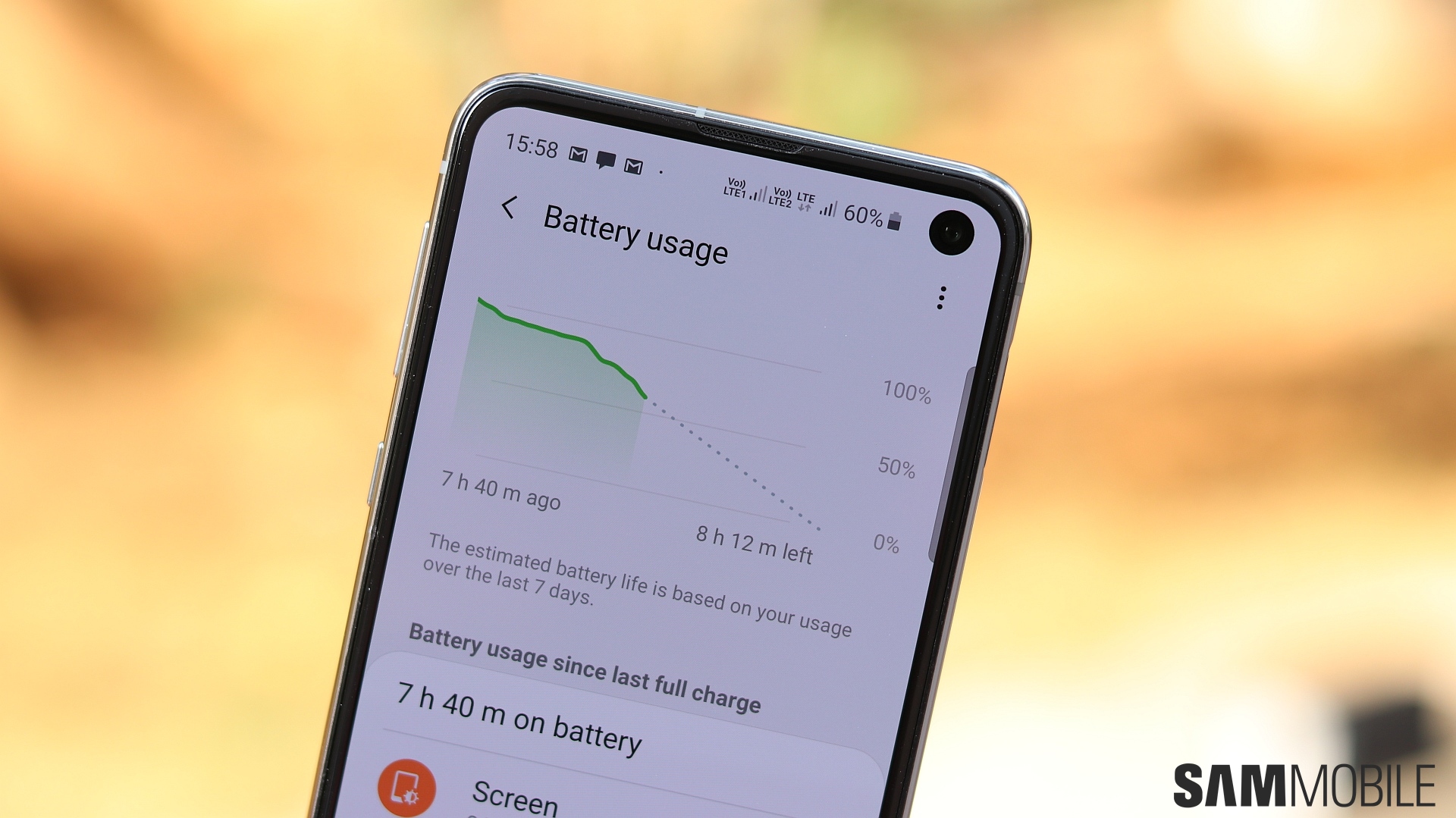
The Galaxy S10e’s battery life is surprisingly good. It’s not great, and you can’t get to the end of the day on a single charge with heavy usage, but it’s certainly better than what we had hoped. With light to medium usage, the phone can last for around 13-14 hours and offer screen on times of around 3.5-4 hours very consistently. Again, the lower-resolution display on the S10e is probably what helps it surprise us with the endurance. Where the Galaxy S10+ falls behind the Galaxy Note 9 despite a similar capacity battery, the S10e holds its own and doesn’t make you worry as much as you would think.
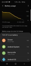

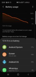

Even if you do find battery life lacking, the small battery (3,100 mAh) means the S10e can charge very quickly. You also get Samsung’s usual power saving modes, and I personally found myself enabling the medium power saving mode when going out of the house for extended periods, as that reduces background data usage over mobile data and helps keep the lights on a bit longer. And the Galaxy S10e supports Wireless PowerShare like the S10 and S10e, so you can wirelessly charge your wearable devices or another phone when the occasion calls for it.
Conclusion
We were not prepared for how good the Galaxy S10e would turn out to be when we were following all those rumors and leaks before the Galaxy S10 lineup’s official announcement. It has a few compromises and lacks some features compared to the Galaxy S10 and S10+, just like the Galaxy S9 did compared to the S9+, but the overall package is a very compelling one. And that’s because the essentials are all there.
The display doesn’t have any curves, but it’s of the highest quality otherwise. You don’t get a telephoto camera for lossless 2x zoom, but you do get an ultra-wide camera that comes in handy. The battery capacity isn’t that high, but the S10e manages to last long enough for it to not be a worrisome limitation. And while there’s no in-display fingerprint sensor on the S10e, its traditional fingerprint sensor works very well. Software performance is also great, even though Samsung is still giving you lesser RAM on the smallest version.
The best part is the price tag, of course. At a starting price of $750, the Galaxy S10e is considerably more affordable than the S10 or S10+ while offering a nearly similar user experience on most fronts. Overall, the Galaxy S10e is an excellent compact flagship phone and gets our hearty recommendation.
| Pros | Cons |
| Stunning AMOLED display despite the lack of curves | Front camera cutout will put off some people, at least in the first few days |
| Compact design thanks to smaller bezels | Bright Night camera feature for low-light photos is mostly useless |
| Flat display enables more confidence in one-handed usage | Lacks some bells and whistles of S10 and S10+, like in-display fingerprint sensor and telephoto/zoom camera |
| Great all-round camera performance, ultra-wide lens | Display can feel a bit cramped at times |
| Noticeably faster and smoother than previous Galaxy flagships | No iris sensor |
| Loud stereo speakers with Dolby Atmos | Stereo speakers slightly quieter than on the S10+ |
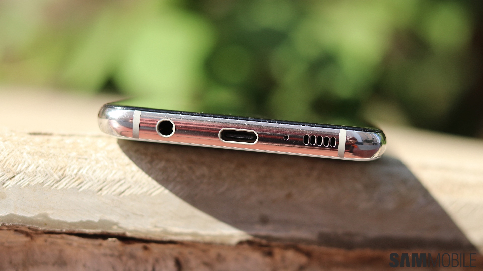
| A headphone jack! | No notification LED |
| New software features, like Digital Wellbeing and Bixby Routines | |
| Power button-mounted fingerprint sensor works great | |
| Battery life is better than expected, supports reverse wireless charging | |
| Great pricing |
The post Samsung Galaxy S10e review: Making compact flagships great again appeared first on SamMobile.
from SamMobile https://ift.tt/2TzHYJs
via IFTTT




ليست هناك تعليقات:
إرسال تعليق