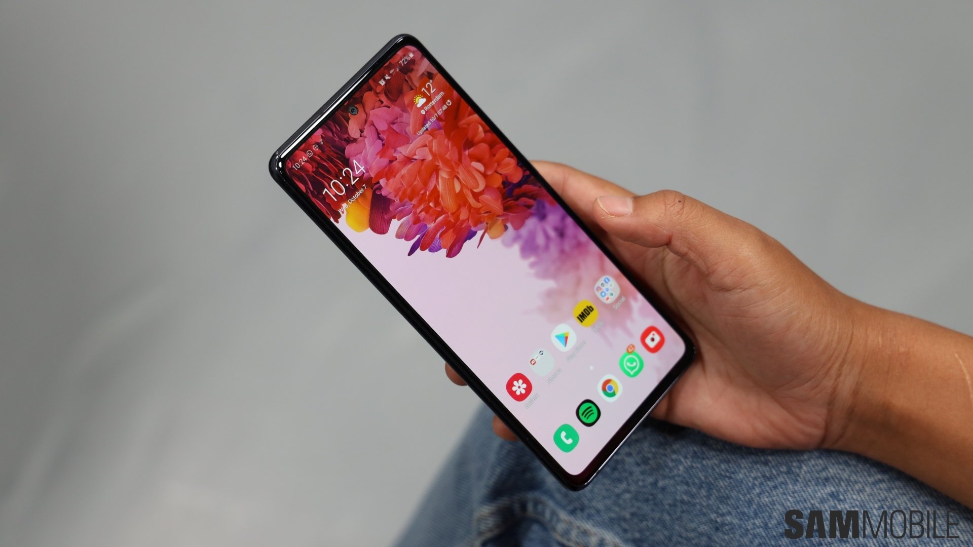
The Galaxy S20 FE is an excellent phone, and it’s a fantastic proposition for the asking price. It’s got much in common with the original Galaxy S20 trio, or at least the Galaxy S20 and S20+, such as the flagship-grade processors, 120Hz screen refresh rate, 30x ‘Space Zoom’ (something the S20 FE is better at), big battery and 25W super fast charging, wireless and reverse wireless charging, stereo speakers, and even IP68 water and dust resistance.
Not everything is as high-end as you would like, such as the plastic back, the 6GB of RAM on the base model sold in most markets, or the absence of a 25W super fast charger in the box. Still, Samsung’s claims of the Galaxy S20 FE being a flagship are well-founded, but if there’s one thing about this phone that I feel is a little too much of a downgrade despite the attractive asking price, it’s the size of the bezels surrounding the display.
The Galaxy S20 FE’s bezels are really off-putting, at least to me. It’s not like bezels are a bad thing, but on the S20 FE, they make the phone seem a lot more like a mid-range device than I would like. I’ve used plenty of $200-$250 Galaxy M series phones in recent months, and every time I pick up the S20 FE and fire up the display, it reminds me of those M series phones because the bezels are pretty much the same size. Only the bottom bezel on the S20 FE is a little less wide, but otherwise, there’s no difference to be seen.
The Galaxy S10 Lite, which the Galaxy S20 Fan Edition is a sequel to despite the different names, had smaller bezels, and so does the Galaxy A71, a phone with a price tag almost half that of the S20 FE. I understand Samsung had to make concessions somewhere, but it’s unclear if not making the bezels as small as possible did much to help the company achieve its goal of bringing a more affordable Galaxy S20 model to the market.
Bezel size may not seem like a major issue, but imagine a customer who walks into a store (yes, stores are open in many countries, despite the ongoing pandemic) and checks out the Galaxy S20 FE and OnePlus 8 side-by-side. Not only will they see a sexier-looking display on the latter, but they will also notice the minimal bezels. The OnePlus 8’s spec sheet might not be as good as the S20 FE’s, but first impressions often have a considerable effect on the choice a customer makes when shopping for a new phone, and a curved screen will easily take the cake as far as first impressions are concerned.
All that said, if I had to buy a phone for $699, I would gladly pick up the Galaxy S20 FE. But I hope Samsung will take my complaint into account when making the next Fan Edition flagship, which we’re going to see every year going forward. It’s not deal-breaking or anything, but having bezels as big as you would see on a $200-$250 device on a smartphone you call a flagship just doesn’t sit right.
The post The bezels on the Galaxy S20 FE are annoyingly big and mid-range-y appeared first on SamMobile.
from SamMobile https://ift.tt/2IeeL25
via IFTTT


ليست هناك تعليقات:
إرسال تعليق