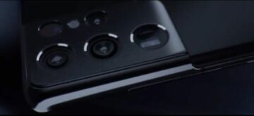
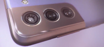
The Galaxy S21 is weeks away from its official unveiling but the new design employed by the upcoming trio of smartphones has already been exposed in leaked renders, photos and early hands-on videos. And I must admit that although I was unsure at first, the new camera bump design is starting to grow on me.
I won’t know for sure until I’ll have the chance to see these phones with my own eyes but the design language soon-to-be-established by the Galaxy S21 series might be my favorite thing about it. The new camera bump doesn’t stand out as much as it did with the Galaxy S20 series and especially the Galaxy S20 Ultra. And if it does stand out, it’s for all the right reasons.
Unlike previous flagship generations whose camera bumps looked as if they were tacked onto the glass back panel, the Galaxy S21 design formula brings about a more seamless transition between the camera bump and the phone’s metal frame.


The top and left edges are flush against the phone’s metal frame and this serves to give the illusion that if you could somehow drag the opposite corner to increase the bump’s surface area, you could extend it to cover the entire back panel, resulting in a completely flat surface. And for many smartphone users, a powerful camera combo and a flat, bump-less back panel is the holy grail of design in today’s mobile world. Samsung may have given us a glimpse of the Galaxy series’ future.
Is Samsung purposefully trying to make the iPhone 12 look cheaper?
What’s also interesting about the Galaxy S21 camera bump’s design is that it might be a piece of a bigger puzzle. It could be one of Samsung’s secret weapons against the iPhone 12 series.
Both Samsung and Apple have been following a similar camera bump design philosophy in recent years and 2020 was no different. The Ultra versions of the Galaxy S20 and Galaxy Note 20, in particular, have prominent rectangular cameras, but the Galaxy S21 series is clearly headed in a different direction.
Meanwhile, Samsung’s mid-range devices like the Galaxy A42 5G and the Galaxy A12 flaunt the usual rectangular camera bump design, and although they are not as refined, they seem to resemble the iPhone 12 cameras in a roundabout way. Even more so now that they’re juxtaposed against the Galaxy S21 series’ design.
And perhaps this is all on purpose. Samsung is seemingly reserving the rectangular camera bump design for some of its mid-range series, perhaps in an attempt to create an association in the mind of consumers between the flagship iPhone 12 lineup and its own mid-range Galaxy portfolio. It’s almost as if Samsung’s mid-range series is working together with the Galaxy S21 to sabotage the iPhone 12’s image and elevate the Galaxy flagships to a higher plane as a result.
Or perhaps Samsung’s reasons are not as closely related to Apple, but whatever the case may be, the Galaxy S21 series appears to have a bold new design language and it’s undeniable that Samsung was brave enough to try something different for 2021.
That’s not only commendable but it might also lead to success. I’m excited for the new design, and perhaps even more so for what it might lead to with subsequent flagship generations. What’s your take on Samsung’s new formula for the Galaxy S21 series? Do you think this different approach has anything to do with the eternal rivalry between Samsung and Apple? Leave a comment below.
The post Galaxy S21’s attractive camera design makes the iPhone 12 look outdated appeared first on SamMobile.
from SamMobile https://ift.tt/3mfWI9X
via IFTTT


ليست هناك تعليقات:
إرسال تعليق