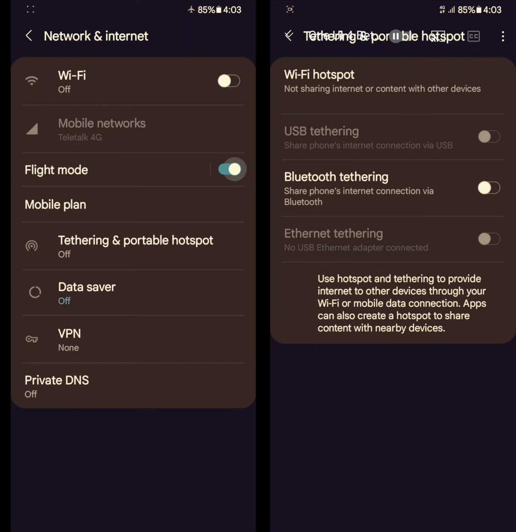
Samsung usually debuts major One UI versions with newer versions of the Android operating system. One UI was released with Android 9, One UI 2.0 was based on Android 10, and One UI 3.0 is based on Android 11. Now, One UI 4.0 screenshots have allegedly been leaked, showcasing what Samsung’s next software version could look like, but we think that those images are fake.
A video was posted on Reddit, allegedly showcasing Android 12-based One UI 4.0. However, the video was later deleted, but some people managed to get screenshots from those videos. The UI looks quite similar to the stock Android 12 design, thanks to rounded corners and a single screen to manage various connectivity options (flight mode, mobile data, Private DNS, VPN, and Wi-Fi). However, there’s something off about these screenshots, and the phone’s Wi-Fi hotspot’s name is mentioned as ‘Galaxy A50,’ which shouldn’t be the case as Samsung usually tests a major new version of One UI on its flagship smartphone and not a mid-range device.
The leaked video was deleted after a few hours, which leads us to believe that the entire video was fake, and we don’t think that One UI 4.0 looks like this. Samsung’s software UI design is usually radically different from stock Android design, and that should be the case with One UI 4.0 as well. You can view the complete list of Galaxy smartphones and tablets that might be eligible to receive the One UI 4.0 update.
I personally want One UI 4.0 to offer the ability to change app icon shapes, an option to rename app labels, and a built-in app locker. What are your expectations from One UI 4.0 and what features do you want to see? Let us know in the comments section below.

The post This better not be what One UI 4.0 looks like appeared first on SamMobile.
from SamMobile https://ift.tt/3gAhwcR
via IFTTT


ليست هناك تعليقات:
إرسال تعليق