My Dad isn’t very tech savvy. He moved to smartphones a lot later than my mom and pretty much every other person in my family, nuclear or extended. To this day, he presses down on the touchscreen like one used to on those resistive touchscreens you found on old Nokia phones instead of tapping it gently.
When I switched him to a Galaxy Note 10 last year, it was the first time he started using a flagship phone. It was also his first phone with more than a single rear camera, and I thought he’d like it because he loves taking pictures. So he starts using it, and a couple of weeks later on one fine day when the weather was lovely, I saw him take the Note 10 out… and pinch to zoom on the screen to zoom in.
That’s right: My Dad had no idea that those three tree-like icons (or are they leaves?) on the viewfinder let you zoom in on things with a single tap, or zoom out to use the ultra-wide camera. He’d been using pinch-to-zoom ever since I gave him the phone, and it’s when I realized how Samsung’s user interface — and smartphones in general — can often be confusing for the average consumer who isn’t a geek.
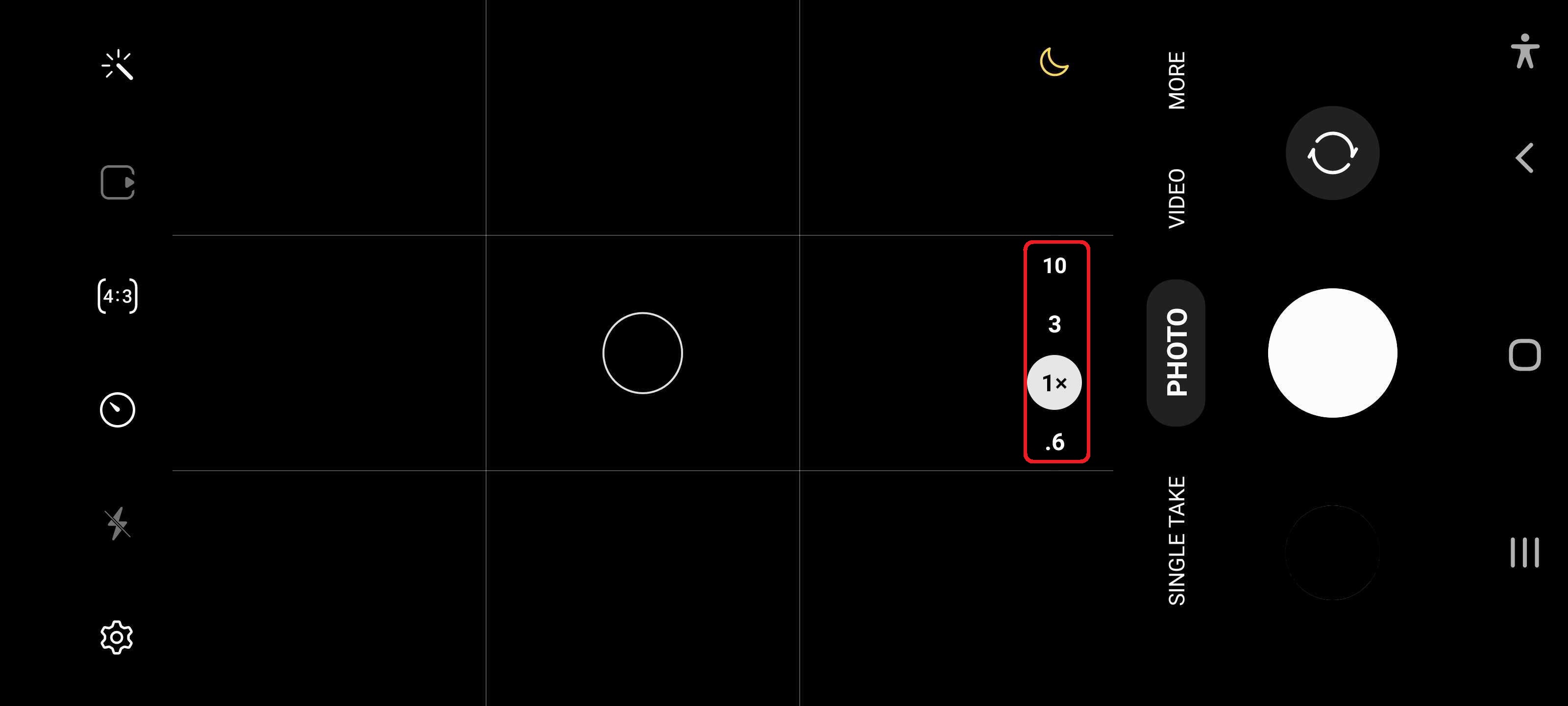
Thankfully, Samsung is finally addressing the camera thing with One UI 4.0. No longer do you get tree icons on the viewfinder for zooming in and zooming out. The camera interface now simply lists the zoom levels – 0.6x, 1x, 3x, and 10x on the Galaxy S21 Ultra, for example.
It’s a minor change, but it’s one that will make a difference. My Dad already knows what the buttons do, but for many consumers out there who may not have figured it out or will pick up a new Galaxy phone in the future, it will be a useful detail.
Wouldn’t you agree?
The post A One UI 4.0 camera interface change that’s great for the average customer appeared first on SamMobile.
from SamMobile https://ift.tt/3nTTo91
via IFTTT


ليست هناك تعليقات:
إرسال تعليق