The Galaxy Watch Active is part of the new lineup of wearable devices that Samsung launched yesterday. Is it a successor to the Gear Sport or an entirely new smartwatch generation from Samsung? That depends on the way you look at it, but for us, it appears to be a mix of the two. It’s not a bad mix by any stretch of the imagination. Read our Galaxy Watch Active hands-on to find out more about our thoughts on the new smartwatch.
Design
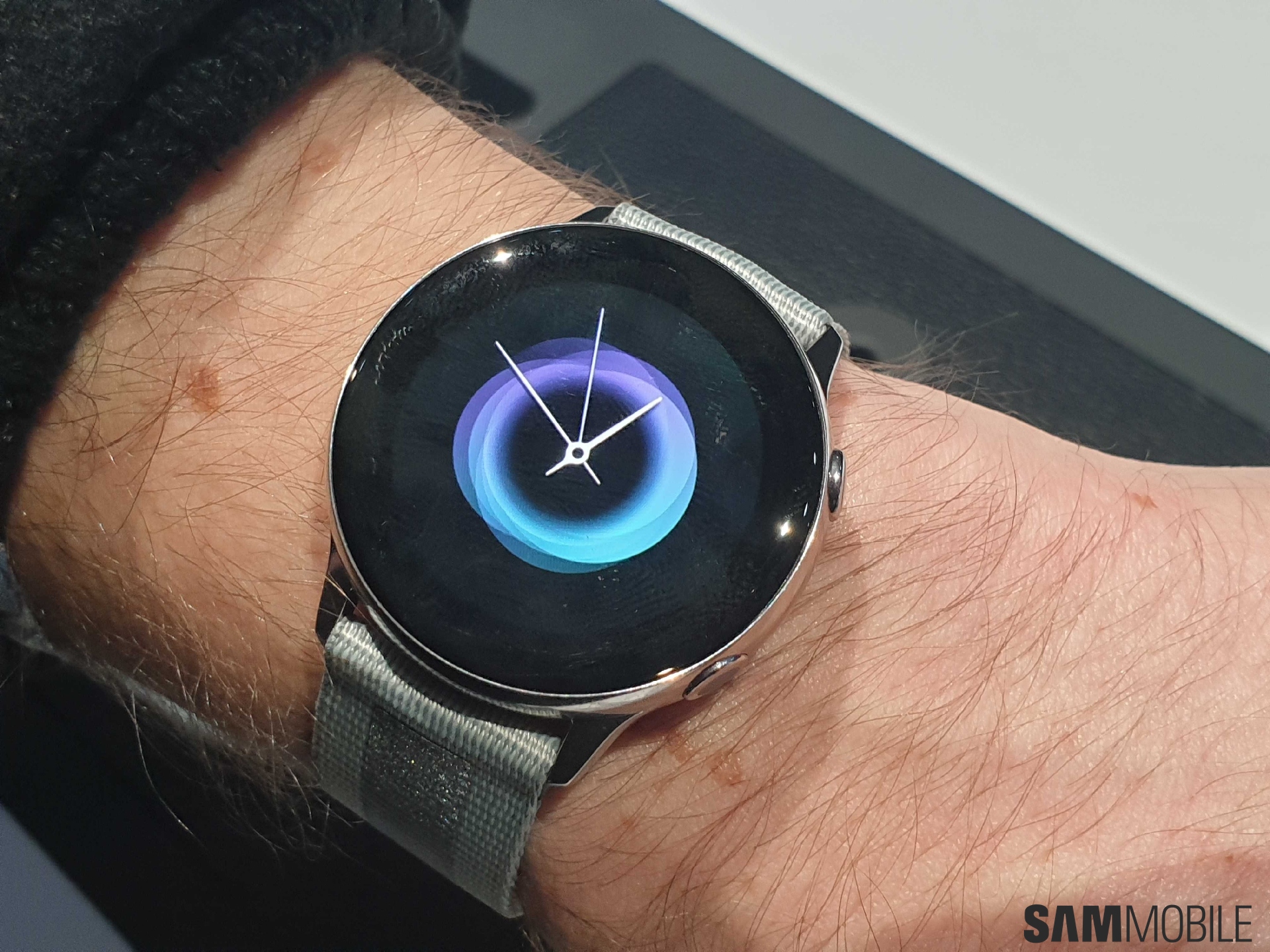
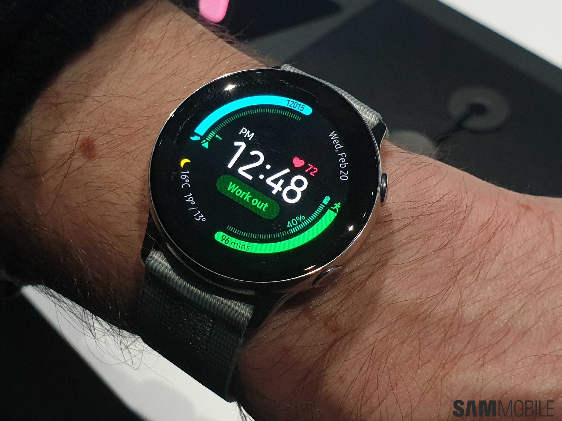
Our first impressions of the Galaxy Watch Active are that it has a streamlined look. Samsung has made subtle but meaningful changes to the design for a simpler appearance. It does retain the same circular design of its predecessors but ditches the rotating bezel. Samsung set its smartwatches apart with the rotating bezel but it has decided to remove it from the Galaxy Watch Active. We’re not too thrilled about this move, but does that make the Galaxy Watch Active any less of a smartwatch? Absolutely not.
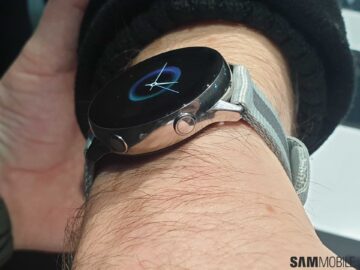
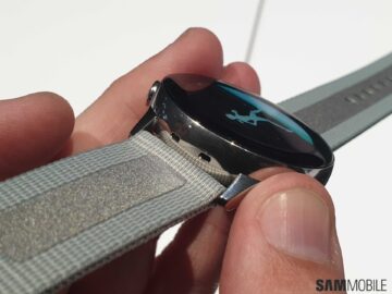
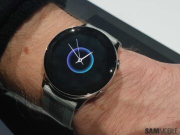
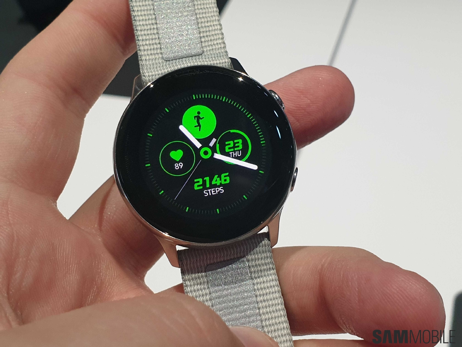
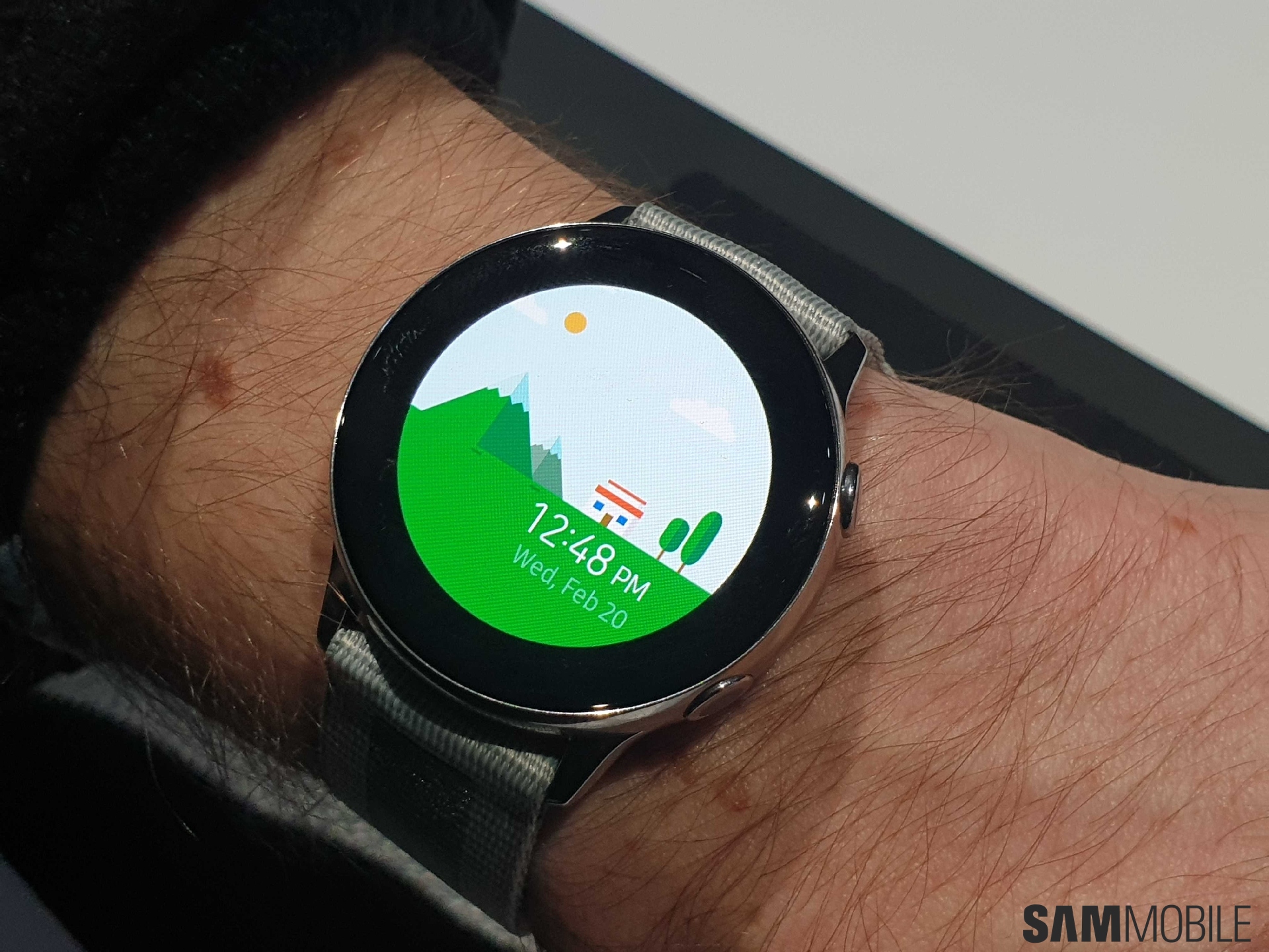
Ditching the fluted rotating bezel meant that the smartwatch could have a smooth design. It has gentle curves not unlike those on the Apple Watch. Sure, the Apple Watch isn’t circular, but the curves do allow for a smooth glass look. That’s what you get on the Galaxy Watch Active and it looks better on it due to the circular design. We do feel that the bezel could have been a bit smaller. As such, it would be better to not use a colorful watch face on this device. You’d get the best look from the Galaxy Watch Active if you opt for a darker watch face instead.
Interface
The Galaxy Watch Active brings One UI to Samsung’s smartwatches and a slightly new user interface since it doesn’t have a rotating bezel ring. That design element was used for navigation and since it’s not present, Samsung obviously had to make changes to the interface. That being said, you wouldn’t feel lost if you’re used to the old interface. Much of it still looks the same even though there are new animations and icons. The overall functionality remains the same and works as expected.
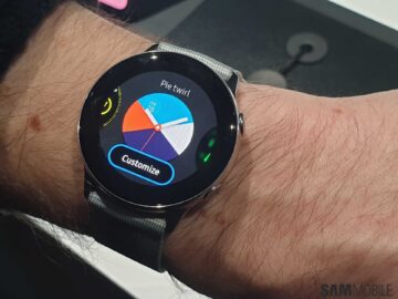
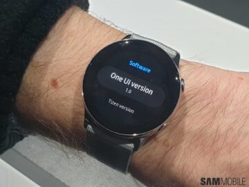

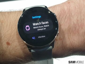
Since the Galaxy Watch Active is geared towards users who live an active lifestyle, the new animations are meant to get users to be more active in their daily lives. We find that they work as intended. There are also new watch faces like we see on every new smartwatch from Samsung. The health tracking features allow for sleep and stress tracking in addition to blood pressure monitoring. The new Daily Activity Tracker widget will ensure that users stay on top of their fitness goals. The smartwatch can also send users a Heart Rate Alert if it detects that they have an abnormally high resting heart rate. That’s a very useful feature to have on the device.
Conclusion
Despite not being that different compared to the Galaxy Sport as far as the size is concerned, the Galaxy Watch Active does feel like a serious new product. The swiping interface and seamless look make it stand out sufficiently enough. We do feel that this has the potential to be a hit for Samsung. We’re also exciting in seeing Samsung bring this new user interface to existing smartwatches.
We’ll have a full review of the Galaxy Watch Active up in the near future so do stay tuned for more of our thoughts on the new smartwatch.
The post Samsung Galaxy Watch Active hands-on: One UI in, bezel ring out appeared first on SamMobile.
from SamMobile https://ift.tt/2IqhMfi
via IFTTT




ليست هناك تعليقات:
إرسال تعليق