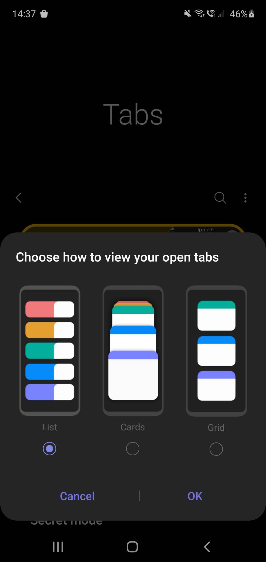
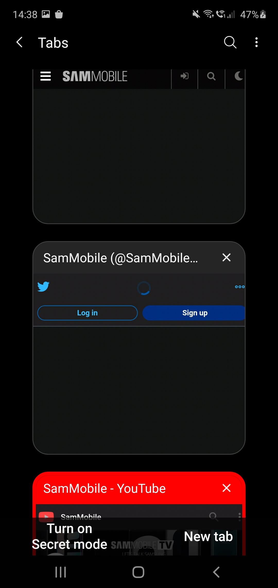
Samsung Internet is getting another distinct interface designed for tab management, fanciness, and tab management fanciness. Simply called “Grid”, the new view is reminiscent of a similar feature Google has been experimenting with in Android versions of Chrome since late 2019. Much like its role model, Samsung’s take on a grid-based tab switcher is currently only available outside of the stable channel.
The good news is that anyone interested in trying out the functionality can do so in a matter of seconds, as Samsung Internet Beta is available for everyone on the Google Play Store and Samsung’s own Galaxy Apps store instead of being locked behind a traditional beta signup process like other apps. You can even sideload the latest version by downloading the installation file from our APK archive.
An improvement on the visibility grid
As soon as you first tap the Tab button found in the app’s toolbar (that became movable this spring), you’ll be presented with a choice of how you’d like your switcher to look like, as seen in the screenshots featured herein. Note that the exact design of your “grid” may vary from that of an actual grid to what’s essentially a less efficient variant of Cards, depending on your system-wide settings concerning font size and proportions of other user interface elements. Regardless of your initial selection, you can always change your mind by opening the tab switchers context menu – also a new addition to version 12.1.1.5.
Assuming no radical changes in development course take place, the grid-like tab switcher is likely to make its way to a stable build of Samsung Internet later this year.


The post Samsung Internet gets fancy new tab switcher akin to Chrome appeared first on SamMobile.
from SamMobile https://ift.tt/38BH2IN
via IFTTT


ليست هناك تعليقات:
إرسال تعليق