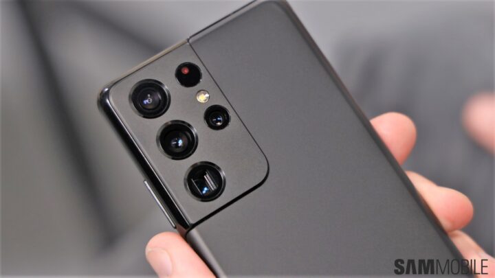
Samsung has mastered the skill of pumping out beautiful flagship devices so much so that we hardly get surprised anymore. Most new flagships are a gorgeous slab of metal and glass with incredible fit and finish. Every once in a while, though, the company does something that makes us sit up and take notice.
Like last year, Samsung has once again opted to launch three models for its Galaxy S lineup – the Galaxy S21, Galaxy S21+ and Galaxy S21 Ultra to be precise. Samsung had made some bold design changes to their predecessors. It did away with some signature design elements to show that it would now be going in another direction.
Samsung drove this point home with the Galaxy Note 20 series. It carried the same new design principles that Samsung had chosen for its flagships. This meant that, among other things, we’d probably never see a return of the center-aligned camera housings on its smartphones. What nobody knew then was that Samsung was merely laying the foundation of an exceptional design element that it would introduce in the future.
Enter the Galaxy S21 series. The luxurious feeling that it gives off is unlike anything we’ve experienced on a Samsung flagship. The Contour Cut camera housing is what catches the eye instantly. Samsung has replaced glass with metal for the camera housing and it feels very premium to the touch.

That’s not even the best part. The way this housing seamlessly blends into the metal frame is nothing short of extraordinary. It feels like an extension of the frame itself, an elegant one at that. It’s one thing to take a major leap in the design department, it’s another to execute it to perfection. The impeccable finish with the curved and polished edges speaks volumes about Samsung’s industrial design capabilities.
While this is a common element across the entire lineup, the Galaxy S21 is a bit of an outlier. It has a plastic back instead of glass but don’t let that fool you. The material that Samsung is using doesn’t make it feel like cheap or tacky plastic. Any doubts that we may have had about the feel were easily put to bed by the Galaxy Note 20’s plastic back. It’s a similar story here.
The Galaxy S21+ and Galaxy S21 Ultra are your familiar slabs of metal and glass. They get the best in class durability with Gorilla Glass Victus on both the front and back. Both feel exceptionally premium to the touch.
We like the matte finish as it goes very well with the new colors, particularly the Phantom Silver and Phantom Black colors for the Galaxy S21 Ultra. Phantom Black is actually the blackest black color Samsung has made. The company has made an entire video explaining why its new black color is so amazing. Do check it out because you’ve probably never seen someone getting borderline poetic about a color.
One can’t help but wonder whether someone from Apple designed this device. Its iPhones have always felt a bit more polished and refined than other smartphones. Now that might be an odd thing for you to read on a Samsung fansite but it’s difficult to deny that Apple is good at product design.
What the Galaxy S21 lineup proves, rather, is that Samsung knows design and is very capable of beating Apple at it. It made me think of the time when I experienced the Galaxy S6 for the first time. That device was a complete overhaul of Samsung’s design strategy. It showed the world that Samsung could do premium design and that it could do that very well indeed. The Galaxy S21 is a similar revelation, one that makes me very excited for the future.
Many of you will be aware that I’ve sworn by foldables ever since the Galaxy Fold was released. I couldn’t even think of giving up the Galaxy Z Fold 2 as my daily driver. However, I’m so in awe of the Galaxy S21 Ultra’s design and feel that I’m going to use it as my main phone this year, at least until we get the Galaxy Z Fold 3!
The post Samsung just beat Apple’s smartphone design with the Galaxy S21 appeared first on SamMobile.
from SamMobile https://ift.tt/38NUsn3
via IFTTT


ليست هناك تعليقات:
إرسال تعليق